011 min
What goes wrong without the Kano model
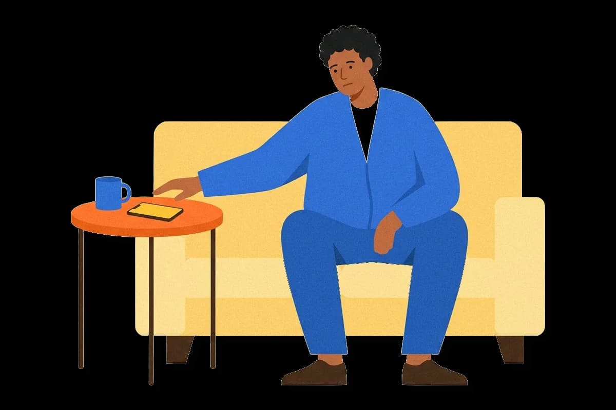
Picture a product manager at a team that makes a task-management app for small companies. The backlog holds forty requests. Large customers ask for an offline mode and faster search. The sales team wants a weekly digest that shows what each team finished. The manager has a vote count for every item and no way to tell what the votes mean.
Votes hide a difference that matters. Customers never ask for some features because they assume them. Nobody requests a working password reset, yet a broken one sends people away. Customers have never requested other features, yet they like them as soon as they see them. A vote count treats all of these the same, so the team ships what was requested most and then finds that satisfaction did not move.
The Kano model separates these cases before the team decides. It does not rank features by how many people asked. It ranks them by what happens to a customer when the feature is there and when it is not.
021 min
Where the Kano model came from
Before 1984, much quality work treated quality as one scale. A product was better or worse, and better meant more satisfied customers. Noriaki Kano, then at the Tokyo University of Science, worked with Nobuhiko Seraku, Fumio Takahashi and Shin-ichi Tsuji on a different view. Their paper argued that a single scale of poor to good quality was not enough, and it proposed looking at quality from two sides at once.
The first test: a TV set and a table clock
The authors tested the idea on ordinary household goods. Kano and his co-authors tested the idea in 1984 by asking consumers questions about TV sets and table clocks. The paper ends with an example of planning a new clock using the results. The model began as a tool for designing physical products.
032 min
How the Kano model sorts features
Kano's question about each feature is simple. How does satisfaction change as the feature goes from missing to excellent? The older answer was a straight line. Kano found that the line depends on the kind of feature, and five kinds cover the cases.
| Group | If the feature is present | If the feature is missing | Example in the task app |
|---|---|---|---|
| Must-be | No praise, only relief | Strong dissatisfaction | Password reset by email |
| One-dimensional | Satisfaction rises with quality | Satisfaction falls | Search speed |
| Attractive | Pleasant surprise | No complaint | The weekly digest |
| Indifferent | No effect | No effect | A choice of sidebar colors |
| Reverse | Some customers are annoyed | These customers prefer it gone | A reminder sent every hour |
Other authors use other names. Must-be features are also called basic or threshold features, one-dimensional features are called performance features, and attractive features are called delighters or excitement features.
The groups call for different decisions. A customer who gets a must-be feature does not feel better and only stops worrying, so the team can never earn credit for it and can only lose credit by getting it wrong. A one-dimensional feature is the one customers compare across products, because more speed or more accuracy always counts for something. An attractive feature gives the product a reason to be remembered, but the product is not worse without it.
Why the curves are uneven
The uneven shape matches a finding from decision research: people react more strongly to a loss than to a gain, a pattern called loss aversion. Researchers have applied prospect theory, the theory behind that finding, to product quality. Prospect theory predicts that falling performance hurts customers more than rising performance pleases them. That is why a missing must-be feature costs the team more than a perfect one earns.
042 min
How a Kano survey works
The manager cannot sort features by guessing, so the team asks customers. The questions come in pairs. The first is the functional question, and it asks how the customer would feel if the feature were present. The second is the dysfunctional question, and it asks how they would feel if it were missing. Both offer the same five answers: I like it, I expect it, I am neutral, I can tolerate it, I dislike it.
A customer answers both questions about the weekly digest: they like it if it exists, and feel neutral if it is missing. That pair puts the digest in the attractive group for this customer. The digest pleases them when it is there, and they would not miss it.
The team infers each feature's category from the pair of answers one customer gives. The full table has twenty-five cells, one for each pair of answers. These five cover the main cases.
| Answer if present | Answer if missing | Group |
|---|---|---|
| I expect it | I dislike it | Must-be |
| I like it | I dislike it | One-dimensional |
| I like it | I am neutral | Attractive |
| I am neutral | I am neutral | Indifferent |
| I dislike it | I expect it | Reverse |
Some pairs contradict themselves, such as liking a feature both when it exists and when it is missing. These go to a sixth group, called questionable. A large share of questionable answers usually means the question was worded badly.
Then the team counts. Discrete analysis gives each feature the group that most customers chose. Continuous analysis keeps the whole spread of answers and turns it into two scores, one for how much the feature adds to satisfaction and one for how much its absence adds to dissatisfaction.
Picture twenty customers. The numbers here are made up. Eleven give the attractive pair for the digest, five give the indifferent pair, two give the one-dimensional pair and two are questionable. Discrete analysis calls the digest attractive, and the count shows that about a quarter of customers would not care.
Two limits on the survey keep the table honest. Practitioner guides such as KanoSurveys.com give about 30 responses as a baseline and 50 to 100 as a safer range, and more if the team compares segmentation groups such as small and large customers. The same feature often lands in different groups for different segments.
051 min
Turning Kano results into a roadmap
The survey gives the manager a rule for order, not a ranked list. Missing must-be features come first, because they are the ones causing complaints now. One-dimensional features come next, since each improvement counts. Then come a few attractive features, chosen for how little effort they need and how well they fit the product. Indifferent and reverse features come off the plan.
This order also shapes a first release. A minimum viable offer needs the must-be features to be credible, and it adds one or two others to give customers a reason to pick it.
The rule has a gap that every team meets. The model says what customers want, not what is affordable to build. A must-be feature that takes two quarters still has to be weighed against its cost. Teams usually pair Kano with an effort estimate or a scoring method such as RICE. The next sections show why the sorting itself can mislead.
062 min
Why Kano results expire
Say the team ships the weekly digest and customers like it. Competitors copy the weekly digest, and new customers start to expect it. A later survey would place the digest in a different group from the first one.
Researchers who reviewed the literature describe a typical path. In a successful product, a feature tends to move from indifferent to attractive, then one-dimensional, and finally must-be. This is why a result from two years ago describes customers of two years ago. Psychologists describe the general habit of getting used to a pleasant change as the hedonic treadmill.
Why owned features become expected
The endowment effect says that people who own something want to avoid losing it. Once customers read the digest every Monday, taking it away would feel like a loss, not like a missed extra. That is the step from attractive toward must-be.
A case: 192 cyclists
A 2017 study in PLOS ONE looked for these groups in bicycles. The study recruited 192 cyclists, and each rode a set route at a cycling event. Afterward each rider rated eight parts of the bicycle and their overall satisfaction. In that study, color, cushion, weight and accessories behaved as attractive features: poor quality did not bring dissatisfaction, but good quality still raised satisfaction. Appearance, the brake system and the transmission system behaved as one-dimensional features.
Measuring without question pairs
The bicycle study did not use the paired questions. The riders scored each part on a 9-point scale and scored their satisfaction from 1 to 100. The authors then fitted statistical curves to see how the performance of each part changed the odds of a satisfied customer. This shows that the categories describe customer reactions, and a survey of question pairs is only one way to measure them.
072 min
Where the Kano model misleads
The survey produces a clean table, and the table can still be wrong. Four failures are worth knowing before the team trusts it.
A high attractive score may not pay off
In the bicycle study, raising an attractive part to a high level did not always raise satisfaction. Raising a one-dimensional part sometimes did. A feature in the attractive group is a candidate, not a guarantee, and the team should test the real effect after launch.
The survey can miss attractive features
Customers answer about things they can picture, so a feature they have never seen is hard to ask about. Some researchers could not find any attractive features because of a weak questionnaire, a loose feature definition or a mistaken view of the feature's life cycle. A team that finds none should check the wording of its questions before concluding that none exist.
Sorting does not create anything
Researchers Witell, Löfgren and Dahlgaard noted that many studies applied the model without exploring what makes a feature attractive. A table of categories tells the team where features sit today. It does not say what new feature would delight anyone, and that still takes the work of finding out what customers are trying to do, which is the job of jobs to be done research.
Mixing groups in one planning matrix
Quality function deployment, or QFD, is a planning method that links customer wants to product characteristics in a matrix. Mixing must-be requirements into a quality function deployment matrix can distort how customer weights are assigned. The fix is to keep must-be items out of the weighted list and treat them as a separate checklist.
What customers say they want also does not always match what they value in practice, so a Kano table is a strong input to a decision and not the decision itself.
081 min
The Kano model compared with nearby methods
Teams often meet the Kano model in a list with other prioritization methods, and the methods answer different questions.
| Method | What it measures | What it leaves out |
|---|---|---|
| Kano model | How customers react to a feature being present or missing | Cost and effort |
| RICE scoring | A score from reach, impact, confidence and effort | Whether the feature is expected or surprising |
| MoSCoW | Which items the team commits to as must, should, could or won't | Evidence from customers |
The deciding fact is the input. Kano needs a customer survey, and the other two can be run by the team alone. When the honest answer is to use more than one, the order is: find the candidate features through customer research, sort them with Kano, then weigh the sorted list against effort with a scoring method.
091 min
How to run a Kano survey this week
The result is a sorted feature sheet: a spreadsheet with one row per feature, its group, and a note on how sure the team is. A spreadsheet and any survey tool are enough.
- Write down the candidate features. Describe each as one benefit in one sentence, and leave out internal technical work that customers cannot see.
- Write the question pair for each feature, with the five standard answers. Pretest the wording on two or three colleagues, because unclear wording is the main source of questionable answers.
- Send the survey to customers who match the people you build for. Split the results by segment from the start.
- Map each response pair to a group using the table, then count the groups per feature.
- Mark every feature whose top two groups are close, or that has many questionable answers. Follow up with a short interview for each of those.
- Order the features with the rule from the roadmap section, then add a date to the sheet and decide when to survey again.
?4 questions
Questions people ask
How many features can one Kano survey cover?
Can the Kano model be used for services as well as software?
Is an attractive feature always worth building?
When should a team repeat a Kano survey?
§5 sources
Sources
Kano, N., Seraku, N., Takahashi, F. and Tsuji, S. (1984). Attractive quality and must-be quality. Journal of the Japanese Society for Quality Control, 14(2).
Lin, F.-H., Tsai, S.-B., Lee, Y.-C., Hsiao, C.-F., Zhou, J., Wang, J. and Shang, Z. (2017). Empirical research on Kano's model and customer satisfaction. PLOS ONE.
Kano model. Wikipedia, an encyclopedia entry.
Kano model FAQs. KanoSurveys.com, a practitioner guide.
Show all 5 sourcesShow fewer sources
Kano Model. ProductPlan glossary, a summary of the model.