Kerning

Also called Pair kerning, Letter-pair spacing

Quick answer

Kerning is the adjustment of the space between two specific letters so that the gaps in a line of text look equal. Because letters differ in shape, equal measured gaps look unequal. A font maker or designer shortens or lengthens the gap for pairs such as AV and LY. Tracking changes a whole range of letters by the same amount.

~20 sec read

012 min

Why letter pairs need kerning

Say a designer sets the word VALLEY in capital letters as the headline of a landing page. The font is Minion Pro, the type is 96 pixels tall, and they have changed none of the spacing. Something looks wrong, but no single letter is wrong. The gap between V and A looks too wide, and so does the gap between L and Y. The other gaps look acceptable.

A font does not measure the space between shapes. It gives each letter an invisible rectangle, made of the letter and a small margin on each side, and it sets the rectangles one after another. The distance between two rectangles is the same for every pair. The shapes inside them are not the same. The facing strokes of V and A run in the same slanted direction, so a long band of empty space opens between them, and the empty corners of both rectangles add to it. Two straight stems, such as the ones in H and I, leave far less empty area at the same distance.

Readers judge spacing by how much empty area they see, not by the distance between rectangles. In a well-spaced font, the blank area between every pair of letters looks about the same. Extra whitespace between two letters makes the word look uneven: V stands apart from A, and Y stands apart from L. Kerning is the correction. The designer, or the font maker before them, changes the gap for that one pair.

021 min

How a kern value works

The fix changes the gap for one pair alone. In a digital font, a kern is a number stored with the pair. It says how much to add to the normal spacing, or remove from it, and it is counted in font units. A font unit is a fraction of the em, which is the current type size. When a font has 1,000 units to the em, a value of 15 adds 0.015 of the type size to the gap. A negative value moves the letters closer.

Minion Pro stores −123 for VA and −97 for AV. For the designer’s headline, −123 means moving the V toward the A by 0.123 of the type size. At 96 pixels, that moves the V about 11.8 pixels toward the A.

Most kern values in a font are negative, and the negative ones are usually the larger ones. The capitals T, V, W and Y usually move closer to an A beside them, and to a lowercase letter on their right, as in Ta, Te and To. Periods and commas move closer to the same letters. Positive values are the exception. They appear mostly beside punctuation, for example after a lowercase f. LY, the second pair in the designer’s headline, belongs to the negative group.

normal spacingVA −12311.8 pixels
Compare the gap between V and A in the two windows. The faded V marks where it stood before the value was applied.

031 min

Where the word kerning comes from

People solved this problem before computers, and the word kerning comes from that work. When all type was cast in metal, every letter sat on a small block called a sort. A part of a letter that needed to overlap its neighbour hung over the edge of the block. That overhanging part was a kern, from the French word carne, a projecting angle. In that period, kerning meant making blocks with such overhangs. Adjusting the space between letters while setting a line was called letter spacing.

Metal kerning was costly because the matrices that shape the blocks had to be physically changed, so printers kerned only the pairs that needed it most, such as VA and AV. For other combinations, such as fi, fl and ffi, foundries supplied ligatures, which are single blocks that carry two or three letters. Digital fonts removed the cost. Once spacing was a number in a file, a font could hold a value for hundreds or thousands of pairs.

042 min

How a font stores kerning

Hundreds or thousands of values need a format. Because the right space differs for each letter pair, a font with 52 capital and small letters has 2,704 spaces to set. Digits, punctuation and accented letters add many more.

The older TrueType format keeps a simple kern table, with one entry for each pair and its value. Such tables typically hold several hundred pairs, and some hold more than a thousand. The newer OpenType format stores kerning in a glyph positioning table, called GPOS, and groups letters into classes. A class is a set of letters whose edges that face the neighbour are the same for kerning purposes. One value for a pair of classes covers every combination of their letters. Minion Pro, for example, puts V and W in one class as the first letter of a pair. Classes save space but cannot cover everything, so fonts also keep lists of single pairs for the cases that classes miss.

Can a program set the values?

The authors of a 2024 paper, Kei Nakatsuru and Seiichi Uchida, point out that kerning has no general procedure or criterion, so it is still done by hand or with rules of thumb. They trained a model that estimates all 2,704 spaces of a 52-letter font at once from images of the letters. On about 2,500 Google fonts, the model’s average estimation error was about 5.3 pixels, where the average letter space was about 115 pixels. A program can come close, which is the idea behind the next section.

051 min

Metric, optical and manual kerning

Stored values are half the job, because the software must decide which numbers to use. It offers three ways, and they differ in who made the numbers.

With metric kerning, the program reads the values that the font maker stored in the font. Most software does this by default. With optical kerning, the program ignores those values and calculates a spacing for each pair from the outlines of the two letters. Only more advanced software offers it. With manual kerning, the designer types a value for one pair in one place, and it overrides both of the others.

Each way has a weak point. Metric kerning depends on the font having good values, and tables can have gaps or mistakes. It also cannot choose a table when two neighbouring letters come from different fonts, which happens when an italic word ends with an upright bracket. Optical kerning copes better there. But a program can see two letters as close when a person sees them as far apart, especially when only a small accent mark is close. In the hands of a skilled person, manual kerning usually gives the best result. Most programs also let the user set a smallest size below which no kerning is applied.

062 min

What research says about letter spacing

Kerning is a craft rule, so it is fair to ask whether the eye cares. The studies below test spacing across a whole line, not single pairs. They show what spacing does to reading.

Crowding and reading speed

Letters that are close together interfere with each other’s recognition. This effect is called crowding. In 2002, Susana Chung of Indiana University tested six readers on short sentences shown one word at a time in the Courier font, with spacing from half the standard to double it. Reading speed rose as letter spacing grew, up to a critical spacing close to the standard one, and then stayed level or fell slightly. For a designer, this means that squeezing letters below the font’s normal spacing has a cost, while adding space beyond it did not make these readers faster.

Dyslexia and wider spacing

The result is different for readers with dyslexia. In 2012, Marco Zorzi and colleagues found that extra-large letter spacing improved text reading in Italian and French children with dyslexia, without any training. The team explains this with crowding, which affects these readers more strongly than other readers.

Neither study tested kerning pairs. They changed the spacing of a whole line by an equal amount, which is tracking. What they add to the case for kerning is the reason it matters: the space around a letter changes how well it can be told apart from its neighbours.

Letter gaps and word gaps

Letter spacing does not act alone. In 2013, Timothy Slattery and Keith Rayner ran two eye-movement experiments that changed the space within words and the space between words, and found that the two interact in a way that affects how readable a font is. Their starting point was that letters too close interfere with each other, and letters too far apart may weaken the word as a unit. A designer who kerns a headline is working inside that balance.

normalwide
Look at the gaps between the letters. The same four letters appear in both windows, and only the spacing differs.

071 min

Kerning at different sizes

The same pair looks different at different sizes. A gap that measures a pixel at body size measures several at headline size, so the uneven gaps in the designer’s headline show up first in large type. That is why logos, headlines and posters get the most kerning attention, and body text is usually left to the font’s own values. Software lets the user choose a smallest size for kerning, and a browser may skip kerning on small text by itself.

Interface type has its own case. At Figma, small text makes up much of the interface, and the team found it hard to read in Roboto. Rasmus Andersson released the first glyphs of Inter, a font designed for screens, in August 2017. Later versions of Inter added an optical size axis, a setting that lets one font adapt to the size it is shown at. Spacing that suits one size does not suit all sizes, and a font can now carry that knowledge.

081 min

Kerning on the web

On a web page, the browser applies the kerning stored in the font, if the font has any. The CSS property font-kerning controls this. It takes three values. With auto, the default, the browser decides, and it may skip kerning on small text or to save time. With normal, kerning is applied. With none, it is off. The W3C specification tells authors who want proper kerning to set normal.

CSS has no property for the value of one pair. The closest property is letter-spacing, which is tracking: it adds the same amount to every pair. Two details matter when both are in use. The browser applies kerning first, then adds any letter-spacing on top. And when letter-spacing is not zero, browsers do not apply optional ligatures such as fi, so a designer who tracks out a line of text loses them. For a logo, where every pair matters, the finished word is usually drawn as a vector shape rather than typed as live text.

091 min

Kerning and accessibility

Some readers set their own spacing, and a page has to survive it. WCAG 2.2 success criterion 1.4.12, Text Spacing, at level AA, requires that no content or function is lost when a user raises letter spacing to 0.12 of the font size or more. The same criterion sets line height at 1.5 times, paragraph spacing at 2 times and word spacing at 0.16 times.

The user’s letter spacing is added on top of the font’s kerning. So display text that is tightly kerned for looks still needs a container that can grow. The common failures are text clipped in fixed-height boxes and wordmarks that are live text with no room to widen. This is also the group that Zorzi’s result points to: readers who read better with wider spacing.

101 min

Applying kerning step by step

A fixed order of work keeps the choices small.

  1. Choose the font and the size first. Kerning is judged at one size, so redo it if the size changes.
  2. Set tracking for the whole line first, then look at single pairs.
  3. Start with pairs that have diagonal or open shapes: A, V, W, Y, T and L, and capitals followed by lowercase letters.
  4. Judge shapes, not words. Squint, blur the screen or turn the word upside down, so that you see the empty areas and do not read the word.
  5. Change one pair at a time by a small amount, and give a repeated pair the same value everywhere.
  6. Check the word at its final size, and on the screen or paper where it will appear.

For body text, leave the font’s kerning on and do not kern by hand. Gaps that are wrong only at large sizes are not visible at reading size, and a hand-set value is lost when the text is edited.

112 min

When kerning goes wrong

Kerning fails in two directions, and some words fail whatever the value.

Too tight: letters merge

When a pair comes too close, a reader may take two letters for one. The usual example is r and n becoming m, so that morn reads as mom. L and I can merge into U, and c and l into d. Designers sometimes call this keming. Merged letters are a problem of legibility, which is whether each letter can be told apart, and it is worse than an uneven gap.

Too much correction

Fixing one pair can make its neighbour look wrong. In a published example set in Clarendon, the word WAR is shown three ways: with no kerning, with some, and with too much. In the last version, the tightly spaced WA does not balance with AR, because the A and R cannot come any closer. Judge the whole word after each change, not the pair alone.

Words that resist spacing

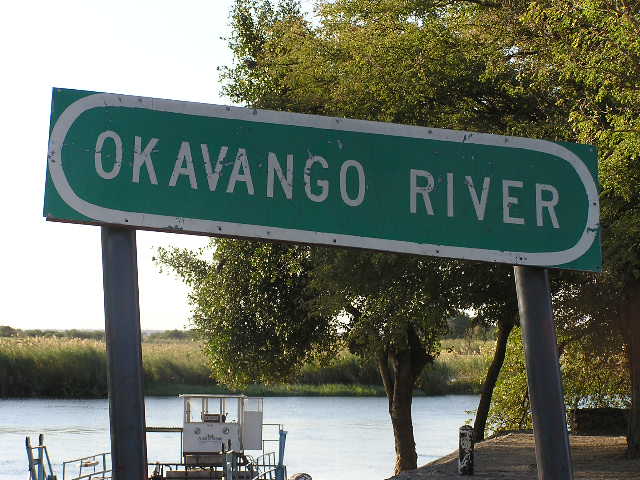
Some words are hard whatever the values. The name Okavango, on a river sign, contains AVA. The three letters fit together so well that the spaces on either side look very large. Wider or tighter spacing both help, and neither is perfect.

A kern also looks at only two letters. In Minion Pro, a quotation mark after an f is closer to the f when a period sits between them than when it does not, because the two small adjustments add up differently. Fonts and software that handle three-letter cases are called contextual kerning, and few ordinary documents use it.

A green oval road sign with white capital letters reading OKAVANGO RIVER, mounted on two posts, with trees and a river behind it.
Fig. 1A sign for the Okavango River. Compare the gaps around the A, V and A in OKAVANGO with the gaps between the other letters.w:User:DDD DDD · Public domain · Wikimedia Commons

121 min

Kerning vs. tracking and leading

Kerning, tracking and leading are often learned together, and tools sometimes put them in one panel. They change different things.

TermWhat it changesHow far it reaches
This pageKerningOne pairWhat it changes: The space between two specific letters
Not in the library yetTracking (letter-spacing)A word, a line or a blockWhat it changes: The space between all letters, by the same amount
DesignLeadingWhole linesWhat it changes: The vertical space between lines of text

The axis that separates kerning from tracking is reach. Tracking adds one amount to every gap and leaves the differences between pairs as they were. Kerning changes the differences. Leading works in the other direction, up and down. Optical alignment uses the same rule as kerning, judging by eye over measurement, but applies it to where a block of text starts and ends.

?3 questions

Questions people ask

Do I need to kern body text by hand?

No. Most software and browsers apply the font’s own kerning by default, and the effect is small at reading sizes. Kern by hand only large display text, such as a logo or a headline.

Why does the same text look different in two apps?

Apps differ in whether they use the values stored in the font or calculate optical kerning, and in the smallest size at which they apply kerning. A browser set to auto may also skip kerning on small text.

Does kerning slow down a web page?

The CSS specification says that in well-built modern browsers kerning usually has little effect on rendering speed. Authors may still turn it off where speed matters more than exact appearance.

§10 sources

Sources

Show all 10 sources
  1. Susana T. L. Chung, "The effect of letter spacing on reading speed in central and peripheral vision", Investigative Ophthalmology & Visual Science, 2002.

  2. Marco Zorzi and others, "Extra-large letter spacing improves reading in dyslexia", Proceedings of the National Academy of Sciences, 2012.

  3. Timothy J. Slattery and Keith Rayner, "Effects of intraword and interword spacing on eye movements during reading", Attention, Perception, & Psychophysics, 2013.

  4. Kei Nakatsuru and Seiichi Uchida, "Learning to Kern: Set-wise Estimation of Optimal Letter Space", arXiv, 2024.

  5. W3C, "CSS Fonts Module Level 3", W3C Recommendation.

  6. MDN Web Docs, "letter-spacing".

  7. W3C, "Understanding Success Criterion 1.4.12: Text Spacing", WCAG 2.2.

  8. Figma, "The birth of Inter".

  9. Wikimedia Commons, "Okavango River Sign.jpg" (photograph).

Keep reading

More from Design

All of Design
All of Design

Missing a concept?

Tell us what to write next. We’ll email you when it’s live.

Several? Separate them with commas.

Only to tell you when it’s live.

How we use your email: privacy.