011 min
The problem the Z-pattern answers
Picture a designer building the home page of a language-learning app. The page has one job: get a visitor to start a free trial. The designer has a logo, a short menu, a headline, one large picture, three lines about benefits and a trial button. All of these ask for attention at the same time.
A visitor will not study the page. People scan a page and decide within moments whether it deserves more effort, so the designer cares about two things: what the visitor meets first, and what comes next. Researchers study this with eyetracking, which records where people's eyes go on a screen. The Z-pattern is a shortcut designers use for the same question. It is a general guide to where the eyes go on a page like this one, so the most important pieces can sit where they will be seen, in the order they should be seen.
022 min
How the Z-pattern works
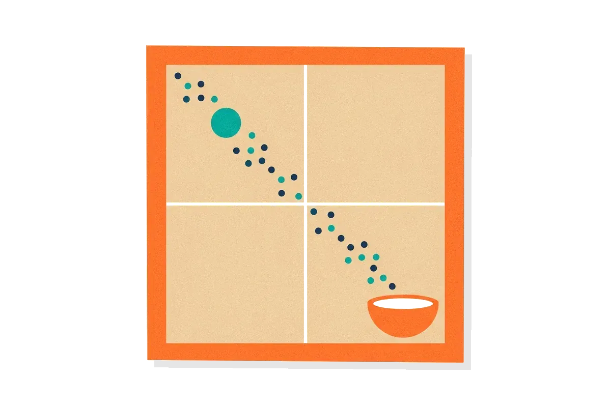
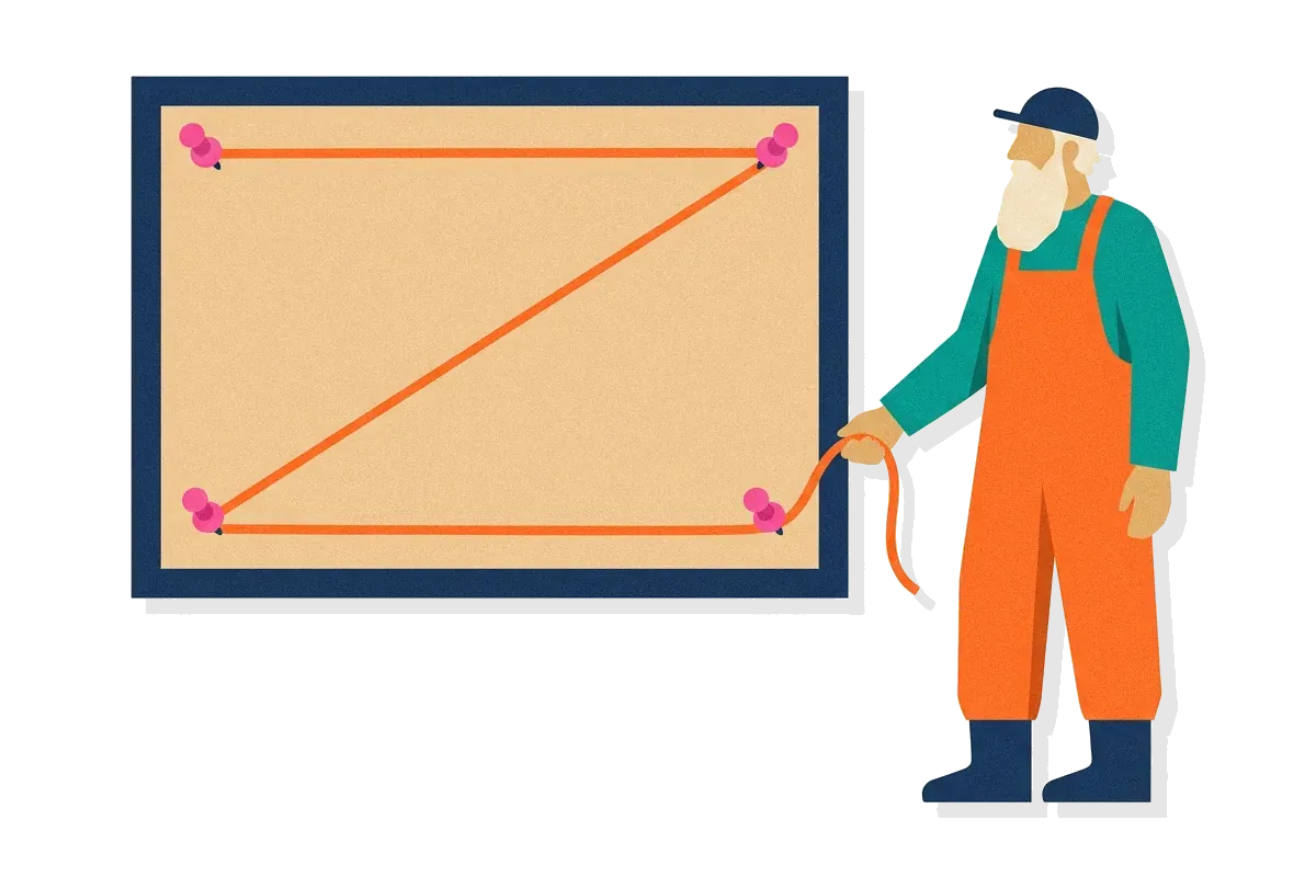
The designer's next question is what the route looks like. The Z-pattern describes four stops joined by three strokes. A stop is a spot where the eyes rest for a moment, which researchers call a fixation. The route starts at the top left, because visitors who read from left to right tend to begin there. Guides then give each stop a job.
| Stop | Place on the page | What guides usually put there |
|---|---|---|
| 1 | Top left | The brand mark or logo |
| 2 | Top right | A short menu or a secondary action |
| 3 | Bottom left | The points that lead up to the main action |
| 4 | Bottom right | The main action, such as a sign-up button |
The middle of the page, where the diagonal crosses, is for the largest piece of content, such as one picture or the headline. Designers choose what goes there with visual weight and direction, which guides call flow. Visual weight is how strongly an element attracts the eyes. A large shape with strong contrast against its background has more of it. Direction comes from lines, arrows, or the way a person in a photo is looking, all of which point the eyes onward.
The diagonal is a jump, not a path
The diagonal is the part of the Z that is easiest to misread. The eyes do not slide along it. They jump from stop 2 to stop 3. NN/g, the usability research firm behind many eyetracking studies, says that during these jumps, which researchers call saccades, a person is virtually blind. So the eyes take in almost nothing between the two stops. Whatever a designer places on the diagonal is seen only if a stop lands on it. A large headline can get a stop. A faint line of small text will be skipped.
031 min
Where the Z-pattern comes from
Who found this route? No one is named. The guides that describe the Z-pattern do not credit a researcher, and NN/g's 2019 review of its own eyetracking work names four ways of scanning text: the F-pattern, the spotted pattern, the layer-cake pattern and the commitment pattern. None of them is a Z. The Z-pattern is a design guide, not a measured result.
An older idea is close to it. The Gutenberg diagram is a model from print design in which a reader's eyes move from the top left of a page toward the bottom right. Wikipedia's entry on the typographer Edmund Arnold gives Z pattern layout as another name for the Gutenberg diagram and attributes the idea to him in the 1950s. Web design guides in the 2010s then gave the Z its own name and its own advice for screens. Two widely read examples are a guide by Jerry Cao of UXPin, published on Creative Bloq, and a 2015 article by Steven Bradley in Smashing Magazine, which sets the Z beside the Gutenberg diagram and the F-pattern.
042 min
Laying out a page along the Z-pattern
A design guide still has to be used on a real page, so back to the language-learning app. The route tells the designer where each piece goes. They put the brand mark at the first stop, a short menu at the second, the three benefits at the third and the free-trial button at the fourth. The headline and the large picture fill the middle, where the diagonal crosses. The rest of the page stays plain, with plenty of empty space, because every extra element gives the eyes another place to stop.
The route does not have to be an exact Z. Instapage's guide to the layout says the shape can bend and the number of turns can vary. What matters is the order of the stops.
Guides point to real pages as models. Nick Babich's guide names the sign-up pages of Basecamp and Evernote and says Dropbox repeated the Z several times before it ended on a free sign-up button. The UXPin guide describes Airbnb's map page, with the logo at the top left, links and sharing options at the top right and the zoom control at the bottom right. Those descriptions were written for the pages as they looked then, so look at the live pages before using them as models.
Repeating the Z down a longer page
A longer page does not end at stop 4. Guides say the route starts again on every screenful, and each turn on the right is a place to offer the main button again. This is the idea behind pages that alternate a picture on one side and text on the other. Eyetracking has tested a layout built this way, as the next section shows.
052 min
What eyetracking found when a layout repeats the Z
NN/g did not test the Z-pattern itself, but in 2017 it tested a layout built on the same idea: rows of picture and text that change sides from row to row down the page. NN/g calls this a zigzag layout.
Kim Flaherty's team took four live pages that used it: BoxyCharm, HelloFresh, Waze and Splitwise. For each one they made a second version in which every picture stayed on the same side. About 30 to 35 people saw one version of each page, and each person had a simple task, such as finding out how Splitwise works.
The result depended on the pictures. On BoxyCharm the pictures showed the products, and people studied them in both layouts. NN/g concluded that when pictures were more than decoration, both layouts worked equally well. On HelloFresh, Waze and Splitwise, people decided the pictures were not useful for their task and began to avoid them. In the zigzag version, though, the pictures acted as obstacles. After a scroll, a picture appeared in the spot where the text had been, and the eyes, which had stayed in place, landed on it by accident before moving back to the text. NN/g calls these accidental stops residual fixations. On Splitwise the problem was larger, because the pictures contained text and looked like the text beside them.
For a designer using the Z, the lesson is narrow. Alternating rows are not wrong. A picture on an alternating row has to be worth looking at, because a decorative one costs the reader extra eye movements.
061 min
Where the evidence for the Z-pattern is thin
That study tested a layout, and the Z-pattern has little direct evidence of its own. Lidwell, Holden and Butler, the authors of Universal Principles of Design, note that layouts based on the Gutenberg diagram are widespread, yet they found little empirical evidence that following it improves reading speed or understanding. They also limit the diagram to pages of heavy text, evenly spread content and blank displays.
Guides disagree about which pages the Z describes. Most say it fits sparse pages with few words and one main goal. Steven Bradley says the opposite in Smashing Magazine: the F and Z routes describe text-heavy pages, and they stop applying once a designer adds hierarchy, graphics and movement. Both views lead to the same advice. A page that directs the eyes on purpose does not need a default route, and a page that does not will probably get whichever default fits its content.
For a designer, this means the Z is a starting plan for the order of content. It is not a finding to defend. The way to settle it for one page is to show that page to people who match its visitors.
073 min
When the Z-pattern stops predicting where eyes go
If the Z-pattern holds on a plain page, a few conditions can still break it. Each of the next five stands alone, so read the ones that match your page.
The right half of the page gets less attention
The Z ends at the bottom right, but the two sides of a screen do not get equal attention. In 2017 NN/g ran another round of its eyetracking research. Its team recorded over 130,000 fixations from more than 120 people doing open-ended tasks, then counted how many were on each half of the screen. On ordinary web pages, 80% of the fixations were on the left half and 20% on the right. Search result pages were counted separately. So the main button at stop 4 sits on the side that people look at least. It needs a large size and strong contrast to be found, and the design should not depend on the route to bring the eyes there. Smashing Magazine's guide also notes that these patterns assume languages read from left to right.
The eyes may not start in a corner
The Z starts at the top left. Laboratory studies with photographs of natural scenes show a different first move. Rothkegel and colleagues report that people first move their eyes toward the centre of an image on a screen, a tendency they call the central fixation bias. Photographs are not web pages, so this does not measure what your page will do. It is a reason to expect that a large picture in the middle of the page may get the first stop before the brand mark does.
Returning visitors look at what changes
Visitors who know a page do not scan it like new ones. Lidwell and colleagues note that people who often see information presented the same way are more likely to look first at the parts that change. A returning user of the language-learning app may skip the brand mark and go straight to the area where new lessons or offers appear.
Phones turn the route into a column
A phone shows one narrow column. There is no room for stop 2 beside stop 1, so the order becomes top to bottom. NN/g also describes a marking pattern, in which the eyes stay in one place while the page moves past, and says it happens more on phones than on desktop computers. On a phone, plan the order of the content from top to bottom first, and treat the Z as a layout for wide screens.
The visual order and the reading order can differ
A Z layout can place items so that the order in the page's code no longer matches the order a sighted visitor sees. Screen readers, which read a page aloud, follow the order in the code. WCAG 2.2 success criterion 1.3.2, Meaningful Sequence, says that when the order of content affects its meaning, software must be able to work out a correct reading order. Check that the code lists the brand mark, the menu, the benefits and the main button in an order that makes sense when read aloud.
081 min
Z-pattern vs. the Gutenberg diagram and the F-pattern
Three neighbours can be mistaken for the Z-pattern, and the table shows what separates the first two.
| Pattern | Route | Where it comes from | The top-right and bottom-left corners |
|---|---|---|---|
| This pageZ-pattern | |||
| DesignGutenberg diagram | |||
| DesignF-pattern |
The one axis that matters in practice is what each pattern assumes about those two corners. Only the F-pattern came from eyetracking, and it appears on text with little formatting, not on sparse pages.
The third neighbour has a similar name. The zigzag layout in NN/g's 2017 study is a way of arranging content, with picture and text changing sides from row to row. Some guides use zigzag pattern for a repeating Z, which is a route the eyes take. When a writer uses the word, check which of the two they mean.
092 min
Applying the Z-pattern
Back to the language-learning app. These moves can be made this week:
- Write down the page's one job and the order in which a visitor should notice things. Nick Babich suggests three questions: what should a visitor notice, in what order, and what should they do?
- Put the brand mark at stop 1 and keep the top bar short, so stop 2 holds only one or two items.
- Use the diagonal for one large picture or one headline, and leave whitespace around it so the eyes have a clear place to stop.
- Put the benefits at stop 3 so the visitor reads the reasons before the button. Make the button at stop 4 the clearest shape on the page, with a label that says what happens next.
- On a longer page, repeat the route once per screenful and offer the main button again at each turn on the right.
Then test the order. Ask a handful of people who match the real visitors to look at the page for a few seconds and say what they noticed first, second and third. Eyetracking or a heatmap can show where they looked but not why, so pair either with a question.
The Z-pattern backfires when it is applied as a rule. Forcing a route onto a page with many competing goals leaves some of them unseen, and decoration on alternating rows costs the reader effort, as the 2017 test showed. When people look somewhere other than the Z predicts, change the page to match where they look. A deliberate visual hierarchy works better than a default route.
?4 questions
Questions people ask
Do I have to use the Z-pattern on every landing page?
How can I check whether visitors follow the Z on my page?
What is the terminal area?
What is a call to action in a Z-pattern layout?
§12 sources
Sources
Show all 12 sourcesHide sources
Nielsen Norman Group (Kara Pernice), "Text Scanning Patterns: Eyetracking Evidence", 2019.
Nielsen Norman Group (Kim Flaherty), "Zigzag Image-Text Layouts Make Scanning Less Efficient", 2017.
Nielsen Norman Group (Therese Fessenden), "Horizontal Attention Leans Left", 2017.
Nielsen Norman Group (Kara Pernice), "F-Shaped Pattern of Reading: Misunderstood, But Still Relevant", 2017.
William Lidwell, Kritina Holden and Jill Butler, Universal Principles of Design, entry "Gutenberg Diagram" (copy hosted on a university course page).
Wikipedia, "Edmund Arnold".
Steven Bradley, "Design Principles: Compositional Flow And Rhythm", Smashing Magazine, 2015.
Lars Rothkegel, Hans Trukenbrod, Heiko Schütt, Felix Wichmann and Ralf Engbert, "The temporal evolution of the central fixation bias in scene viewing", arXiv preprint, 2016.
W3C, "Understanding Success Criterion 1.3.2: Meaningful Sequence", WCAG 2.2.
Nick Babich, "Z-Shaped Pattern For Reading Web Content".
Jerry Cao (UXPin), "Design jargon explained: the Z-Pattern", Creative Bloq.
Instapage, "What Is the Z-Pattern Layout & When to Use It?".