012 min
Who accessibility is for
Accessibility starts from a count of people, not from a checklist. The World Health Organization reports that 1.3 billion people experience significant disability, which is 16% of the world’s population, or 1 in 6.
The W3C Web Accessibility Initiative, the group at the World Wide Web Consortium that writes web accessibility guidance, says web accessibility covers all disabilities that affect access to the Web. It lists six groups: auditory, cognitive, neurological, physical, speech, and visual.
Each group meets different barriers. A person who is blind cannot see a button that has no text description, so they depend on a screen reader, software that reads the page aloud. A person with a hand tremor may not be able to hit a small link with a mouse, so they may use a keyboard, a voice command, or a switch device, a single large button that replaces the mouse. A person who is deaf needs captions on video. A person with a cognitive disability may need short sentences, clear labels, and no time limit on a form.
The same barriers also reach people who have no permanent disability. A person with a broken arm cannot use a mouse for six weeks. A person in a noisy train station needs captions because they cannot hear the sound. Microsoft’s Inclusive Design principles state that creating products for people with permanent disabilities creates results that benefit everyone.
This is why the field treats accessibility as a property of the product, not as a favour to a small group. A barrier removed for one person is usually removed for many others.
022 min
Where accessibility comes from
Accessibility began in the physical world, with the street. In the early 1970s, Michael Pachovas and a few friends wheeled themselves to a curb in Berkeley, California, poured cement into the form of a crude ramp, and rolled away. They were disability advocates, and the ramp was an act of protest. Wheelchair users could not cross most streets, because every corner ended in a raised curb.
Law followed slowly. The Architectural Barriers Act of 1968 required government buildings to be accessible, but it did not cover streets. In 1972 the city of Berkeley installed its first official curb cut, a lowered section of curb, at an intersection on Telegraph Avenue. On July 26, 1990, President George H.W. Bush signed the Americans with Disabilities Act (ADA), which prohibits disability-based discrimination and mandated changes to the built environment, including curb cuts.
The web inherited the idea in a single sentence. Tim Berners-Lee, who invented the World Wide Web, wrote: “The power of the Web is in its universality. Access by everyone regardless of disability is an essential aspect.” That statement is quoted at the top of the W3C’s own introduction to accessibility.
What the curb cut taught designers
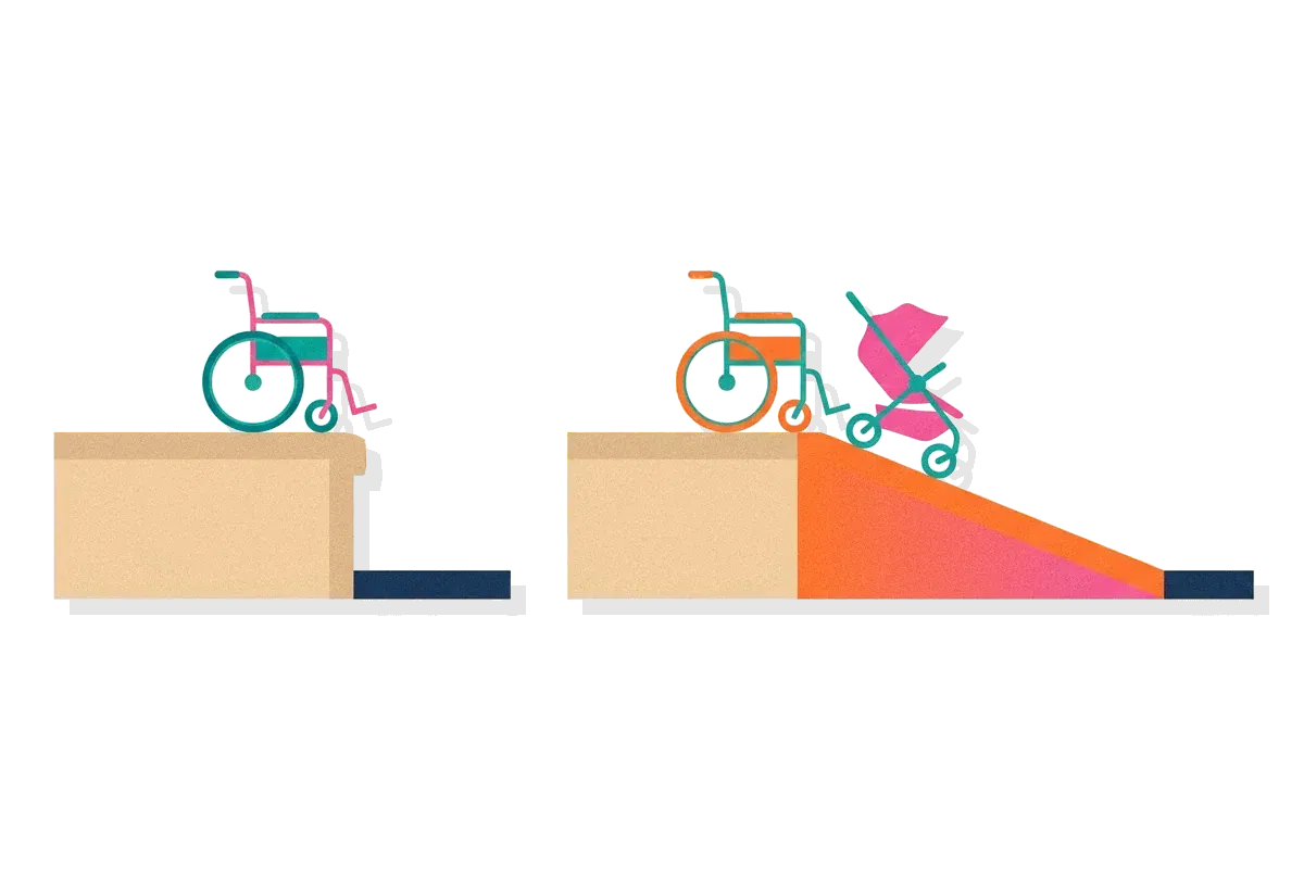
The legal change had a side effect that nobody had planned for. Angela Glover Blackwell described it in a 2017 essay. When the wall of exclusion came down, everybody benefited, not only people in wheelchairs. Parents with strollers, workers with heavy carts, and travelers with luggage all headed for the curb cuts. A study of pedestrians at a shopping mall in Sarasota, Florida, found that nine out of 10 pedestrians who carried nothing still went out of their way to use a curb cut.
Designers call this the curb-cut effect: a feature built for people with disabilities ends up serving a much larger group. Captions are the digital example. They were built for viewers who are deaf and are now used by people watching video with the sound off.

031 min
The four principles behind accessibility standards
Most countries that regulate digital accessibility point to one technical standard: the Web Content Accessibility Guidelines, or WCAG. The current version, WCAG 2.2, became a W3C Recommendation on 12 December 2024. It is a list of testable rules called success criteria. Each one has a level: A (lowest), AA, or AAA (highest). Laws and contracts usually ask for level AA.
The criteria are grouped under four principles. Each principle answers one question about a person using the page.
| Principle | The question it asks | Example criterion |
|---|---|---|
| Perceivable | Can the person detect the content with at least one sense? | SC 1.1.1 Non-text Content: images have a text alternative |
| Operable | Can the person act on the content with the device they have? | SC 2.1.1 Keyboard: every function works from a keyboard |
| Understandable | Can the person tell what the content means and what to do? | SC 3.3.2 Labels or Instructions: form fields say what to enter |
| Robust | Can assistive software read the content reliably? | SC 4.1.2 Name, Role, Value: each control tells software what it is |
The order matters when you debug. A person who cannot perceive a control cannot operate it, and a person who cannot operate it never reaches the part that has to be understood. Fix the earlier principle first.
042 min
How accessibility fails on real websites
WebAIM, an accessibility organisation, runs an automated test on the home pages of the top 1,000,000 websites every year and publishes the result as the WebAIM Million. In 2026 it found detectable WCAG 2 failures on 95.9% of those home pages. That number rose from 94.8% in 2025, which ended six years of small yearly improvements.
The failures are not exotic. Six types account for 96% of all errors WebAIM detected, and the same six have led the list for seven years.
| Failure | Home pages affected (2026) | Who it blocks |
|---|---|---|
| Low contrast text | 83.9% | People with low vision, and anyone in bright light |
| Missing alternative text for images | 53.1% | People who use a screen reader |
| Missing form input labels | 51% | Screen reader users, and voice control users |
| Empty links | 46.3% | Screen reader users |
| Empty buttons | 30.6% | Screen reader users |
| Missing document language | 13.5% | Screen readers that pick the wrong voice |
An empty link is a link with no text inside it, usually an icon. A screen reader announces it as just “link”, with no hint of where it goes. A missing form label means a field with no name attached to it, so a person using voice control cannot say “click email”.
WebAIM also named a cause for the rise. It reported a significant increase in home page complexity and in ARIA code, both of which correlate to increased detectable errors. ARIA is a set of extra HTML attributes that tell assistive software what a custom control is. Used well, it fills gaps. Used wrongly, it replaces a working native element with a broken one.
A court case about a pizza site
In Robles v. Domino’s Pizza, a man who is blind and uses screen-reading software could not order from Domino’s website or app. He sued under the ADA. The Ninth Circuit Court of Appeals ruled on 15 January 2019 that the ADA applied to the website and app, because they connected customers to the goods and services of the physical restaurants. It also held that Domino’s had received fair notice that its website and app must comply. The court did not set WCAG 2.0 as a legal requirement, but it left an order to follow WCAG 2.0 open as a possible remedy.
The case turned accessibility from a design preference into a legal exposure for US companies with public websites. European law moved the same way, but this article does not cover those rules.
052 min
Accessibility in practice: four criteria to test
Four criteria cover most of what designers and engineers can check without special equipment. Each one maps to a failure in the table above or to a rule from the standard.
Contrast: SC 1.4.3 Contrast (Minimum)
The standard requires that the visual presentation of text and images of text has a contrast ratio of at least 4.5:1. Large text needs 3:1. A contrast ratio compares how bright the text is with how bright the background is. Take grey text on a white page. Using the WCAG formula, a grey of #767676 on white measures 4.54:1 and passes. A grey of #777777, one step lighter, measures 4.48:1 and fails. Most people cannot see that difference. A checker tool can, so run one on every text and background pair in your design system. The contrast concept covers the visual side of this.
Target size: SC 2.5.8 Target Size (Minimum)
WCAG 2.2 added a rule that the size of the target for pointer inputs is at least 24 by 24 CSS pixels, with exceptions for spacing and some other cases. The W3C’s explanation says users with dexterity limitations and those who have difficulty with fine motor movement find it difficult to accurately activate small targets when there are other targets that are too close. The conditions it names include hand tremors, spasticity, and quadriplegia. This is also where Fitts’s Law applies: the time to hit a target rises as the target shrinks and a user with a tremor may need several tries on a small one.
Keyboard: SC 2.1.1 Keyboard
All functionality of the content must be operable through a keyboard interface without requiring specific timings for individual keystrokes. Try it now on your own product: unplug the mouse, press Tab, and watch where the focus goes. A hover-only menu or a drag-only slider fails this test.
Text alternatives: SC 1.1.1 Non-text Content
All non-text content that is presented to the user has a text alternative that serves the equivalent purpose. The key word is “equivalent purpose”. The alternative for a photograph on a news page describes the news. The alternative for a magnifying-glass icon on a button says “Search”, not “magnifying glass”.
062 min
Applying accessibility to a product team
Accessibility costs the least when it is part of the first design review, and the most when it is found after launch. These moves fit into a normal sprint.
- Put contrast and target size in the design system. Check each colour pair and each control size once, when the token is defined, so no page can ship a failing combination by accident.
- Use native HTML elements first. A real button gives you keyboard focus, a name, and a role for free. A clickable div needs ARIA, key handlers, and focus code to do the same job, and each of those can break.
- Test with the keyboard and a screen reader, not only with a scanner. A heuristic evaluation is a good place to add accessibility checks, because reviewers already walk the product screen by screen.
- Write labels and error messages in plain words. A form field that says what to enter and what went wrong helps people with cognitive disabilities, and it helps everyone else too. See readability.
- Recruit disabled participants for user research. Automated tools and checklists find rule failures. Only people who use the product with assistive technology can tell you if a task is actually possible.
Plan for a limit. Accessibility work has no finish line, because every new feature can add a new barrier. Treat it as a quality gate on each release, the same way you treat security or performance.
072 min
Where accessibility practice is contested
The standard is widely accepted. The arguments are about how to meet it.
Can software fix it automatically?
Several vendors sell accessibility overlays, add-on scripts that scan a page and try to repair it. Many practitioners reject the promise. The Overlay Fact Sheet, a statement signed by accessibility professionals, says: “While the use of an overlay may improve compliance with a handful of provisions in major accessibility standards, full compliance cannot be achieved with an overlay.” Its reasoning is that conformance means meeting every requirement of the standard, and the products document that they cannot repair every issue.
The vendors’ side is that an overlay is cheaper than rebuilding a site and fixes the common failures at once. The strongest form of that argument is practical: a small organisation with no developer may do more good with an imperfect repair than with nothing. The signatories answer that the repair can interfere with the assistive tools disabled people already use. Where that leaves you: fix the code first, and treat any overlay as a temporary measure, not as evidence of conformance.
Do automated scores show real access?
The WebAIM Million counts only automatically detectable failures. WebAIM itself says the rate of full WCAG 2 A/AA conformance was certainly lower than the 4.1% of pages with no detected failures. The opposite also holds: a page can pass every automated check and still be unusable, because a scanner cannot tell if a heading makes sense or if an alternative text describes the right thing. Use scanners to find the common errors, then test the rest by hand.
081 min
Accessibility vs. nearby concepts
Four terms are often used as if they meant the same thing. They overlap, and the W3C says it is most effective to address them together. They still start from different questions.
| Concept | The question it starts from | Who it centres |
|---|---|---|
| This pageAccessibility | ||
| Not in the library yetUsability | ||
| DesignInclusive design | ||
| DesignUniversal design |
The W3C’s definition of usability is that a product is designed to be effective, efficient, and satisfying. Usability work often does not look closely at people with disabilities, so a product can score well in usability testing and still fail a screen reader user. Accessibility is the check that closes that gap. A related idea, cognitive load, explains why clear structure helps people with cognitive disabilities and also helps everyone who is tired or rushed.
?6 questions
Questions people ask
What is accessibility in UX?
What is an example of accessibility in web design?
What does WCAG level AA mean?
Is accessibility the same as usability?
Can an accessibility overlay make my site compliant?
Are websites legally required to be accessible?
▶3 videos
Watch
Understanding Accessibility
What is web accessibility? Learn accessibility techniques.
Semicolon Guy
Mobile Accessibility Settings లో మీకు తెలియని 5 Hidden Settings | Accessibility | Telugu tech pro
Telugu Tech Pro
§10 sources
Sources
Show all 10 sourcesHide sources
World Health Organization, “Disability” fact sheet, 7 March 2023.
W3C Web Accessibility Initiative, “Introduction to Web Accessibility”.
W3C, “Web Content Accessibility Guidelines (WCAG) 2.2”, W3C Recommendation, 12 December 2024.
W3C, “Understanding SC 2.5.8: Target Size (Minimum)”.
WebAIM, “The WebAIM Million: the 2026 report on the accessibility of the top 1,000,000 home pages”.
Angela Glover Blackwell, “The Curb-Cut Effect”, Stanford Social Innovation Review, Winter 2017.
United States Court of Appeals for the Ninth Circuit, Robles v. Domino’s Pizza, LLC, opinion filed 15 January 2019.
Overlay Fact Sheet, a statement by accessibility professionals.
Microsoft, “Inclusive Design” principles.
W3C Web Accessibility Initiative, “Accessibility, Usability, and Inclusion”.