012 min
Why universal design began at a curb
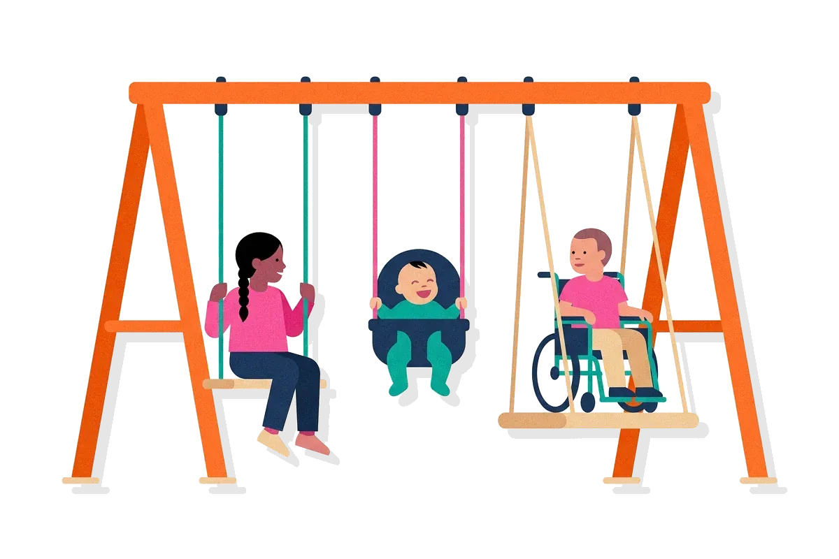
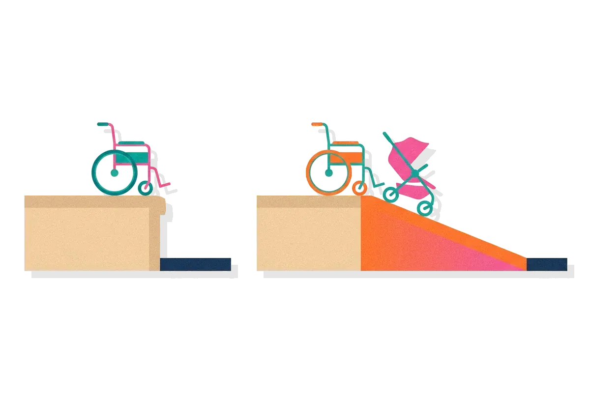
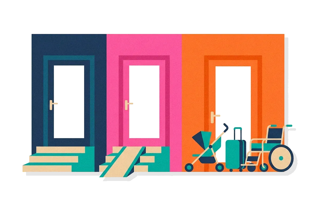
A curb is a small step, but for a person in a wheelchair it can end a route. The usual answer was to adapt: build a ramp in one place, or ask someone for help. The answer behind universal design was different. It put the ramp where everyone already walked.
The ramp poured in Berkeley
In the early 1970s, Michael Pachovas and several other disability advocates went in their wheelchairs to a curb in Berkeley, California. They poured cement against the curb and shaped a rough ramp. They meant it as a political act. In 1972 the city installed its first official curb cut, on Telegraph Avenue.
Who used the ramp
The ramp was built for wheelchair users, but they were not the only people who chose it. Parents with strollers, workers with carts and travellers with rolling suitcases went to the cut instead of the plain curb. So did runners and skateboarders. A study at a shopping mall in Sarasota, Florida, found that nine in ten pedestrians who carried nothing also went out of their way to reach one.
This pattern is called the curb-cut effect. A design made for the people who face the most difficulty is often the easiest design for everyone. It is the main idea of universal design.
The curb-cut effect beyond buildings
In 2017 Angela Glover Blackwell used the curb cut in the Stanford Social Innovation Review to argue that policies built for the most excluded people tend to help everyone else too. Her other examples included seat belt laws, which began as a way to protect young children and later covered adults as well.

022 min
Where universal design comes from
The Berkeley advocates were not the first to ask for access. Standards for disabled access already existed when the ramp was poured. In 1960 specifications for barrier-free design were published, based on more than eleven years of research on disability and ergonomics, the study of how people fit and use equipment. In 1961 the American National Standards Institute published A117.1, the first barrier-free design standard. Laws followed: the Architectural Barriers Act of 1968, Section 504 of the Rehabilitation Act of 1973, the Fair Housing Act Amendments of 1988 and the Americans with Disabilities Act of 1990. Each set minimum requirements so that buildings did not discriminate.
Those rules led Ron Mace, Ruth Hall Lusher and others to ask for something different. Their premise was that an environment could be made far more usable than a law could realistically require.
Mace was an American architect who caught polio at the age of nine, in 1950, and used a wheelchair for the rest of his life. He studied architecture at the School of Design at North Carolina State University and graduated in 1966. Mace is the person credited with coining the term universal design. In 1989 he founded the Center for Accessible Housing at the same university, which later became the Center for Universal Design.
North Carolina's 1973 building code
Mace also worked on law. He helped North Carolina adopt Chapter 11X in March 1973, described as the first building code in the United States that focused on accessibility. It later served as a model for other states.
Other names for the same aim
Other names exist. Barrier-free design is the term used mostly in Japan and other non-English-speaking countries, while Design for All is the name of a related philosophy.
A group of experts from several fields wrote the seven principles in 1997. The Center for Universal Design at North Carolina State University published them, and ten people are credited, Mace among them. The next section sets them out.
032 min
The seven principles of universal design
The 1997 group wanted a short list that designers could use to judge an existing design, to guide a new one and to teach both designers and consumers what makes a product more usable. The result was seven principles.
| Principle | What it asks | A common example |
|---|---|---|
| Equitable use | The same way of using the design for everyone, with no one singled out | A main entrance that is step-free for all, not a separate door at the back |
| Flexibility in use | A choice in how the design is used | Scissors that work in either hand |
| Simple and intuitive use | Use that is clear whatever the person's experience, language or concentration | An elevator panel with one button for each floor |
| Perceptible information | Information that reaches the person through more than one sense | A fire alarm with both a sound and a flashing light |
| Tolerance for error | Fewer hazards, and less harm from a slip | An undo command in an editor |
| Low physical effort | Comfortable use with little fatigue | A door lever that opens with an elbow |
| Size and space | Enough room to approach, reach and use it from any posture | Controls within reach of a person sitting or standing |
Return to the curb cut. A gentle slope takes little effort. It is wide enough for a wheelchair and a stroller together. It sits in the path that everyone already uses, so nobody is sent to a side route.
Flexibility in use is not one fixed shape
A common reading of universal design is that it means one object for every body. The second principle says something else. It asks for a choice in how the design is used, for a form that suits left and right hands, for help with accuracy and for room to work at the user's own pace. The goal is a design that gives people options without a special version, not a single rigid design.
042 min
Universal design in homes, products and workplaces
The principles are easiest to see in things people touch every day. Homes show them clearly. A universally designed house has a step-free entrance, a bedroom, kitchen and bathroom on the entry level, wide doors and halls, lever handles, rocker switches, non-slip floors and good lighting. These help a wheelchair user, and they also help a parent carrying a child, a guest with a broken ankle and an older owner who wants to stay at home. The National Association of Home Builders ties the idea to aging in place and trains builders through its Certified Aging-in-Place Specialist program.
Planning these features in the first drawing usually costs less than changing a finished house. A house that has them also looks like any other house, which makes it easier to sell to a wide range of buyers.
Public transport applies the same rule at city scale. A step-free platform that meets the vehicle floor lets a wheelchair, a stroller and a suitcase roll straight on. At work, the idea leads to workstations that adjust to the person, and to hiring and training materials offered in more than one format.
Small products follow the same logic. Flexible drinking straws, hook-and-loop fasteners and automatic doors are often listed as everyday examples.
OXO Good Grips
The best-known product case starts at a kitchen counter. Sam Farber, a retired housewares executive, noticed that his wife had trouble holding a vegetable peeler because of arthritis. In 1990 he founded OXO and hired the design agency Smart Design to make kitchen tools. The brief was for an affordable range that anyone could use, not only people with arthritis.
How OXO tested the handle
The designers made one handle for every tool. It had to work when pulled, as with a peeler, pushed, as with an apple corer, or twisted, as with a lemon reamer. It also had to feel secure in any size of hand and with any grip strength. They tested prototypes with volunteers from the American Arthritis Foundation. They chose Santoprene, a soft rubber that stays non-slip when wet.
052 min
Universal design in digital products
A screen has no steps, but it has other barriers: a button too small to hit, or text too faint to read. The principles apply there too. The Web Content Accessibility Guidelines, known as WCAG, express several of them as tests that a team can run.
The fourth principle, perceptible information, asks for more than one channel. Captions go with audio, text alternatives go with images, and an alert uses both sound and a visual signal.
A target size you can measure
Success criterion 2.5.8, Target Size (Minimum), requires a pointer target to be at least 24 by 24 CSS pixels, with some exceptions. A CSS pixel is a unit of screen size. The rule helps people with hand tremors and anyone who uses a touchscreen as the main input. This is the seventh principle, size and space, written as a number. A larger target is also quicker for anyone to hit, as Fitts's law predicts, so the rule helps people who have no tremor.
A contrast ratio you can measure
Success criterion 1.4.3, Contrast (Minimum), sets a ratio of at least 4.5 to 1 between text and its background. Large text has a lower limit of 3 to 1. The aim is that people with moderately low vision can read the text without extra assistive tools.
Captions and display settings used by many
Microsoft's inclusive design guidebook notes that closed captions, made for the hard of hearing, also help people reading in a crowded airport and children learning to read. Many people now use high-contrast display settings, first made for people with vision impairments, to read a screen in bright sunlight.
The guidebook calls the general pattern the persona spectrum. A device designed for a person with one arm also serves a person with a temporary wrist injury and a parent holding an infant. It gives three counts for use of one arm in the United States: 26,000 people a year who lose an arm or hand, 13 million with a temporary injury and 8 million with a situational limit. The total is more than 20 million.
062 min
Universal design vs. accessibility and inclusive design
Three terms now describe this work, and they are often used as if they meant the same thing. They differ in what each one measures.
| Accessibility | Inclusive design | Universal design | |
|---|---|---|---|
| What it is | Meeting defined requirements so people with disabilities can use something | A method that draws on the full range of human diversity, including learning from people with different perspectives | A result: one design that the widest range of people can use without adaptation |
| How it is checked | Against a code or standard, such as the Americans with Disabilities Act or WCAG | By who took part and whose needs shaped the work | By whether the finished design works for people across the range |
| Typical example | A ramp added beside a flight of steps | A research panel that includes people who use screen readers, software that reads a screen aloud | A level entrance that needs no ramp |
According to the University at Buffalo's IDEA Center, universal design and accessibility are different things. Accessibility usually means meeting the minimum that codes prescribe for people with disabilities. Universal design is judged by performance, meaning how well people of every ability can use the result. For that reason, meeting a law is not the same as reaching a universal design.
In practice teams use all three. They follow the accessibility standards, bring in excluded users early and aim for one design that needs no special version.
072 min
Where universal design is criticized
Universal design has critics, and some of the strongest are its own supporters. The IDEA Center at the University at Buffalo counts nine criticisms of the principles. Several of the principles' own authors said the list suited product design better than other fields. Critics add that the principles ignore appearance, which matters because a design that makes users look awkward or draws attention to them will not be adopted. Some wording does not translate: "Tolerance for Error" can be read as meaning that errors should be accepted, and "Equitable Use" becomes a legal term for equal opportunity in Japanese. The principles also give no way to measure how universal a design is, have no body of evidence behind them and say nothing about limits such as cost or the need to preserve historic buildings.
In 2012 the IDEA Center answered with eight Goals of Universal Design: body fit, comfort, awareness, understanding, wellness, social integration, personalization and cultural appropriateness. Each goal names an outcome that can be measured, where the principles named a quality of the design. The goals add health and social participation, which the principles left out. The IDEA Center also noted that the principles mix aims of different kinds: equitable use is a social justice aim, flexibility is a design strategy, and the other five are about human performance.
When two needs conflict
Some needs cannot both be met by one fixed design. A person with low vision may need bright light, while a person who is sensitive to light needs dim light. One lighting level cannot suit both. This is why universal design does not claim to meet every need in every situation. Where needs conflict, the usual answer is a setting the user can adjust, which is what the personalization goal asks for.
Where that leaves a practitioner
A team can still use the principles as a quick checklist and the goals as a way to describe the outcome it wants. Neither replaces testing with real people, because the critics' point about missing evidence holds for both.
081 min
Applying universal design
A product designer building the checkout form of a subscription app can apply the idea in six moves.
Start from the range, not the average.
A persona describes one typical buyer. Add people at the edges of the range: someone using one hand, someone on a bright street, someone reading in a second language.
Offer choices.
Let people type, paste or use autofill, and let them change the pace.
Show information in two ways.
Put an error in words and mark the field, so it does not depend on color or sound.
Make targets large and forgiving.
Meet the 24 by 24 pixel minimum, and ask for confirmation before the card is charged.
Test with excluded users early.
People who use screen readers or switch devices, which replace a pointer with one or two buttons, find problems when a fix is cheap, not after a rebuild.
Plan an adjustable option where needs conflict.
A text size or contrast setting costs little and resolves conflicts between needs that no single design can meet.
For each feature, ask whether it works for the widest range of people without a special version. If it does not, make the smallest change that fixes it and keep the rest unchanged.
?4 questions
Questions people ask
Is universal design the same as the Americans with Disabilities Act?
Does universal design cost more?
How do you test whether a design is universal?
Where does universal design apply beyond buildings?
§10 sources
Sources
Show all 10 sourcesHide sources
Center for Universal Design, North Carolina State University, "The Principles of Universal Design", Version 2.0, 1 April 1997.
IDEA Center, University at Buffalo, "What is Universal Design?" (Steinfeld and Maisel, 2012).
Angela Glover Blackwell, "The Curb-Cut Effect", Stanford Social Innovation Review, Winter 2017.
Museum of Design in Plastics, "OXO kitchen utensils, Smart Design, 1990", 22 June 2022.
W3C, "Understanding Success Criterion 2.5.8: Target Size (Minimum)".
W3C, "Understanding Success Criterion 1.4.3: Contrast (Minimum)".
Microsoft Design, "Inclusive 101 Guidebook".
National Association of Home Builders, "What is Universal Design?"
A summary by Wikipedia contributors, "Ronald Mace".
A summary by Wikipedia contributors, "Universal design".