011 min
A pattern that changes when one color changes
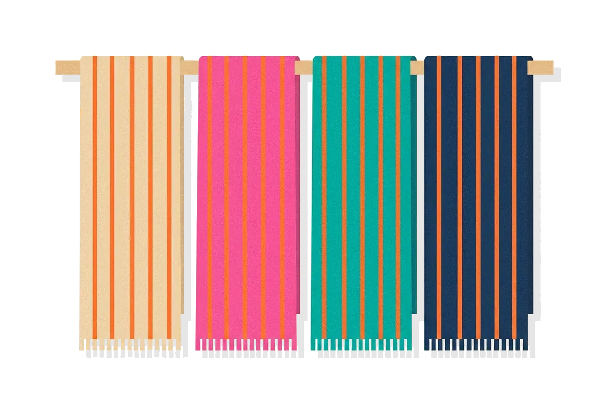
Picture a textile designer with a rug pattern that a client likes. The pattern is thin red lines on a cream background. The client asks for a darker version. The designer changes only the cream gaps between the lines to black and leaves the red thread alone.
The rug now looks as if it were woven with a deeper red. Next the client asks for a lighter version. The designer swaps the black gaps for white ones, and the same red thread looks pale. No dye changed. Only the color between the red lines changed.
This is the Bezold effect. A designer who does not know it keeps adjusting the red, because the red seems to be the problem. The red is not the problem. Small areas of two colors reach the eye together, and the viewer sees one blended color.
A second effect works in the opposite direction. When the same two colors cover large areas, the eye compares them instead of blending them, and each color seems to move away from its neighbor. Size decides which of the two happens. Someone worked this out in the 1870s, while trying to solve a problem much like the designer's.
022 min
Where the Bezold effect comes from
Wilhelm von Bezold (1837–1907) was a German professor of physics at the Royal Polytechnic School in Munich. In 1874 he published a book on color for artists and craftspeople, called Die Farbenlehre im Hinblick auf Kunst und Kunstgewerbe. An English translation, The Theory of Color in its Relation to Art and Art-Industry, appeared in Boston in 1876.
Retellings of the discovery say he met the effect while he was changing a rug design by changing only one color. His book supports the general picture. It says that a pattern which works in one set of colors can be moved into another set by swapping whole color pairs, and that the outlines must be changed at the same time. That is the designer's job from the opening: change a color and keep the pattern.
Bezold was not a rug maker
A few retellings call Bezold a rug maker. The title page of his book lists him as a professor of physics. He studied how the eye mixes colors, and his examples come from carpets, shawls and wall paintings.
What Bezold called it
Bezold did not call the effect spreading. In his book, two colors placed together can end in one of two ways, and he called them mixture and contrast. His notes on the color plates say that mixture shows in most of the figures and contrast in one. Later writers gave the first outcome the name color spreading, and today the name Bezold effect usually refers to that first outcome. The name simultaneous contrast refers to the second.

031 min
How the Bezold effect works
The eye cannot keep very small things apart. Bezold gave an everyday case: look at a line engraving from far enough away, and the black lines and white gaps stop being separate. You see an even gray tint instead. A woven shawl behaves in the same way, and its threads blend into one mixed color.
His explanation was physical. When two impressions reach the same sensitive element of the retina at once, the eye cannot perceive them one by one. What it perceives is a combination of the two.
Now apply this to the rug. From across the room, the red lines and the gaps between them reach the same sensitive spots in the eye. The viewer sees a mix of red and the gap color. Red mixed with black gives a darker red. Red mixed with white gives a paler one. The thread did not change. The mix did.
The blend moves hue as well as lightness. On Bezold's Plate V, fine red lines on a blue ground take on a slightly purplish tinge, because the eye mixes some of the blue into the red.
Seen up close, the lines separate and the effect fades. That is why a swatch can look right on its own and wrong once it is woven, printed as stripes, or drawn as thin lines.

042 min
Why size decides between blending and contrast
Bezold found that the relative size of two areas decides which color moves. When a small patch sits inside a much larger field, nearly all of the change falls on the small patch, and the large field stays about the same. On his Plate V, a red patch surrounded by blue moved a long way toward yellow, while the blue hardly changed.
The table puts the two outcomes side by side.
| Fine, interspersed areas | Large, adjacent areas | |
|---|---|---|
| What the eye does | Blends the colors | Compares the colors |
| What happens to each color | It moves toward its neighbor | It moves away from its neighbor |
| Usual name | Bezold effect, color assimilation | Simultaneous contrast |
| Example | Thin red lines between black lines look darker | A red patch on a blue field turns toward yellow |
Later researchers tied the switch to how fine the pattern is. They measure this as spatial frequency, the number of light and dark repeats in a given stretch of view. A description of White's illusion says that patterns with small repeats tend to produce assimilation of brightness, and patterns with large repeats tend to produce contrast. There is no single width at which the switch happens. It depends on how large the pattern looks from where the viewer stands.
Modest steps shift colors more than big ones
Bezold advised small color steps for the contrast side of the story. He found that two colors which are fairly close change each other more than two colors that are far apart. A designer who wants a visible shift does not need a strongly different neighbor.
A border stops the blending
A border between two colors breaks the blend. On Plate V, Bezold printed some pairs of red and blue with borders between them. In those figures, the colors look as they would on a neutral background. For a designer, a thin border is useful: it keeps a color closer to its own look. The border color still mixes in a little with what it touches, so a border does not remove the effect completely.
051 min
More tones from fewer dyes
Bezold saw a practical use for the blending. A weaver may need a paler or a darker patch in a band of one color. Dyeing new thread is the obvious answer. Bezold suggested another: draw fine lines on the band. For a band that should read paler, use white lines, and for one that should read darker, use black lines. The band is dyed once, and the lines give the other tones. He argued that this keeps the whole piece looking consistent, even as the dyes fade.
One pattern in many colorways
The designer in the opening faced a related job: a colorway is a version of one design in a different set of colors. Bezold's book speaks to it. A pattern that has pleased in one set of colors can be carried over to another set by swapping whole color pairs, and the outlines must change at the same time. After a swap, the Bezold effect decides how each new pair looks once the thread is woven. Changing the color that covers the most area changes the look of every other color in the pattern, even though none of them was touched.
061 min
A case you can buy: oranges in nets
Almost a century after Bezold, the artist Josef Albers published several demonstrations of the effect in his book Interaction of Color (1963). The vision researcher Karl Gegenfurtner notes that they were clearly stronger than Bezold's, and that later versions are often named after the researcher Munker. A modern example is on supermarket shelves.
In 2024 Gegenfurtner described oranges sold in orange nets. Unripe, greenish oranges look ripe and bright orange inside the net, and look greenish again when taken out. He explains the effect as assimilation: the thin weave of the net is assimilated into the skin color of the orange.
He did not claim it is the only cause. Light also bounces between the net and the skin and raises the color's saturation, the viewer remembers what an orange should look like, and a group of similar colors looks more saturated. To test the blending alone, he made an artificial net of the Munker kind, which has no bouncing light and no group of similar colors. It still turned a greenish orange into a clearly orange one.
Sellers have known this for a long time. Lemons, onions, zucchini and potatoes are often packed in nets whose color matches a perfect example of that product. Shoppers see the net's color mixed into the produce, so the produce can look closer to perfect than it is.
072 min
Using the Bezold effect in design
The designer's lesson in the opening is a general one: do not judge a color alone. Five moves follow from it.
Judge a color where it will be used.
View the swatch at final size, inside the pattern or layout. A swatch on its own says little about thin stripes.
Change the dominant color first.
When a pattern looks wrong, swap the color that covers the most area, then re-check the others. They will look different without being touched.
Get extra tones from lines.
Fine hatching, pinstripes or dot patterns in white or black make a base color read lighter or darker. This works in print, illustration and textiles, and it adds no new swatch.
Separate colors that must stay true.
A thin border or a gap between a brand color and a strongly patterned neighbor keeps the color closer to its own look. Use it where visual hierarchy depends on one color being read correctly, such as a call to action.
Check thin text and hairlines in the final layout.
WCAG 2.2 success criterion 1.4.3, Contrast (Minimum), asks for a ratio of at least 4.5 to 1 for normal-size text. That ratio is calculated from two flat colors. Thin strokes on a tinted or patterned background can blend with it, so the number alone is not enough. People with low vision are the most affected, because their margin for error is smaller. The same care applies wherever a mark must stand out from its figure-ground surface.
When using it on purpose backfires
The effect is hard to predict. The result depends on size, viewing distance and the other colors present, so a look tuned on one screen or print size can drift on another. Brand colors suffer most, because they must look the same everywhere. If a color has to match across media, test it in each medium rather than trusting the specification.
081 min
How to spot the Bezold effect in a design review
Four things are easy to check in a review:
- A brand color matches its specification in a flat swatch, but looks different as stripes, small icons or hairlines.
- A color picker returns the same value from two areas, yet people say the two areas look different.
- A designer changes one color, and reviewers report that a different color went wrong.
- Feedback asks for a darker or lighter version of a color that has not changed in the file.
There is also a simple test. Look at the color through a small hole in a plain gray card. If it changes when the card hides its surroundings, the surroundings caused part of the change.
091 min
The Bezold effect vs. nearby concepts
The Bezold effect is related to several other ideas in Color Theory, and each differs on one axis.
| Concept | What it is | What separates it from the Bezold effect |
|---|---|---|
| Simultaneous contrast | Large areas side by side push each other apart | Size: large areas compare, small areas blend |
| Afterimage | A ghost color that appears after staring at a color | Time: it follows staring, while the Bezold effect needs no waiting |
| White's illusion | Gray bars of one shade look different next to stripes of black and white | Color: it is the grayscale case, and the colored version is the Munker–White illusion |
| Color Constancy | The brain keeps an object's color steady when the light changes | Cause: lighting changes in one, neighboring colors change in the other |
The word contrast in everyday design talk causes confusion. Designers use it for the gap between two colors, which makes it sound like the opposite of blending. In the science of color, contrast is one of two outcomes, and blending is the other.
102 min
What science has not settled about the Bezold effect
The Bezold effect has no settled account inside the visual system. The usual explanation for contrast is lateral inhibition, in which nerve cells reduce the response of their neighbors. That explanation fits contrast, but descriptions of White's illusion note that it predicts the opposite of what people see there. Another proposal is belongingness, the idea that a patch looks lighter or darker depending on which bars it seems to belong to.
The pattern matters more than either color alone
In 2003, Patrick Monnier and Steven Shevell compared the perceived color of a light on patterned backgrounds of two colors with its color on a plain background of either one. The patterned backgrounds shifted the perceived color more. They concluded that the cause lies in how receptive fields in the cortex are organized, and not in the optics of the eye or in known retinal neurons.
A white edge can reverse the effect
In 2020, Tama Kanematsu and Kowa Koida worked with thin gray lines on a cyan background. Gray lines flanked by white contours looked red, and gray lines without the contours looked hardly red. With the white edges, the lines took on the color opposite to the background, which is a contrast effect. For designers the point is practical: the edge of a thin element can decide which of the two effects appears.
Until the cause is clear, the safe rule is the one Bezold's plates already show. Test a color at its real size, with its real neighbors.
?4 questions
Questions people ask
How small is small enough for the Bezold effect?
Does the Bezold effect work on screens?
Can the Bezold effect change hue, or only lightness?
Is the Bezold effect the same as an afterimage?
§8 sources
Sources
Show all 8 sourcesHide sources
Wikipedia, "Bezold effect":
Wilhelm von Bezold, The Theory of Color in its Relation to Art and Art-Industry, translated by S. R. Koehler, Prang & Co., Boston, 1876 (full text):
Karl R. Gegenfurtner, "Perceptual ripening of oranges", i-Perception, 2024:
Patrick Monnier and Steven K. Shevell, "Large shifts in color appearance from patterned chromatic backgrounds", Nature Neuroscience 6, 2003:
Tama Kanematsu and Kowa Koida, "Large enhancement of simultaneous color contrast by white flanking contours", Scientific Reports, 2020:
Josef Albers, Interaction of Color, Yale University Press, 1963 (publisher page):
Wikipedia, "White's illusion" (a summary of the lateral inhibition and spatial frequency accounts):
W3C WAI, "Understanding Success Criterion 1.4.3: Contrast (Minimum)", WCAG 2.2: