011 min
Why designers reach for the golden ratio
Picture a designer laying out an article page that is 1,000 pixels wide. A main column and a sidebar must share that width, and the designer wants a split that looks planned, not guessed. A colleague says to use the golden ratio.
The designer divides 1,000 pixels into a main column of 618 pixels and a sidebar of 382 pixels. The split took one multiplication, because the rule behind the ratio fixes the numbers. Three questions are harder. What exactly is the rule? Does it appear in plants, art and buildings as often as people say? And do viewers really prefer shapes built on it?
The next sections take those questions in that order. The page then returns to the designer's decision.
022 min
What the golden ratio says
Start with a line cut into a longer part, a, and a shorter part, b. The cut is golden when a ÷ b gives the same result as (a + b) ÷ a. Only one positive number does this. It is (1 + √5) ÷ 2, which is 1.6180339…, and mathematicians write it φ.
a ÷ b = (a + b) ÷ a = φ ≈ 1.618
Two facts make φ easy to work with. Its square is exactly 1 more than itself: φ² = φ + 1. Its reciprocal is exactly 1 less: 1 ÷ φ = φ − 1 = 0.618. So the longer part of a golden cut is 0.618 of the whole, and the shorter part is 0.382 of the whole. Apply that to the designer's 1,000 pixels and you get 618 and 382.
The golden rectangle
A golden rectangle has sides in the ratio 1 to φ. Cut off a square whose side is the rectangle's short side, and the piece that remains is another golden rectangle, smaller but with the same shape. You can repeat the cut as often as you like. Drawing a quarter-circle inside each square and joining them gives the golden spiral that many design guides show.
Why no fraction equals it exactly
φ is irrational, which means no fraction of two whole numbers is exactly equal to it. Fractions can get close, though. In the Fibonacci sequence each number is the sum of the two before it: 1, 1, 2, 3, 5, 8, 13, 21, 34, 55. Divide each number by the one before it and the results get closer to φ.
| Pair | Result |
|---|---|
| 5 ÷ 3 | 1.667 |
| 8 ÷ 5 | 1.600 |
| 13 ÷ 8 | 1.625 |
| 21 ÷ 13 | 1.615 |
| 34 ÷ 21 | 1.619 |
| 55 ÷ 34 | 1.618 |
The results fall above φ and below it in turn, and the gap shrinks at each step. So the Fibonacci sequence supplies approximations to φ, but it is a different thing from φ. For a designer the useful part is that 8 ÷ 5 = 1.6 is already close enough for most layouts.
032 min
Where the golden ratio comes from
The ratio began in geometry, not in art.
Euclid and the geometry
In Book VI of the Elements, Euclid defined a line cut in extreme and mean ratio, which is the golden cut. He wrote the Elements around 300 BCE. Euclid treated the cut as a problem to solve, and he used it to construct regular pentagons, where a diagonal divided by a side equals φ.
Pacioli and the title
The link to beauty came much later. In 1509 Luca Pacioli named a book De divina proportione after the ratio, and much of its text came from Piero della Francesca. Leonardo da Vinci drew the solid shapes in the book. The title is where the name divine proportion comes from.
Pacioli and the advice to artists
Pacioli is often said to have urged artists to use the ratio in their work. Mario Livio traces the idea of Pacioli as an art adviser to a mistake in 1799, and says Pacioli in fact advised the whole-number proportions of Vitruvius.
How it got the name golden
Neither Euclid nor Pacioli called it golden. As far as is known, the term golden section first appears in print in a German science dictionary from 1789. James Sully used the English form in 1875. People who say the ancient Greeks worked with a golden ratio are using a name that did not exist in their time.
041 min
Where the golden ratio does appear in plants
Once the ratio had a title that praised it, people began to look for it in the world. Plants give the best-measured result.
Many plants add new leaves or seeds one at a time, each at a fixed turn from the last. A full turn is 360°. Cutting 360° in the golden ratio gives two angles, and the smaller is about 137.5°, called the golden angle. A plant that turns by that angle between each new seed never lands on an old position, so the seeds fill the head evenly.
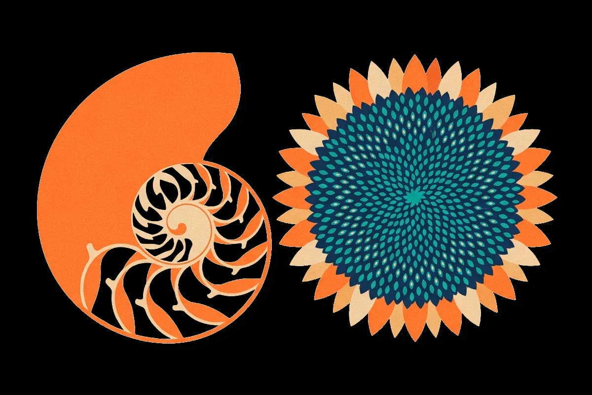
In a sunflower head the seeds form two sets of spirals, one turning clockwise and one turning anticlockwise. The number of spirals in each set is often a Fibonacci number, such as 21 or 34. That is the link to φ, because neighbouring Fibonacci numbers have a ratio close to φ.
The counts are not always Fibonacci
In 2016 Jonathan Swinton and Erinma Ochu published a citizen science count of sunflower heads, which means ordinary people helped collect the data. Of 768 spiral counts in the most reliable part of the data, 565 were Fibonacci numbers, and 67 more followed a related Fibonacci pattern. They also recorded heads with no Fibonacci pattern at all. So the golden ratio describes the usual outcome in sunflowers, not a law that every head obeys.
052 min
Claims about the golden ratio that do not hold
Outside plants, the evidence is weaker. Yu Liu and David Sumpter's 2018 review judges the claims for the Great Pyramid, the Parthenon and the nautilus mostly false or misleading. The claims repeated most often concern the pyramid, the Parthenon, the nautilus and one famous book.
Writers say the Great Pyramid of Giza was built to the golden ratio. Its height was different when it was built, more than four thousand years ago. Liu and Sumpter also find no evidence that the ancient Egyptians knew the golden ratio.
The Parthenon, the temple in Athens, is the next example. Published dimensions of the temple vary, probably because authors measure between different points. That lets a writer pick numbers that fit φ.
The nautilus is a shell that grows in a spiral. A spiral shape alone says nothing about φ, because every growth factor produces a spiral of this kind. Falbo's field study of nautilus shells found their spiral well away from a golden one.
The pages of the Gutenberg Bible
The historian John Man called the pages of the Gutenberg Bible golden-section shaped, yet his own measurements give a height-to-width ratio of 1.45. That is about 10 percent below φ.
Overlays of golden circles on finished logos follow the same pattern. They are drawn after the logo exists, and they prove a method only when the company has said it built the logo that way.
These claims share one habit. A page, a building or a shell has many lengths. With enough lengths to choose from, some pair comes out near 1.6, and the writer reports that pair and ignores the rest.
061 min
Do people find the golden ratio more attractive?
Those claims are about what artists and builders did. A separate question is what viewers like, and that can be tested.
Fechner's rectangles
In the 1800s the German scientist Gustav Fechner ran one of the first experiments on beauty. Fechner asked observers to choose the most pleasing rectangle from a set of rectangles with different proportions. Fechner found that observers preferred rectangles with golden proportions, but evidence gathered since then points away from that result. Some later authors judge his result to be an exception, or a product of his method. A viewer's taste for one rectangle shape, then, is not a settled finding.
The effect of looks on judgment is a separate matter. The aesthetic-usability effect describes how a page that looks pleasing is judged easier to use, whatever its proportions.
Faces
The same idea was tested on faces, where the ratio is often said to define beauty. In 2010 Pamela Pallett, Stephen Link and Kang Lee found faces most attractive when the eye-to-mouth distance was about 36 percent of face length. They also found the width between the eyes was best at about 46 percent of the face width. The authors compared both numbers with the classic golden value of 38 percent and found each one different from it. The authors noted that these preferred values match those of an average face.
072 min
How designers apply the golden ratio
Evidence on taste is thin, so a designer is left with what the ratio offers as a method: one fixed rule that removes some arbitrary choices. Three uses are common.
Page layouts
The designer's 618-pixel and 382-pixel split is a common use. The larger part is 61.8 percent of the width. A real page rarely keeps the raw numbers. Say the team sets every size as a multiple of 8 pixels, as an 8-point grid does. Then 618 is not allowed but 616 is, and the sidebar becomes 384 pixels. Those two widths have a ratio of 1.604, within 1 percent of φ. A grid system that divides the page into columns can then place the split on a column edge.
Type sizes
Tim Brown described the typographic use in a 2011 article for A List Apart. A modular scale is a list of sizes in which each size is the one before it multiplied by one fixed ratio. Brown showed how to build a type scale by multiplying a size by 1.618 for each step up and dividing by 1.618 for each step down. A series of sizes built this way is a typography scale.
Start at 18 pixels for body text. The sizes above it are 29.1, 47.1 and 76.2 pixels, and the size below it is 11.1 pixels. Brown's own example page sets its first-level heading at 29.124 pixels, the first step up from 18. The same ratio is often applied to line height: 1.618 times a 16-pixel body size is about 26 pixels. Because every size relates to the others by the same factor, the steps give headings a clear order, which supports visual hierarchy.
Grid lines and photo framing
The ratio can also place guide lines. A grid with lines at 38.2 and 61.8 percent of the width is a phi grid. The rule of thirds uses 33.3 and 66.7 percent. On a 1,000-pixel frame the lines move from 333 and 667 to 382 and 618. That is a shift of about 49 pixels, under 5 percent of the width. Choosing one grid over the other changes a layout only a little, so the choice should come from the content. The same lines can guide how a photo is cropped, with the main subject placed where two lines cross. Calculators and overlays in design tools such as Figma draw these lines for you, though the arithmetic is one multiplication.
081 min
Applying the golden ratio
The designer now has a usable method. These moves keep it useful.
- Use the ratio for one decision, such as the column split or the type scale. Using it for everything makes it hard to see which choice failed.
- Round to your spacing unit. On an 8-pixel grid, 616 and 384 work and 618 and 382 do not. A ratio of 1.6 is close enough.
- Put real content in the shape before you commit. A 382-pixel sidebar may be too narrow for the table it must hold, and the content decides.
- Use fewer steps in a type scale than the ratio allows. Most products need only a few sizes.
- Test the result with a larger text size and with extra line spacing, as the next section explains.
The ratio saves time on a choice that has no better answer. It stops helping when content, screen size or readability gives a better one.
091 min
When the golden ratio gets in the way
The rule ignores everything about the situation it is applied to. Three situations show the cost.
Type scales that grow too fast
Each step in a golden scale is 62 percent larger than the one before. The third step above 18 pixels is 76.2 pixels, more than four times the body size. A product with dense screens may need five sizes within a narrow range, and a golden scale cannot supply them. The step below body text is 11.1 pixels, which is small enough that some readers will struggle with it. A smaller ratio gives sizes closer together.
Text that users resize
WCAG 2.2 Success Criterion 1.4.12, Text Spacing, requires that nothing is lost when a user sets the line height to 1.5 times the font size or more. A line height of 1.618 is already above 1.5. The problem comes from boxes whose height was fixed to match the golden proportion. When a user adds more spacing, the text no longer fits and gets clipped.
Narrow screens
On a phone 375 pixels wide, the 618-to-382 split would leave a sidebar about 143 pixels wide. Most layouts stack the columns on a screen that narrow, and then there is no split to apply.
101 min
Golden ratio vs. nearby ideas
The golden ratio is one number. The ideas below are often mixed up with it, but each is a different kind of thing.
| Idea | What it is | Relation to the golden ratio |
|---|---|---|
| Fibonacci sequence | Whole numbers where each is the sum of the two before | Ratios of neighbouring terms get closer to φ |
| Rule of thirds | A grid with lines at one third and two thirds | Lines at 33.3 and 66.7 percent, not 38.2 and 61.8 |
| 8-point grid | Sizes set in steps of 8 pixels | Whole-number steps, which can only approximate φ |
| Modular scale | Sizes that each equal the last times one ratio | The golden ratio is one possible ratio |
The golden ratio is a single value. The Fibonacci sequence is a list of numbers, and the other two are ways of choosing sizes or lines that can use the value or leave it out.
?3 questions
Questions people ask
What other names does the golden ratio have?
Can I use 1.6 instead of 1.618?
Is a credit card or a sheet of A4 paper a golden rectangle?
§9 sources
Sources
Euclid, Elements, Book VI, Definition 3. Text and commentary by D. E. Joyce, Clark University.
Wikipedia, "Golden ratio" (encyclopedia article; used for the Pacioli, Gehler and Gutenberg Bible details).
Liu, Y. and Sumpter, D. J. T. (2018). Is the golden ratio a universal constant for self-replication? PLOS ONE 13(7), e0200601.
Swinton, J. and Ochu, E. (2016). Novel Fibonacci and non-Fibonacci structure in the sunflower: results of a citizen science experiment. Royal Society Open Science 3(5).
Show all 9 sourcesShow fewer sources
Phillips, F., Norman, J. F. and Beers, A. M. (2010). Fechner's aesthetics revisited. Seeing and Perceiving 23, 263-271.
Pallett, P. M., Link, S. and Lee, K. (2010). New "golden" ratios for facial beauty. Vision Research 50(2), 149-154.
Brown, T. (2011). More Meaningful Typography. A List Apart.
W3C. Understanding Success Criterion 1.4.12: Text Spacing (WCAG 2.2).
Markowsky, G. (1992). Misconceptions about the Golden Ratio. The College Mathematics Journal 23(1), 2-19.