012 min
The problem information hierarchy solves
A reader arrives at a page with a task: find a price, check a deadline, decide whether the page is worth reading. Most readers do not read every word to do that task. Jakob Nielsen's 1997 write-up of Nielsen Norman Group (NN/g) research reports that 79 percent of test users always scanned any new page they came across and that only 16 percent read word-by-word.
A reader who scans samples the page and stops when it stops being useful. If the answer is in the fifth paragraph, a scanning reader may never reach it. Reading also costs effort, and a page that makes the reader sort the content themselves adds to that cost (see cognitive load theory).
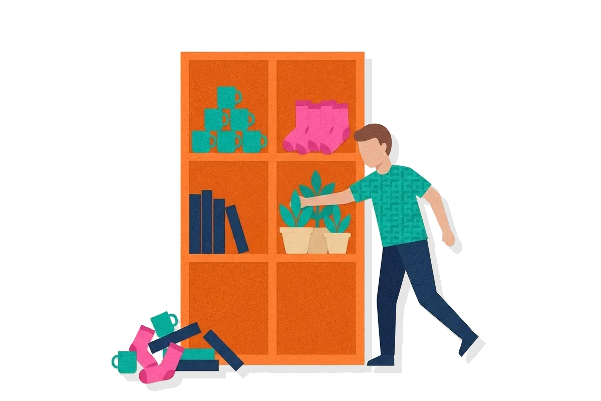
Information hierarchy is the author's decision about which content a scanning reader should meet first. Without that decision, the page follows some other order. Common ones are the order of the author's notes, the order in which the work was done, or the order of the company's departments. None of these is the order the reader needs.
Say a product manager writes release notes for a mobile app. They list 14 changes in the order the team shipped them, and the one change that alters how people do their daily task is number 11. A reader who stops after five items never learns that it exists. The fix is not a larger font on item 11. The fix is to rank the 14 changes first and then move item 11 to the top.
022 min
How information hierarchy works
Information hierarchy is built in three steps: rank, group, signal. The first step is the one that is specific to this concept. The other two put the ranking into a form the reader can see.
Rank
List every piece of content the page holds. For each piece, ask what the reader is trying to do and how much that piece helps. Then place each piece in one of three levels.
Level 1: the point the reader must leave with, even if they read nothing else. Level 2: the facts that support or qualify it. Level 3: detail that only some readers need.
| Level | Reader question | Release-note example | Usual treatment |
|---|---|---|---|
| 1 | What is the main point? | The change that alters the daily task | First position, heading, short sentence |
| 2 | Why, or under what conditions? | Who gets the change and when | Below the point, grouped under it |
| 3 | What are the details? | Fixed bugs, version numbers | Lower on the page, a list or a link |
Group
Pieces that support the same point sit together under one label. The label should say what the group contains, because many readers will see the label without the text under it. WCAG 2.2 success criterion 2.4.6 asks for this: headings and labels must describe topic or purpose.
Signal
Order and treatment make each level visible. In text, the signals are position, headings, short paragraphs and lists. In an interface, they are size, weight, colour contrast and space. A scanning reader chooses where to look next from the first words of a unit, so the first words of every heading and paragraph have to carry its content. NN/g's guideline is one idea per paragraph, because users skip over any additional ideas if they are not caught by the first few words.
The ranking is what makes the result predictable. If you know the three levels of a page, you can predict what a scanning reader will take away: the first screen, the headings, and the opening words of each paragraph. Content placed anywhere else is read only by people who chose to keep going.
032 min
Where information hierarchy comes from
The oldest named form of information hierarchy is the inverted pyramid, a way of writing news in which the conclusion comes first and the background comes last. The name comes from a triangle pointing down: the widest part at the top stands for the most important material, and the narrowing part below it for material of diminishing importance.
Historians disagree about when the form was created. Many say the telegraph started it, because reporters had to condense their material. Studies of 19th-century American newspapers suggest the form spread several decades later than the telegraph. The date is unsettled.
Jakob Nielsen carried the idea to the web in a 1996 column. He described the opposite habit first, the one he was trained in as a researcher: a paper opens with a problem statement and prior work, and only after pages of detail does it reach the results and the conclusions. Journalists do the reverse. Inverted-pyramid writing is useful for newspapers because readers can stop at any time and will still get the most important parts of the article. Nielsen argued that this matters more online, because many web readers see only the top of a page.
No single person is credited with the phrase "information hierarchy" in the sources checked for this article. Treat it as practitioner convention, a name designers and content writers share for ranking content, and not as a finding from one experiment. The evidence for it comes from studies of how people read, covered below.
042 min
A named test: one paragraph about Nebraska
NN/g tested the effect of content guidelines in 1997. The team built five versions of one website, with the same basic information and the same navigation, and had users do the same tasks on each. The control version used promotional writing. Its paragraph opened with "Nebraska is filled with internationally recognized attractions that draw large crowds of people every year, without fail." The six attractions and their visitor counts came only after that sentence.
Three versions changed the order or the layout of the same facts:
- Concise: about half the word count of the control.
- Scannable: the control's text, with the six attractions turned into a list.
- Objective: neutral wording in place of boasts.
Measured usability was 58% better for the concise version and 47% better for the scannable version. The objective version scored 27% better. The version that combined concise, scannable and objective writing measured 124% better usability.
The scannable result is the one that shows hierarchy at work. It used the same text as the control, so nothing was added or removed. The list gave the six names their own lines, where a scanning reader finds them, and the opening sentence stopped being the part of the page the reader had to get through first.
Two limits apply. The page reports the results as percentages relative to the control and does not give the sample size in the part quoted here. The versions also changed several things together, so the result does not isolate hierarchy from word count.
052 min
A second case: the Nutrition Facts label
The Nutrition Facts panel on packaged food in the United States shows the same content to every shopper, in a fixed format. It tests hierarchy in a different setting from the Nebraska page.
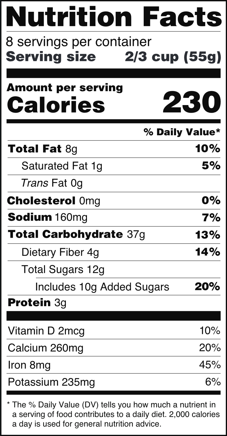
In its 2016 update of the Nutrition Facts label, the US Food and Drug Administration (FDA) increased the type size for "Calories," "servings per container" and "Serving size," and set the number of calories and the serving size in bold. The FDA's own page says the "iconic" look of the label stayed the same. The rows did not move to new places. What changed is the signal: type size and weight raised two items above the rest of a long list of nutrients.
The first case turned a paragraph into a list for people looking up facts on a website. This case ranks a printed list for someone comparing two products in a shop, who usually has a few seconds per product. The variable that differs is the medium and the amount of time. The shared point is that a ranking has to be chosen even when the content order cannot change.
The FDA page states what changed and does not describe how the ranking was decided, so this article does not claim that the order was tested. Calories and serving size are also linked. A calorie count means little without the serving it refers to, which is why the two are raised together.
062 min
Applying information hierarchy
Five moves a team can make this week:
Write the one sentence the reader should leave with.
If you cannot write it, the page has no first level yet. NN/g gives the same order for design work: "Before beginning a design, take a step back from the visuals and define the hierarchy of the content and the key point(s) you want the user to take away."
Rank the content by the reader's task.
Put every piece of content on a list. Ask of each piece: if the reader stopped after this one, what would they know? Order the list by the answer.
Put level 1 where the reader looks first.
Start with the conclusion, then the support, then the background, as the inverted pyramid does.
Group related pieces and label each group.
Support points that belong together form a chunk (see chunking). Give each chunk a heading that names its topic. Nielsen's guidance is meaningful sub-headings, not clever ones.
Apply the signals last.
Only after the ranking is fixed do you choose size, weight and contrast. This part is the work of visual hierarchy.
The release notes from earlier would change like this. The product manager writes the headline for the change that alters the daily task, adds two lines on who gets it and when, then groups the other 13 changes under three headings. The bug fixes go last in a list.
Where it stops working: a ranking can be over-applied. If every item is level 1, the page has no hierarchy. If the supporting evidence is pushed so far down that readers never see it, a reader who wants to check the claim cannot. Level 3 is not a level for unimportant material. It holds material that fewer readers need, and those readers must still be able to find it, for example through progressive disclosure.
071 min
How to spot a weak information hierarchy
These are observable on a live product.
- Support tickets ask for something the page already states. Count the questions whose answer is on the page, and note where on the page it sits.
- Session recordings show readers scrolling past the key content. Look for the point where the scroll speeds up.
- The first screen holds introductions, banners or background. The conclusion starts below it.
- The headings, read alone, do not tell the story. Copy the headings into a list. If the list does not say what the page claims, the groups are labelled by topic only in the author's mind.
- The squint test shows the wrong element. NN/g describes blurring a design to see what is emphasised. If the most prominent element is not the level 1 point, the signals disagree with the ranking.
081 min
Information hierarchy vs. nearby concepts
Three neighbours get confused with it. The axis that separates them is what each one decides.
| Concept | What it decides | Scope |
|---|---|---|
| This pageInformation hierarchy | ||
| DesignVisual hierarchy | ||
| DesignInformation architecture | ||
| DesignProgressive disclosure |
NN/g's definition of visual hierarchy says it guides the eye to the most important elements, and its advice is to define the hierarchy of the content before applying visual variations. That order is the difference. Information hierarchy is the decision. Visual hierarchy is how the decision is displayed. A page can have a correct ranking and weak signals, or strong signals that point at the wrong content.
091 min
Information hierarchy and accessibility
Two WCAG 2.2 criteria apply directly.
WCAG 2.2 success criterion 1.3.1, Info and Relationships, exists to ensure that information and relationships implied by visual or auditory formatting are preserved when the presentation format changes. Its example is a screen reader reading the content aloud. A heading that is only a large bold paragraph looks like level 1 on screen, but it carries no level for software that reads the markup. Use real heading elements and real list elements for the levels.
WCAG 2.2 success criterion 2.4.6, Headings and Labels, says that when headings are clear and descriptive, users can find the information they seek more easily. Descriptive headings also help people with cognitive or visual disabilities find their place in the page.
NN/g adds a related rule for visual signals: do not rely only on colour to communicate hierarchy. A ranking shown by colour alone disappears for a reader who cannot tell the colours apart.
102 min
Where the evidence is limited
Information hierarchy is a convention, and the sources behind it have limits.
The original reason was revised. In 1996, Nielsen wrote that users do not scroll, and a 2003 note on his own column says that as users got more experience with scrolling pages, many of them started scrolling. The guideline survived, with a weaker reason. In the same note, Nielsen still advises putting the most important information above the fold, which is the part of the page visible without scrolling. The reason is now that readers decide how far to go, and a hierarchy lets them decide well.
The origin is disputed. As noted above, historians disagree about when the inverted pyramid began. The practice is documented. Its inventor is not.
A ranking is a judgment. Two teams can rank the same content differently, and the sources checked here give no method that proves one ranking right. This is why NN/g's advice is to test the finished design with target users to see whether it reads as intended.
Conclusion-first has costs. A reader who must judge a claim needs the support within reach, so level 2 must stay close to level 1. A conclusion with its evidence moved to a link asks the reader to trust it first.
Where this leaves a practitioner: treat the ranking as a hypothesis. Write it down, build the page from it, and check with a few readers what they took from the first screen.
?6 questions
Questions people ask
What is information hierarchy in UX?
What is an example of information hierarchy?
How is information hierarchy different from visual hierarchy?
Should the most important content always go at the top?
How do I decide what is most important?
Does information hierarchy matter for accessibility?
§7 sources
Sources
Show all 7 sourcesHide sources
Jakob Nielsen, "Inverted Pyramids in Cyberspace", Nielsen Norman Group (1996, with updates 2003 and 2015). nngroup.com
Jakob Nielsen, "How Users Read on the Web", Nielsen Norman Group (1997). nngroup.com
Kelley Gordon, "Visual Hierarchy in UX: Definition", Nielsen Norman Group. nngroup.com
"Inverted pyramid (journalism)", Wikipedia (a summary, not a primary source). en.wikipedia.org)
US Food and Drug Administration, "Changes to the Nutrition Facts Label". fda.gov
W3C, "Understanding Success Criterion 1.3.1: Info and Relationships", WCAG 2.2. w3.org
W3C, "Understanding Success Criterion 2.4.6: Headings and Labels", WCAG 2.2. w3.org