011 min
Progressive disclosure takeaways
- What it is: Start with the core options. Reveal specialist ones only when the user asks.
- Where it comes from: Named in the design of the Xerox Star, 1981. No single researcher measured it.
- Apply it by: Ranking features by how often people use them, then labelling the way in clearly.
- It backfires when: Controls people need are hidden, or the design needs three or more levels.
022 min
What progressive disclosure actually says
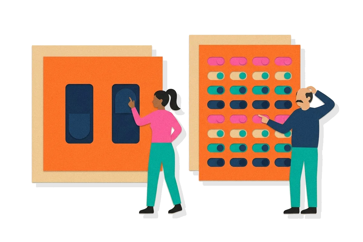
Progressive disclosure is a rule about order. A designer splits an interface's features into two groups and shows them at different times. The first group is what most people need most of the time, and it is visible from the start. The second group is everything else, and it appears only after the user asks for it. Each group is called a disclosure level. The first screen is the initial level and the revealed screen is the secondary level.
Jakob Nielsen, in his 2006 column for Nielsen Norman Group, states the rule in two steps:
Initially, show users only a few of the most important options. Offer a larger set of specialized options upon request.
The reason it works is a trade-off between two things users want. They want enough features to cover their own special needs, and they want an interface simple enough to learn quickly. Showing everything serves the first wish and fails the second. Showing only the basics serves the second and fails the first. Progressive disclosure gives both, because the extra features exist but are not in the way.
Nielsen names three effects. First, the fact that something is on the initial display tells users it is important, so a beginner spends attention on the features most likely to be useful. Second, hiding advanced settings keeps beginners from making mistakes with options they do not need. Third, experts save time because they do not have to scan past a long list of features they rarely use. He counts this as an improvement in three of the five components of usability: learnability, efficiency of use and error rate.
The principle connects to cognitive load theory. Every option on the screen is something the user has to take in and rule out, so fewer options at the start means less to process before the first action. The principle does not remove the options. It only delays them until they are wanted.
The whole design depends on one decision, the split. Features that most people need must be on the initial level, so that the secondary level is rarely required. The initial level also cannot hold too many options, or it stops focusing attention on what matters. A wrong split fails in two ways. If a common feature is hidden, many users must take the extra step every time. If a rare feature is shown, every user has to read past it.
Progressive disclosure is a design principle, not a law. There is no formula and no measured curve with named variables. Its support is a set of related studies and a long record of practice, described in the sections below.
032 min
Where progressive disclosure comes from
The term appears in the design of the Xerox Star, the office computer that Xerox introduced in April 1981. In "The Xerox Star: A Retrospective", published in IEEE Computer in September 1989, several of the Star's designers describe the principle as part of the system's design:
Progressive disclosure dictates that detail be hidden from users until they ask or need to see it.
The designers explain how the Star applied it. It did not only provide default settings. In their words, it "hides settings that users are unlikely to change until users indicate that they want to change them." Their example is the property sheet. A page-layout sheet does not show the settings for running headers unless the user says the document will have running headers.
No single person is credited with inventing the idea, and this entry does not name one. The Star authors present it as a principle their team applied, and Nielsen wrote in 2006 that progressive disclosure and staged disclosure "are both more than 30 years old." The practice is older than the name most designers use for it. Treat it as practitioner convention that was written down well, first by the Star team and later by Nielsen, rather than as a finding from one experiment.
The experimental support came from a related idea. In 1984, John M. Carroll and Caroline Carrithers published "Training Wheels in a User Interface" in Communications of the ACM. They built a version of a commercial word processor in which error-prone features could not be reached, and tested it with new users. Nielsen later described Carroll's studies as early scientific support for progressive disclosure. The details are in the section on evidence below.
042 min
What the training wheels studies showed
Carroll's work is the main body of research behind the principle, and it needs a careful description. A training wheels design is not the same thing as progressive disclosure. In Carroll's studies, new users were limited to a few features. They could not open the rest at all until the limit was removed. Progressive disclosure keeps the rest of the features one request away.
The 1984 paper reports that "creating a training environment from the basic function of the system itself afforded substantially faster learning coupled with better learning achievement and better performance on a comprehension post-test." Nielsen's later summary of two studies by Carroll and colleagues gives the figures. Users with the limited design were compared with users who had every feature from the start. In initial use, the limited design was 26% faster on time on task in Study 1 and 21% faster in Study 2.
| Initial use | Study 1 | Study 2 |
|---|---|---|
| Time on task | 26% faster | 21% faster |
| Knowledge of system | 69% more facts learned | 21% more facts learned |
| Subjective satisfaction | 28% higher rating | not measured |
In Study 2 the limit was then removed, and both groups used the full feature set. People who had started with the limited design were 52% faster on advanced tasks and learned 10% more facts about the system. This result is the surprising one. A reasonable guess is that people with all features available from the first day would build a fuller picture of the system. They did not. The limited design focused attention on core concepts, and that understanding helped later with the advanced features.
The studies used one word processor in the early 1980s, with new users. They support the claim that focusing a beginner's attention on a core set helps learning. They do not measure what happens when a button hides a feature from an experienced user in a modern product.
052 min
How progressive disclosure shows up in real interfaces
Where the principle is applied
- Property sheets in the Xerox Star (1981). The Star's designers describe a property sheet that shows an object's properties only on request, and that keeps some information hidden even then. The fields for "Other" line height or paragraph spacing do not appear until the user sets the property to "Other". This is the principle in its original form, applied inside a single panel.
- The print dialog. Nielsen calls it the classic example. The dialog shows a small set of choices first, mainly how many copies to print and which printer to use. A button for advanced options leads to a second dialog with rarely used settings, such as scaling and printing pages in reverse order. Most users print without opening it.
- The HTML `details` element. Browsers include a built-in disclosure widget. According to MDN, the
detailselement creates a widget in which information is visible only when the widget is toggled into an open state, and it needs asummaryelement as its label. Any team can use the pattern without writing a script.
Where it is violated or overused
Nielsen also describes the failure at the initial level. He wrote that print dialogs had grown over the previous decade, and that some applications offered a first dialog with detailed options that belonged in a secondary one. The principle was in use, but the split was wrong, so the initial level was not simpler than a single screen.
The second failure is hiding too much. In June 2016, Kara Pernice and Raluca Budiu of Nielsen Norman Group reported a study of hidden navigation, such as a menu behind a hamburger icon. It had 179 participants who did tasks on six sites, on smartphones and on desktops. On desktops, people used hidden menus in only 27% of the cases. They used visible navigation in 48% of the cases and combined navigation in 50%. On desktops, people were at least 39% slower when the navigation was hidden.
This is not a case of rarely used features. Main navigation is what most visitors need, so a design that hides it fails the first rule of the split.
062 min
A second case
The second case comes from a different product class and a different pattern. Nielsen's team tested 46 web-based applications. One of them was a hotel reservation system that placed every stage of a booking on one screen.
The single screen worked well while people were choosing a room. It showed availability and prices for several room categories across several dates, so users could compare options without leaving the page. Most hotel sites spread these details over several pages, which made that kind of comparison harder.
The same screen caused problems because it also asked for an address and credit card details. The hotel needs them to complete the booking, but a person who is still comparing rooms does not need them yet. Nielsen's recommendation was staged disclosure, which defers the payment fields to a second screen. He added that the design would be better as two screens, not five, because users get slowed down by too many steps.
The variable that differs from the first case is the reason something is hidden. In the print dialog, the hidden items are rare. In the hotel form, the payment fields are needed by every user who books, but only later. The first case separates common from uncommon. The second separates early from late.
Deciding what to defer therefore takes more than counting how often a feature is used. It also takes an understanding of the order in which people work and which options they use together.
072 min
Applying progressive disclosure
Here are five moves a designer can make this week.
Rank features by how often people use them.
For a new design, Nielsen recommends task analysis and field studies. For an existing system, use frequency-of-use statistics. For an application, you can instrument the code to record how often each feature is used. Put the most used features on the initial level.
Check the numbers against observation.
Analytics can mislead. A page may get many visits because users want it, or because they entered it by mistake. Add observational usability testing to the statistics.
Make the way in obvious.
Place the advanced-options control where it is clearly visible. Label it so that users know what they will find. Nielsen calls this strong information scent, which means the label gives a reliable hint about what is behind it.
Stop at two levels.
Nielsen writes that designs with more than two disclosure levels typically have low usability. If you need three, simplify the design, or group the advanced features so that users need to check only one place.
Offer one way in.
Nielsen advises against giving several ways to reach the secondary options, because the aim is to speed up the initial display.
Illustrative scenario: a product designer is reviewing an export panel with fourteen settings. Usage data shows that most exports change only the file format and the page range. The designer shows those two and puts the other twelve behind a labelled "More export options" control. Support tickets later show that a compression setting is often needed by one customer group. The designer moves it to the initial level, because the split was wrong for that group.
When it backfires. The principle fails when the hidden control is one the user needs now. A power user who needs a setting every day has to take the extra step every day. It also fails when the label does not say what is behind it.
081 min
How to spot progressive disclosure going wrong
A reviewer can check these signs in a session recording, an analytics report or a ticket queue.
- A control behind the secondary level is used by a large share of users. It probably belongs on the initial level.
- Users open the secondary level and return to the initial level straight away. The label did not match what they found.
- Users move back and forth between levels during one task. This is the reason Nielsen gives for the low usability of designs with more than two levels.
- Support tickets ask where a setting is, and the setting exists. The feature was hidden, and nothing pointed to it.
- The initial level has so many controls that people scroll past most of them. Nothing was deferred, so the principle is not being applied.
091 min
Accessibility
A disclosure control is a button that changes what is on the screen, so it must work for people who do not see the screen or do not use a mouse.
WCAG 2.2 SC 4.1.2 Name, Role, Value (Level A) requires that the name and role of every user interface component can be programmatically determined, and that states the user can set can be programmatically set. For a disclosure control, this means a screen reader must be able to announce its name, say that it is a button, and say whether the section is open or closed. W3C notes that standard HTML controls already meet this success criterion when used according to specification, which is one reason to prefer the native details element to a custom script.
WCAG 2.2 SC 2.1.1 Keyboard (Level A) requires that all functionality is operable through a keyboard interface. The control that reveals the secondary level must be reachable and usable with the keyboard alone. This affects people with motor impairments who cannot use a mouse, and people who use screen readers.
101 min
Progressive disclosure vs. nearby concepts
| Concept | The axis that separates it |
|---|---|
| Not in the library yetStaged disclosure | |
| DesignRecognition vs. recall | |
| DesignHick's Law |
Nielsen separates the first pair in a table of his own. In progressive disclosure the navigation is hierarchical, and the user starts at the initial display and, if necessary, moves to the secondary one. In staged disclosure the navigation is linear, one step at a time. The main usability benefit also differs: learnability for progressive disclosure, and simplicity at each step for staged disclosure.
111 min
Where the evidence is contested
No researcher in this entry rejects the principle, but the evidence has limits, and the disagreement is about how much to hide.
The first limit is the evidence base. The training wheels studies are early 1980s work on one product with new users, and the feature limit in them was stricter than a button.
The second is Pernice and Budiu's study of hidden navigation. They found that discoverability is cut almost in half when a website's main navigation is hidden, and that task time rises and perceived difficulty increases. Many teams describe this pattern as progressive disclosure. Nielsen's definition covers advanced or rarely used features, and main navigation is neither, so the study does not contradict the definition. It does show that the name is used to justify hiding things the principle was never meant to hide.
The third limit comes from Nielsen himself. He warns that designs with more than two disclosure levels typically have low usability, because users lose their place moving between levels. That is a limit on the principle, stated by its main advocate.
Where this leaves a practitioner: apply the principle to advanced and rarely used features, keep the primary tasks visible, limit the design to two levels, and test with real users instead of relying on the principle alone.
121 min
How progressive disclosure changed since
The meaning of progressive disclosure has widened since the Star. In 1981 and 1989 it described how a desktop application treats settings: hide detail until the user asks. In his December 2006 column, Nielsen applied it to websites, noting that sites had grown complex enough to need it, and he named deferring secondary material as a key guideline for mobile design.
By 2016 the term was often used for something different. Designers on smaller screens began placing main navigation behind a hamburger icon. Pernice and Budiu's study of that practice, published on 26 June 2016, found worse results than visible navigation. The practice does not match the original meaning, because main navigation is something most visitors need at once.
Browsers have since added a standard disclosure widget, the details element. The core meaning has not changed: show what most people need first, and make the rest available on request.
?7 questions
Questions people ask
What is progressive disclosure in UX?
What is an example of progressive disclosure?
How do I apply progressive disclosure to my design?
How many levels of progressive disclosure are too many?
How is progressive disclosure different from staged disclosure?
Are there exceptions to progressive disclosure?
§8 sources
Sources for progressive disclosure
Johnson, J., et al. (1989). The Xerox Star: A Retrospective. IEEE Computer, 22(9), 11-29.
Nielsen, J. (2006). Progressive Disclosure. Nielsen Norman Group.
Nielsen, J. (2006). Training Wheels User Interface. Nielsen Norman Group.
Carroll, J. M., & Carrithers, C. (1984). Training wheels in a user interface. Communications of the ACM, 27(8), 800-806. DOI 10.1145/358198.358218, record at
Show all 8 sourcesShow fewer sources
Pernice, K., & Budiu, R. (2016). Hamburger Menus and Hidden Navigation Hurt UX Metrics. Nielsen Norman Group.
W3C. Understanding SC 4.1.2: Name, Role, Value (WCAG 2.2).
W3C. Understanding SC 2.1.1: Keyboard (WCAG 2.2).
MDN Web Docs. The Details disclosure element.