012 min
The problem the law of proximity explains
Say a designer lays out a sign-up form with four fields: name, email, password and confirm password. To keep the page tidy, they use one gap size everywhere. Each label sits 16 pixels below the field above it and 16 pixels above its own field. (These pixel values are made up for the example.)
In testing, people hesitate. The label "Email" sits exactly halfway between the name box and the email box, so it could belong to either one. A few people type their email address into the name box. Others scroll back up to check which box is which. Every word on the form is correct. Only the spacing is wrong.
The form fails because people do not read a layout one item at a time. Before they read a single word, they have already sorted the page into groups, and they use the gaps between things to do it. Things with small gaps between them look like one unit. A larger gap looks like the edge between two units. When every gap is the same size, the page offers no groups at all, so each reader has to work them out by reading. That extra effort is cognitive load: mental work spent on the layout instead of on the task.
This sorting by distance is called proximity. It is one of the oldest findings in the study of perception, and it started with rows of dots on a printed page.
022 min
Where the law of proximity comes from
The rows of dots were drawn by Max Wertheimer, one of the founders of Gestalt psychology. In a paper published in 1923, he asked a plain question. When people look at many separate dots, what decides which dots they see as belonging together? His colleagues Wolfgang Köhler and Kurt Koffka worked on the same problem. "Gestalt" is the German word for form or whole shape. The school argued that people see whole patterns first, rather than adding up parts.
Wertheimer started with a row of evenly spaced dots, and people saw one plain line. Then he moved some dots closer together. Now people saw pairs, and everyone saw the same pairs. In every one of his examples, the grouping that looked most natural was the one with the smallest gaps. He called this the factor of proximity, and it was the first grouping principle in his paper. Similarity, common fate and several others followed it.
Wertheimer worked by demonstration, not by measurement. He drew patterns and described what anyone looking at them would see. In 1961, Oyama showed that the strength of grouping by proximity could be measured on its own, without setting it against another cue. Decades later, designers adopted the rule for everyday layout work. Robin Williams's book The Non-Designer's Design Book (Peachpit Press) made proximity one of four basic rules for people who make flyers, reports and pages without design training. Her version is short: put related items closer together than unrelated ones.
Proximity works for sound too
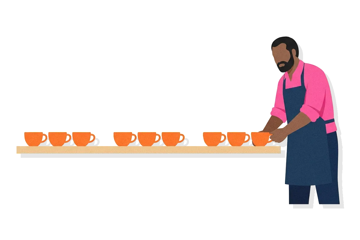
Wertheimer noticed that the rule is not only visual. If someone taps on a table in the rhythm tap-tap, pause, tap-tap, pause, a listener hears pairs of taps. The short pauses join the taps, and the long pauses separate them. Distance in time does the same job as distance on a page. It is also why a short pause in speech joins words into one phrase.
Babies group by distance early
Grouping by distance does not have to be taught. A 2012 review of a century of Gestalt research reported that babies of 3 to 4 months already group by proximity. The same review found that grouping by similar shape seems to appear only at 6 to 7 months. So distance is one of the first grouping cues a person can use.
033 min
What the law of proximity actually says
Wertheimer's dots and the sign-up form follow the same rule. Of two possible groupings, people see the one in which the gaps inside each group are smaller than the gaps between groups.
The rule is about comparison, not size. A 16-pixel gap does not join or separate anything by itself. It joins things when the gaps around it are larger, and it separates things when the gaps around it are smaller. That is why the even form failed. The gap above each label was equal to the gap below it, so the ratio was 1 to 1, and neither grouping won.
Here is the fix in numbers, again made up for the example. Put each label 4 pixels above its own field. Leave 24 pixels between one field and the next label. The gap inside each label-and-field pair is now 4 pixels, and the gap between pairs is 24. The ratio is 6 to 1, and a reader sees four pairs at once, before reading a word.
Relative distance decides, not pixel counts
In the 1990s, Michael Kubovy, Johan Wagemans and Alex Holcombe showed people grids of dots for 300 milliseconds at a time. Each grid could be seen as lines running in more than one direction, and people reported which lines they saw. The answers fit one simple curve. The chance of seeing a direction depended only on how its gap compared with the competing gap. The overall shape of the grid made no difference. The researchers called this the pure distance law. In their dot grids, once one gap was about 1.5 times the other, people almost never saw the dots group along the wider gap.
That number comes from dots in a lab, not from screens, so treat it as a rough lower limit rather than a design rule. Real layouts also carry text, colour and borders, and each of them affects grouping. The direction of the finding still helps: when two neighbouring gaps are close in size, the grouping becomes uncertain.
Why the eye trusts distance
The brain relies on distance because, in the physical world, distance is usually a reliable signal. Parts of one object tend to sit near each other. In Elder and Goldberg's 2002 study of photographs of natural scenes, the distance between edges removed about 75% of the uncertainty about which edges belong together. Smooth continuation and similarity removed only about 10% each. Of these three cues, distance carried by far the most information.
Distance as people see it, not as it reaches the eye
Proximity works on the distance a person perceives, not on the raw distance in the image that reaches the eye. In 1964, Rock and Brosgole sat people in a dark room in front of a grid of glowing beads. The beads were really closer together from top to bottom than from side to side. The grid was then turned at an angle, so that in the image on the eye the beads were closer from side to side. Looking with one eye, people reported rows of beads, but looking with both eyes, they reported columns. With one eye they could not see the angle, so they grouped by the flat image. With both eyes they could see depth, so they grouped by the real spacing. Grouping happens after the brain has worked out depth.
043 min
How proximity shows up in real interfaces
Real interfaces get proximity right and wrong in the same ways the sign-up form did. In 2020, Aurora Harley of Nielsen Norman Group collected several cases.
Applied well. On a large screen, the Wellington City Council website puts its Search link on the same line as the main menu. Extra space to the left of Search sets it apart, so it reads as a different kind of tool, even though it uses the same font as the menu items. On a tablet there is no room for that gap. So the site moves Search up into the smaller group of utility links, where it fits with its neighbours.
Violated. A form on the California EDD website asked people to list their employers. The Add button that put an employer on the list sat in one row with the Next, Save as Draft and Cancel buttons. Next and Save as Draft move a person through the process, but Add changes the list. The spacing grouped them anyway. Because the button sat with actions it had nothing to do with, and away from the employer details it changed, people had trouble finding it.
Too far away. The Kayak mobile app put its Skip link in the top-left corner, far from the main content and the large buttons. People overlooked it and assumed they had to create an account. An element far from where people are looking joins no group, so people often do not see it at all.
When a layout reflows
Responsive layouts move things around as the screen gets narrower, and the gaps change with them. On a desktop screen, the Transport for London driving page shows its links about the Ultra Low Emission Zone and the Low Emission Zone side by side. People can compare the two and pick the one they need. On a phone, the same two sections ended up far apart, because the page stacked its columns one under the other. Nothing was removed, but a pair that people needed to compare stopped looking like a pair.
A recipe grid that lost its groups
In an earlier version, the Food Network tablet app left wide gaps between the parts of each recipe in its grid. The space under each recipe title was there to fit long titles that wrapped onto a second line. Most titles were short, so the space stayed empty. Each byline and rating then sat about as close to the recipe below it as to its own. People could not tell which rating belonged to which recipe. A later version put each recipe in a card, which is a box with a border. That fix did not change the gaps. It added a different grouping cue, and the next section explains why that worked.
052 min
Where the law of proximity loses
Proximity is strong, but it is not the only grouping cue, and other cues can beat it.
A border beats a gap
A visible border is a stronger signal than spacing, so a box drawn around items can group them even when the gaps say otherwise. Stephen Palmer described this cue, called common region, in 1992. That is why the Food Network cards worked. A border also helps when a layout has no room for larger gaps. The cost is clutter. A page where every group has a border is full of lines that carry little meaning, and often spacing alone would have done the job.
Proximity does not always beat similarity
Many design guides say that proximity overrides colour and shape. Often it does, but that is not a fixed rule. Wertheimer himself showed that either cue can win. Start with dots grouped by distance and slowly widen the gaps inside the groups. At some width, people stop grouping by distance and start grouping by colour, following the law of similarity. Later lab work found that the two cues add together. So a strong colour difference can split a group that spacing created, and spacing can split a group that colour created. The grouping is strongest when both cues agree.
A connecting line beats distance
Elements that touch, or that are joined by a line, read as one unit even when they are far apart. Stephen Palmer and Irvin Rock argued in 1994 that this is a separate principle, uniform connectedness. In their view, distance only means something once the eye has already found separate pieces.
Too much space
Over-grouping is the failure in the other direction. If the gap between a heading and its paragraph grows as large as the gap above the heading, the heading no longer looks attached to either. If a price sits far from its product, it may join the next product instead. Generous spacing everywhere is still even spacing, and even spacing creates no groups.
061 min
Proximity vs. similarity, common region and whitespace
Each of these competing cues has its own name, and two more terms share proximity's name or its material.
| Concept | What makes things look grouped | Interface example |
|---|---|---|
| This pageProximity | ||
| Not in the library yetSimilarity | ||
| DesignCommon region | ||
| DesignUniform connectedness |
Whitespace is the empty space itself. Proximity is the effect that differences in that space create. Adding the same amount of whitespace everywhere groups nothing. Only uneven space does.
The proximity principle in social psychology is a different idea with a similar name. It says people tend to form friendships with those who live or work near them. It describes relationships between people, not how people see a layout.
072 min
Proximity and accessibility
All of these cues are visual, and some people do not get the visual version of a page. A screen reader does not perceive spacing. It reads the page in code order and announces what the code says. If the sign-up form joins each label to its field only by placing them close together, a screen reader user may hear "Email" and then a text box with no name, and must guess what it is for.
WCAG 2.2 Success Criterion 1.3.1, Info and Relationships, asks that any relationship shown through visual layout also survive when the page is presented another way, such as read aloud by a screen reader. For the form, that means each label is tied to its field in the code, for example with the HTML label element. A set of related fields, such as the parts of an address, goes inside a fieldset element with a legend that names the set.
Position still matters for people who can see part of the screen. W3C technique G162 places a label directly before its field: above it, or to its left in left-to-right languages. People who use a screen magnifier see only a small part of the page at a time. If a label sits far to the left of a wide field, the label can be out of view while the field is in view. A label directly above its field stays in view with it.
082 min
Applying the law of proximity
Back on the sign-up form, the fix was to change the gaps, not to add anything. The same approach works on most screens.
Decide the groups before you set any spacing.
Write down what belongs together: each label with its field, each price with its product, each action with the thing it changes. Spacing can only show groups you have already decided on.
Use a spacing scale with clear steps.
Pick a few gap sizes, such as 4, 8, 16, 24 and 40 pixels, and give each one a job. Small gaps go inside a group and larger gaps go between groups. Avoid two neighbouring gaps that are nearly the same size.
Put each heading closer to its own text than to the text above it.
Otherwise the heading looks like the last line of the previous section. This is also how spacing supports visual hierarchy.
Place each action next to what it acts on.
The EDD Add button belonged beside the list of employers, not with Next and Cancel. The same goes for footer links: sort them into a few labelled groups instead of one long even row.
Check every screen width.
At each breakpoint, the width where the layout changes, ask whether items people must compare still sit together, as the Transport for London page shows.
Blur the layout to test it.
Blur a screenshot, or step back from the screen, until you cannot read the words. The blocks you can still see are the groups a new reader sees first.
This advice has a limit. Proximity needs space, and space is scarce on a small screen. Larger gaps between groups can push important content off the first screen. There, a border or a background colour groups things using less room. And a layout cut into too many small groups is as hard to scan as a layout with none.
?4 questions
Questions people ask
Does the law of proximity change in right-to-left languages?
How should icons and their text labels be spaced?
Is proximity the same as Gestalt grouping?
Does proximity matter in charts?
§9 sources
Sources
Show all 9 sourcesHide sources
Max Wertheimer, "Laws of Organization in Perceptual Forms" (1923), translated in W. D. Ellis, A Source Book of Gestalt Psychology (1938). psychclassics.yorku.ca
Johan Wagemans and colleagues, "A century of Gestalt psychology in visual perception: I. Perceptual grouping and figure-ground organization", Psychological Bulletin 138(6), 2012. pmc.ncbi.nlm.nih.gov
Michael Kubovy, Alex O. Holcombe and Johan Wagemans, "On the lawfulness of grouping by proximity", Cognitive Psychology 35(1), 1998. doi.org
Aurora Harley, "Proximity Principle in Visual Design", Nielsen Norman Group, 2020. nngroup.com
Aurora Harley, "The Principle of Common Region: Containers Create Groupings", Nielsen Norman Group, 2020. nngroup.com
W3C, "Understanding Success Criterion 1.3.1: Info and Relationships", WCAG 2.2. w3.org
W3C, "Technique G162: Positioning labels to maximize predictability of relationships". w3.org
Lesa Snider, "Design basics: the proximity principle", Macworld, 2009, a summary of Robin Williams's The Non-Designer's Design Book. macworld.com
"Proximity principle" (social psychology), Wikipedia. en.wikipedia.org