011 min
Why designers reach for the color wheel
Say a designer has chosen a blue for the main button of a product. The page needs one more color, for a badge that should stand out from the blue without clashing with it. Trying shades one at a time is slow, and a rule such as "pick something opposite" only works if "opposite" has a meaning.
A color wheel gives it one. With it the designer can see which hues are next to the blue, which are across from it, and which are a third of the way around. Those positions predict how two colors look side by side, and that is why the wheel has lasted more than 300 years.
022 min
Where the color wheel came from
The first circle of colors was drawn for light, not for paint. Isaac Newton had used a glass prism to split sunlight into a band of colors. Newton is generally credited as the first to show that band of colors as a circle, in his 1704 book Opticks. The experiment that produced the band is told in color theory.
Newton's circle was uneven. He cut it into seven arcs, one each for red, orange, yellow, green, blue, indigo and violet, and made the arcs different lengths so that they matched the steps of a musical scale. He wanted more than a picture. He wanted a way to predict the color that a mixture of colored lights would make.
How Newton found the color of a mix
For each color in a mixture, Newton placed a small circle on that color's arc, and made the circle larger when the mixture held more of that color. He then found the balance point of all the small circles together. A line from the center of the ring through the balance point ended on the rim at the hue of the mixture, and the length of that line gave the intensity of the color.
The circle therefore carried two facts at once. The angle gave the hue, and the distance from the center gave the strength. A balance point on the rim meant the fullest color, and one at the center meant white.
Why purple sits on the circle
A prism's band runs from red to violet and stops. It has no purple in it, so its two ends do not meet on their own, and a circle needs a color between them. Newton's mixing rule supplies one. He noted that a mixture made mostly of red and violet gives a purple that is not one of the colors a prism shows. The circle therefore holds a color that the prism itself does not show.
What mixing opposite colors gives
Newton also asked what happens when colors from opposite sides of the circle are mixed. Mixed in equal amounts, two colors from opposite sides of the circle put the balance point on the center, yet Newton found that the result was a faint color with no name rather than a perfect white. He added that he had never managed to make a perfect white from only two colors. The rule says that opposites cancel toward white, and his own test showed that it holds only approximately.
Why guides give two dates
Many guides date the color wheel to 1666. That is the year they give for Newton's prism experiments, not for a circle. The earliest circle a reader can check is the one in Opticks, which came out in 1704.

031 min
How the color wheel changed after Newton
Newton's wheel described light. Painters mixed pigments, and they wanted a wheel for their own work. The first known colored wheels appeared four years after Opticks, in a French artist's manual from 1708.
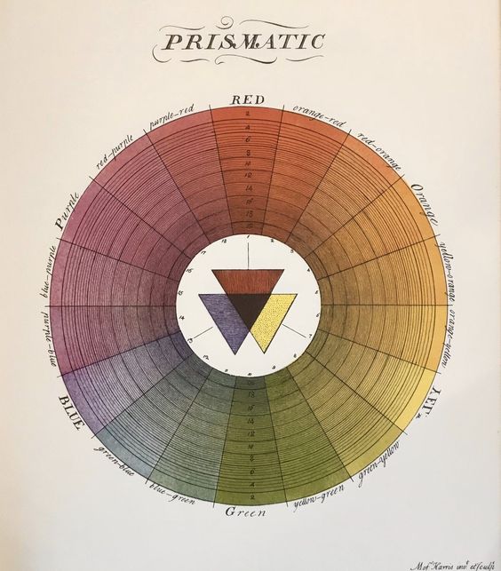
Later in the same century, painters' wheels settled on a different set of starting colors. The naturalist and engraver Moses Harris published The Natural System of Colours in 1766 and showed how a wide range of colors can be made from red, yellow and blue. Red, yellow and blue became the set of three that most people still learn first.
Goethe disagreed with Newton about where color comes from. He argued that color comes from light and from what stands against it, and in his 1810 Theory of Colours he drew a symmetric wheel in which the colors that the eye produces in response to each other sit across from each other. Newton counted only the colors of the spectrum as basic, while Goethe, going by what he observed, gave magenta a place of its own in a complete circle.
The version most guides print today came from a teacher at the Bauhaus school. Johannes Itten drew a wheel of twelve colors, with primary, secondary and tertiary levels, and saw no need to divide the colors any further. Most color wheels in use now follow that twelve-part layout, so the next section takes it apart.
042 min
How a twelve-part color wheel is built
Itten's twelve-part wheel is built in three steps, and each step is a rule about mixing.
| Level | Colors | How it is made |
|---|---|---|
| Primary | red, yellow, blue | The starting colors. The wheel does not make them from anything. |
| Secondary | orange, green, violet | An equal mix of two primaries. |
| Tertiary | red-orange, yellow-orange, yellow-green, blue-green, blue-violet, red-violet | One primary mixed with the secondary beside it. |
Each hue sits between the two that mix to make it, so neighbors share most of their makeup. That is why they look related.
Which colors count as primary depends on the medium
Red, yellow and blue are the painter's set. Screens work differently. A screen adds light, so red, green and blue at full strength together give white. Paint and ink absorb light, so mixing more of them makes a darker color, and a printer's set is cyan, magenta and yellow with black added as a fourth ink. The physicist Ogden Rood developed the first wheel built on red, green and blue light instead of pigments.
| Model | Primaries | Used for | How mixing works |
|---|---|---|---|
| RYB | red, yellow, blue | Teaching painters | Subtractive: pigment absorbs light |
| RGB | red, green, blue | Screens | Additive: light adds up toward white |
| CMY | cyan, magenta, yellow | Printing | Subtractive: ink absorbs light |
The painter's choice of red, yellow and blue is mostly tradition. A long guide to artists' color wheels on the Handprint site says that painters use these three because it has always been done that way, and that artists have worked for centuries with palettes that contain none of them.
What the wheel leaves out
A wheel shows hue, which is a color's place in the order of the spectrum. A color has two more properties. Saturation is how pure or intense it is, and value is how light or dark it is. Adding white to a hue makes a tint, adding black makes a shade, and adding gray makes a tone.
Hues on the red, orange and yellow side are called warm, and hues on the blue and green side are called cool. These names are a convention for how the colors feel. The wheel has no measurement behind them.
051 min
Color schemes read from the color wheel
Once every hue has a position, a color scheme is a shape drawn on the wheel.
| Scheme | Where the hues sit | What it gives |
|---|---|---|
| Monochromatic | One hue only | Tints, shades and tones of a single hue, so the set looks unified |
| Analogous | Two to four hues in a row, usually three | Hues that share most of their makeup, so the set looks related |
| Complementary | Two hues directly across the wheel | The largest difference in hue, so each color makes the other stand out |
| Split-complementary | One hue and the two neighbors of its complement | The contrast of a complementary pair with a second, nearby option |
| Triadic | Three hues spaced a third of the way apart | Variety that stays balanced |
| Tetradic | Four hues, either two complementary pairs or four spaced a quarter apart | The most variety, and the hardest set to balance |
For the designer's blue, a complementary scheme points straight across the wheel, an analogous scheme stays beside the blue, and a triadic scheme adds two hues a third of the way around. Those are three different answers to the same question about the badge. The first one raises a problem, because "straight across" depends on which wheel the designer holds.
062 min
Why the color wheel gives one color two complements
The designer follows the complementary row and asks for the opposite of the blue. Say the designer checks the blue against two wheels, one made for painters and one made for screens. The painter's wheel answers orange. The screen wheel answers yellow.
On the painter's red, yellow and blue wheel, blue sits across from orange, while on the red, green and blue wheel built for screens it sits across from yellow.
A third account disagrees with each wheel on one pair. Opponent-process theory, which describes how the eye and brain compare colors, says the most contrasting pairs are red with green and blue with yellow. That matches the screen wheel on blue and the painter's wheel on red.
The same Handprint guide adds a second warning. The complement found by mixing paints is often very different from the complement the eye sees, and both change with the method used to define them.
The cause is that "complement" has more than one definition. On a painter's wheel it is the hue across the circle. On a screen wheel it is the hue that, added as light, cancels the other toward white or gray. In vision science it is the hue the eye treats as the opposite. These agree for some colors and not for others, so the designer's question needs a medium before it has an answer. For a screen, the answer is yellow.
071 min
What the color wheel does not show about mixing paint
A painter meets a different surprise from the same wheel. The wheel puts orange halfway between red and yellow, and it is natural to read that as a recipe. Say a painter mixes equal parts of a red paint and a yellow paint to make orange. The orange is usable, but it is less vivid than the red or the yellow it came from.
The Handprint guide explains why. An equal mix is as far from both paints as a mix of the two can be, and every step away from a pure paint costs some saturation. The wheel gives the hue of the mix and does not show how much purity is lost on the way.
The set of starting colors matters here too. For paint, pigment and ink, the cyan, magenta and yellow set gives a wider range of colors, at stronger intensity, than the traditional red, yellow and blue set. That is a reason painters buy a ready-made green, orange or violet rather than mixing every secondary from red, yellow and blue.
082 min
Where the color wheel stops being reliable
Back at the screen, the designer takes the yellow and puts it on the white page. It is hard to see. The wheel gave the right hue, and it does not show lightness at all.
The wheel shows hue and nothing else
A hue angle fixes where a color sits around the circle. It leaves out how light or pure the color is. Two colors can sit across from each other and still have nearly the same lightness, and text in one on the other is then close to unreadable. Check each pair for contrast before using it.
Equal steps in hue are not equal steps in lightness
Software makes this easy to miss. Color pickers draw hue as an angle in HSL or HSV, two models that describe a color by its hue, its saturation and its lightness or value, so a designer moving around the ring sees every hue at the same lightness setting. On a gradient that changes only the hue in HSV, yellow, magenta and cyan look much lighter than red and blue. The designer's yellow is light against white because the eye reads yellow as light, whatever the number says.
A saturation number that can mislead
In HSL, a very light yellow counts as having the same saturation as the pure green primary, although it has almost no chroma by the usual measures. The setting that looks like a measurement of purity does not match what people see.
Spaces built to separate the three
Newer color spaces try to keep hue, lightness and chroma, which is the purity of a color, apart so that changing one leaves the others alone. Björn Ottosson, who designed the Oklab color space, listed predicting lightness, chroma and hue well as a requirement for it. A wheel drawn in such a space gives steps that look more even to the eye than the HSL ring does.
A pair the wheel recommends can fail for some viewers
Red and green sit across from each other on the painter's wheel. The most common kind of color vision deficiency makes red and green hard to tell apart. A pair chosen only by hue can therefore merge for some viewers, so shape, text or position should carry the same meaning. See accessibility.
What the wheel cannot say about context
The wheel has no viewer and no surroundings in it. How a neighbor shifts the look of a color, and what a color means in a given culture, belong to color theory. How the brain keeps a surface looking the same under different lights is color constancy.
091 min
Using the color wheel in a design
The designer's blue and yellow now need a decision. Use the wheel for the step it is good at, and add checks for the rest.
- Pick the wheel for the medium: red, green and blue for screens, cyan, magenta and yellow for print, and red, yellow and blue when the goal is learning to paint.
- Fix one base hue, here the blue, and choose a scheme by its position.
- Set lightness separately. Move the second color lighter or darker until text and shapes stay readable, and view the pair in grayscale.
- Make sure the difference does not depend on hue alone, so the badge is also marked by shape, text or position.
- Try the pair in the real layout. A neighbor changes how a color looks, so a swatch on the wheel is a starting point.
Palette tools such as Adobe Color apply the same position rules to any base color and return the matching set. The lightness and vision checks above still apply to what they return.
The designer ends with the blue unchanged and a yellow that is darker than the wheel's version: chosen by position, then corrected by contrast.
101 min
Color wheel vs. nearby concepts
People mix up the wheel with the larger body of ideas around it.
| Concept | What it covers | How it differs from the color wheel |
|---|---|---|
| DesignColor theory | ||
| PsychologyColor constancy | ||
| DesignContrast |
111 min
Color wheel questions
How many colors are on a color wheel? Twelve in the common version, but the number is a choice. Newton drew seven arcs, and Chevreul drew 72 segments for the Gobelins tapestry dye works, so the count depends on how fine the work needs to be.
Where do black, white and gray go on a color wheel? They have no place on it. The wheel orders hues, and black, white and gray have none, so they are called achromatic and are handled through value instead.
Is there a three-dimensional color wheel? Yes. Philipp Otto Runge designed a color sphere in the early 1800s with pure colors around the middle, white at the top and black at the bottom. Munsell's system is also three-dimensional.
Which color wheel should I use for print? Use a cyan, magenta and yellow wheel, since those are the inks a printer mixes, with black added as a fourth ink. A red, green and blue wheel describes light on a screen.
?4 questions
Questions people ask
How many colors are on a color wheel?
Where do black, white and gray go on a color wheel?
Is there a three-dimensional color wheel?
Which color wheel should I use for print?
§10 sources
Sources
Show all 10 sourcesHide sources
Isaac Newton, Opticks, or, A Treatise of the Reflections, Refractions, Inflections and Colours of Light (first published 1704; fourth edition, 1730), Project Gutenberg:
Cambridge University Library, "Reinventing the (colour) wheel", a survey of colour wheels in its collections, 2019:
Wikipedia, "Moses Harris", on The Natural System of Colours (1766):
Wikipedia, "Theory of Colours", on Goethe's color circle:
Wikipedia, "Complementary colors", on how the pairs differ between models:
Handprint, "Color wheels", a guide to artists' color wheels and mixing:
Wikipedia, "HSL and HSV":
Björn Ottosson, "A perceptual color space for image processing" (Oklab):
National Eye Institute, "Color Blindness":
Wikipedia, "RYB color model", on how the red, yellow and blue set compares with cyan, magenta and yellow: