011 min
What discoverability looks like in a phone app
Around 2010, Don Norman and Jakob Nielsen, two specialists in how people use products, tried Apple's phone and tablet apps and wrote down what they could and couldn't find. In Apple Mail, swiping a finger to the right across an unopened message brings up a dialog that offers to delete it. They opened the same email and made the same swipe, and nothing happened. They tried the swipe in Apple Calendar, and it did not work there either. Nothing on any of those screens had told them the swipe existed or where it would work.
That gap between an action existing and a person being able to find it is what Norman and Nielsen meant by discoverability. In a menu, the delete command would be written out where anyone could read it. A swipe has no such entry, so you learn it by being shown or by trying it by accident. Norman and Nielsen wrote that nobody had yet worked out how to tell the person using an app what the alternatives are.
You may have had the same moment yourself, when you saw someone else swipe a row on their phone and a button you had never noticed appeared.
021 min
How discoverability works: menus and memory
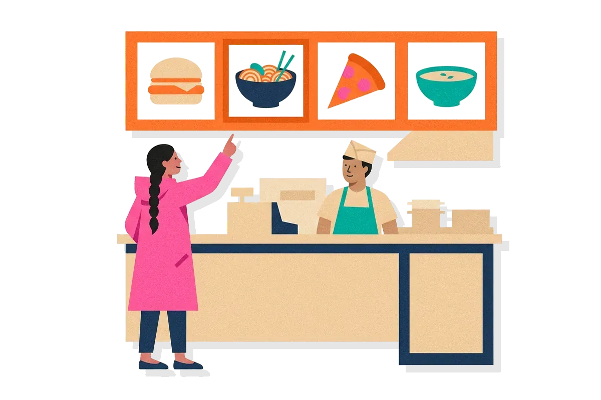
Graphical menus are the classic way an interface makes its commands discoverable. Don Norman, a design researcher, and Jakob Nielsen of the Nielsen Norman Group, a user experience research firm, wrote a magazine column on touch gestures. They argued that the main gain of the graphical user interface, the style of screen built from windows and menus, was that people no longer had to memorise commands. They put the principle simply: you can find every command by opening each menu in turn. Even if you have never used a program, you can read what each menu lists and pick one.
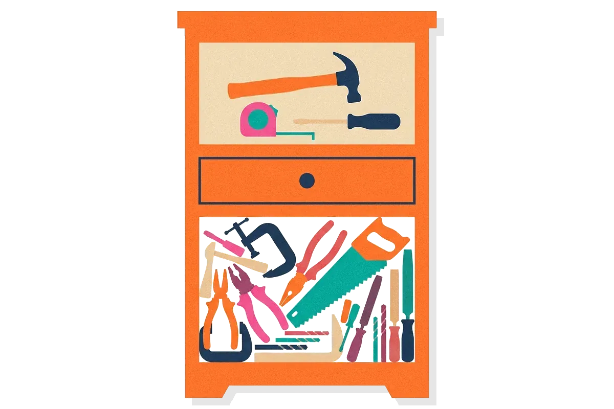
Menus work because of how memory behaves. Spotting an option in a list takes less effort than remembering that the option exists. Jakob Nielsen turned that into a usability heuristic, a broad rule of thumb for judging a design. His rule tells designers to spare people's memory by showing elements, actions and options. That idea has its own page as recognition rather than recall.
Norman and Nielsen's column went on to say that touch gestures were overturning basic principles of interaction design. They named discoverability among those principles, alongside visibility, feedback, consistency and undo.
032 min
What affects discoverability on a screen
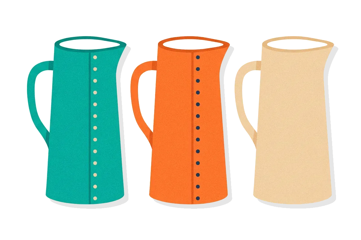
A feature's discoverability on a screen depends on a few plain properties. Wikipedia's entry on the word lists the feature's size, its colour, whether it is highlighted and its position on the page. A large button in a strong colour near the top of the screen gets found before a small grey link in the footer. The top of the screen also gives a feature extra visibility, much as the top half of a newspaper's front page does.
Colour alone is a weak cue, because some people cannot see certain colours. When designers use colour to mark a feature as important, they usually add a second cue such as a shadow or bold type. That habit belongs to accessibility, the work of making a product usable by people with different abilities.
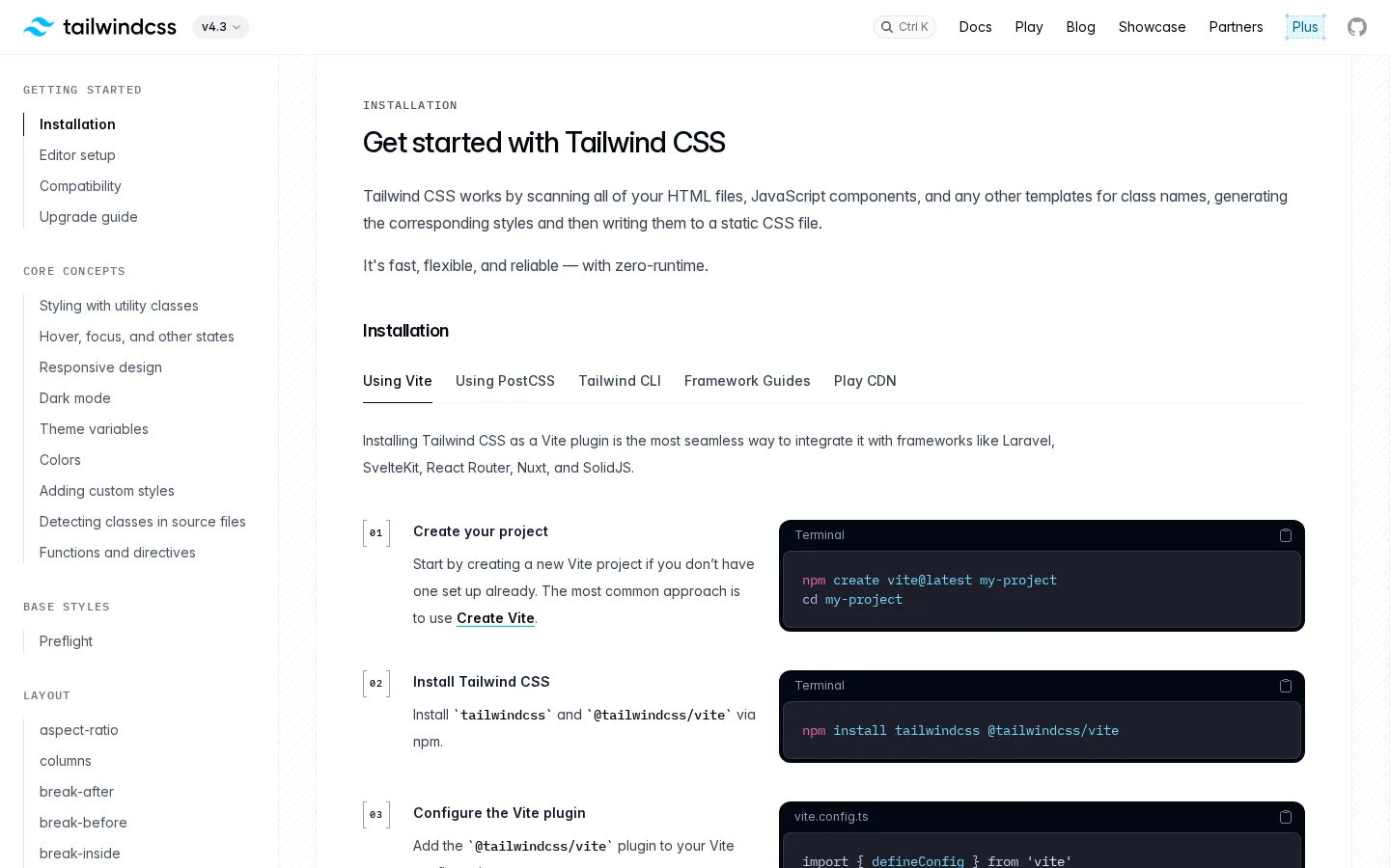
The Tailwind CSS documentation site, captured on 6 November 2026, puts its features in plain view in two ways. In the top bar, a small search box has the keyboard shortcut Ctrl K printed inside it, so a visitor learns the quicker route just by looking. On the left, a column lists every documentation page at once, grouped under headings such as Getting started and Core concepts.
Discoverability in voice interfaces
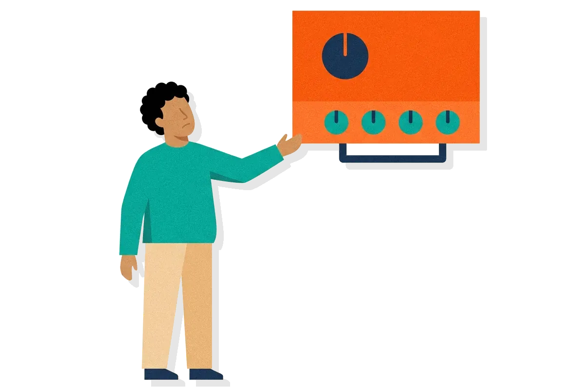
A voice assistant has no screen of options, so you can't see what you are allowed to say. Wikipedia notes that voice interfaces may have low discoverability when people don't know the commands they can use, and that such interfaces may therefore display a list of available commands.
042 min
Where discoverability comes from
The idea of discoverability grew out of a word from psychology, affordance. J. J. Gibson, a perceptual psychologist, invented the word for what a particular creature can do in a particular environment. In Gibson's version, an affordance could exist without anyone being able to see or know about it.
Don Norman brought the word into design in 1988, in the book first titled The Psychology of Everyday Things and now called The Design of Everyday Things. Norman's own example is a door that can be pushed or pulled, where a plate tells you to push and a bar or handle tells you to pull. Norman has written that his 1988 use of the word in design referred to affordances a person can perceive.
Designers soon used affordance for any possible action, seen or not, and the meaning blurred. So in 2008, in a column for the Association for Computing Machinery's magazine Interactions, Norman proposed the word signifier for the part of an affordance a person can perceive. The 2013 edition of his book added signifiers too. The plate on the door is the signifier, and the fact that the door can be pushed is the affordance.
Discoverability is the question these words lead to. Can a person tell which actions are possible and how to do them? Wikipedia credits Norman with popularising the term in that sense. Around 2010 he used it again in a magazine column on touch gestures, written with Jakob Nielsen, a specialist in how people use products.

052 min
Hidden menus and discoverability: a 179-person study
In June 2016, the Nielsen Norman Group (NN/g, a user experience research firm) reported a study of what happens when a website hides its main menu. Kara Pernice and Raluca Budiu ran the study with a remote-testing company called WhatUsersDo. They had 179 people do tasks on 6 websites, on smartphones and on desktop computers. On some sites the menu sat behind an icon of three short lines. On others the navigation links ran across the page in plain view. A third kind of site showed part of the navigation and hid the rest.
The researchers counted how often people used the navigation, how late in the task they first used it, and how often they reached content through it.
On desktop, people used hidden menus in 27% of cases, against 48% on sites with visible navigation and 50% on sites with combined navigation. People who did open a hidden menu did so later in the task, and some said the site had no menu at all. On NN/g's measure of content discoverability, hidden navigation scored more than 20% lower than visible or combined navigation. NN/g concluded that hidden navigation is less discoverable than visible or partly visible navigation, and the team advised against hiding it, especially on desktop.
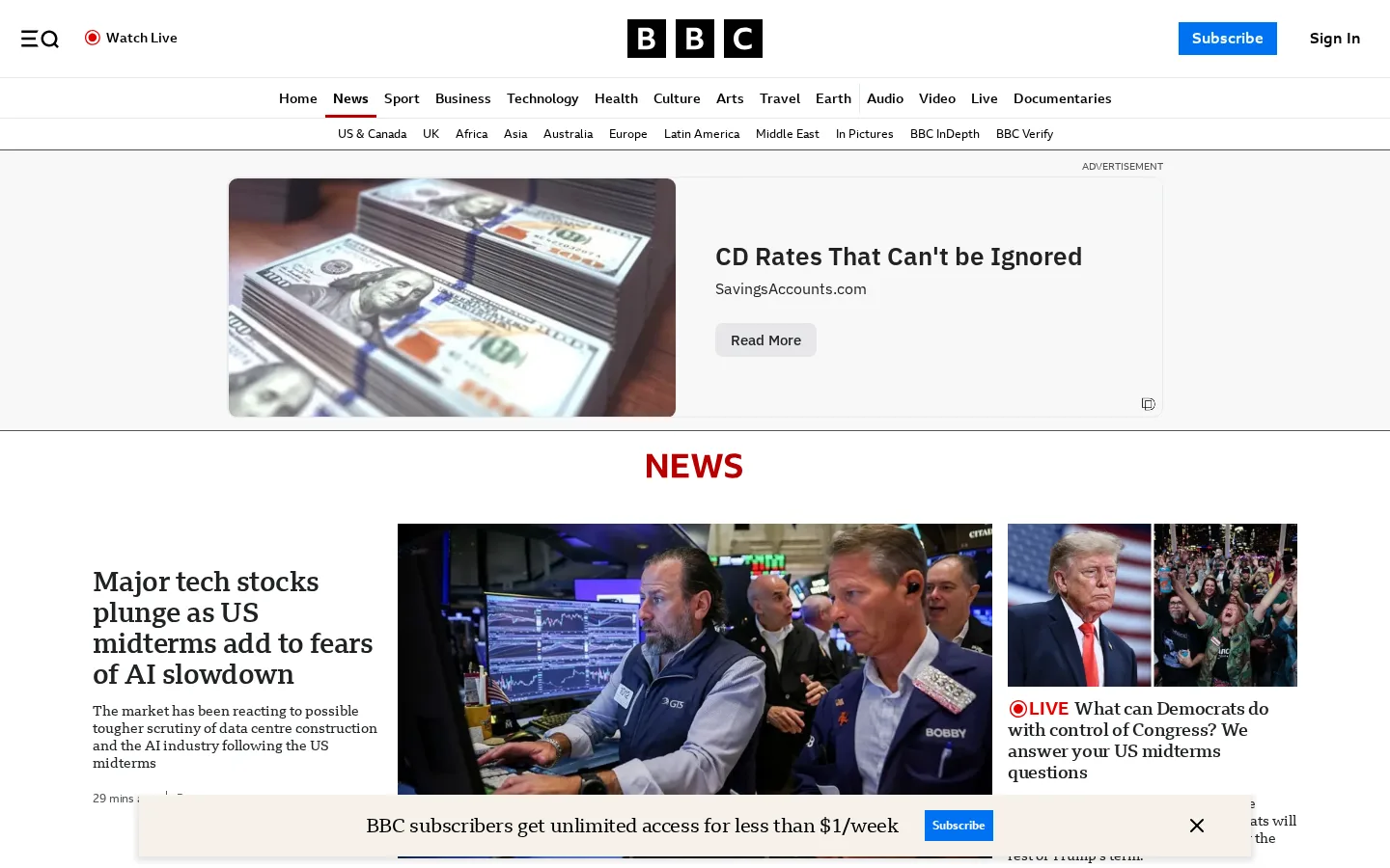
A phone-sized capture of the BBC News page, taken on 6 November 2026, shows a header with a single icon of three lines beside a magnifying glass, the BBC logo and a person icon, and no section names anywhere. Only that one unlabelled icon leads to the sections the site holds.

061 min
Flat design and discoverability: an eye-tracking study
In September 2017, Kate Moran of the Nielsen Norman Group, a user experience research firm, reported an experiment on what weak clickability cues cost. The team took 9 live web pages and altered each into two nearly identical versions, with the same layout, content and visual style. One version had strong signifiers, meaning cues that something can be clicked, such as underlined blue link text and glossy buttons. The other had weak signifiers, such as link text styled like plain text and buttons drawn only as an outline. That is the look of flat design, a style that strips away shading and borders.
71 web users each got a task and said when they had found the target, while eye-tracking cameras recorded where their eyes rested. Each rest is called a fixation. Pages with weak signals drew 25% more fixations on average, and people spent 22% more time looking at them.
Moran's team read the extra looking as people struggling to find the element they wanted, or not trusting it when they first saw it. The Nielsen Norman Group calls that feeling click uncertainty. The cost was smaller on sites with little crowding on the page, a traditional layout and important controls that stand out from what surrounds them.
072 min
Discoverability failures: false signals and hidden gestures
Android phones of around 2010 had a menu button that was always on screen. Don Norman, a design researcher, and Jakob Nielsen of the Nielsen Norman Group, a user experience research firm, wrote a magazine column on touch gestures. They pointed out that the button implies a menu is available. Yet many apps, and many places inside apps, have no menu at all. The only way to learn that was to press the button and watch nothing happen. They counted it as a flaw. A button that shows but does nothing in some places sends a false signal, so being visible is not enough.
Hidden gestures are still common in phone apps. In 2026 a research team at Seoul National University posted a preprint, a paper shared before other researchers have reviewed it, called GhostUI. It collects hidden interactions in 81 popular mobile apps. These are gestures with no visible cue, such as long presses and swipes, and the collection covers six gesture types. In the messaging app Band you can reply to a message by long press or by swipe, and neither way shows a cue. The team called cases like this the most concerning, because the second route is as invisible as the first. When no visible alternative exists, as in Band, a person who does not already know the gesture has to look it up elsewhere or keep trying until something works.
082 min
How to make a feature discoverable
The simplest move is to show what the site holds, and the BBC News page does that on a desktop screen. In a capture from 6 November 2026, a full row of section names runs under the header as plain words, from Home, News and Sport to Documentaries, with a smaller row of regions below it. A visitor can read what the site offers without opening anything. The Nielsen Norman Group, a user experience research firm, recommends the same thing in its 2016 hidden-menu study with 179 people: do not hide navigation, especially on desktop.
Before you ship a feature, check your own screens:
In a 2017 eye-tracking experiment, the Nielsen Norman Group had 71 people look for targets on pages with strong or weak clickability cues. Weak cues cost less on pages with little on them. So the busier your page, the more clickable things need to look clickable.
092 min
Discoverability vs findability, affordance and learnability
Discoverability gets mixed up with four neighbours, and each asks a different question.
| Concept | The question it asks | Example |
|---|---|---|
| This pageDiscoverability | ||
| Not in the library yetFindability | ||
| DesignAffordance | ||
| DesignSignifiers | ||
| Not in the library yetLearnability |
Findability is the nearest neighbour. If you are looking for a page you know exists, that is findability. If you did not know the page or the action existed, that is discoverability.
The Nielsen Norman Group, a user experience research firm, describes learnability as the speed at which people learn basic tasks with a design. Discoverability comes first in time, because you need to find out an action exists before you can learn to do it well.
Affordance and discoverability differ too. An affordance is what the object allows, whether or not anyone can tell. Discoverability is whether anyone can tell, and the cue that lets them tell is the signifier.
102 min
Questions people ask about discoverability
What is the meaning of discoverability?
In design, discoverability means whether people can work out which actions a product allows and how to do them. In law, discovery means the two sides in a court case sharing evidence before the trial, and the information-science use of discoverability borrows loosely from that, while the design sense was popularised by Don Norman.
What is the difference between discoverability and visibility?
Visibility means something can be seen. Discoverability asks whether seeing it tells you what it does and where it works. Android phones of around 2010 had a menu button that was always on screen, yet it implied a menu that many screens lacked.
How does discoverability relate to accessibility?
Accessibility is about whether people with different abilities can use a product at all, while discoverability is about whether they can tell what it offers. The two overlap where a cue depends on colour alone.
Is discoverability the same as usability?
Usability is the wider quality. The Nielsen Norman Group (NN/g), a user experience research firm, splits usability into five components, and one is learnability, which means how fast people learn basic tasks. Discoverability is the narrower question of whether people can tell an action exists.
Is discoverability the same as search engine ranking?
No. In search and media, discoverability means how easily content is found through search results or recommendations. In UX it means whether people can find an action inside an interface.
Is a hidden menu a problem on phones too?
The evidence for phones is thinner than for desktop. In 2016 the Nielsen Norman Group (NN/g, a user experience research firm) had 179 people do tasks on 6 websites with hidden, visible or combined navigation. On desktop, people used hidden menus in 27% of cases against 48% for visible navigation. NN/g did not test sites with only visible navigation on phones, and it says the gap between its desktop and phone results in content discoverability was not statistically significant.
?6 questions
Questions people ask
What is the meaning of discoverability?
What is the difference between discoverability and visibility?
How does discoverability relate to accessibility?
Is discoverability the same as usability?
Is discoverability the same as search engine ranking?
§9 sources
Sources
Show all 9 sourcesHide sources
Donald A. Norman and Jakob Nielsen, Gestural Interfaces: A Step Backwards in Usability, Interactions column.
Donald A. Norman (2008), Signifiers, not affordances, column for Interactions (ACM).
Kara Pernice and Raluca Budiu (2016), Hamburger Menus and Hidden Navigation Hurt UX Metrics, Nielsen Norman Group.
Kate Moran (2017), Flat UI Elements Attract Less Attention and Cause Uncertainty, Nielsen Norman Group.
Jakob Nielsen, 10 Usability Heuristics for User Interface Design, Nielsen Norman Group.
Usability 101: Introduction to Usability, Nielsen Norman Group.
Discoverability, Wikipedia.
The Design of Everyday Things, Wikipedia.
Kweon, Park, Lee, Lee and colleagues (2026), GhostUI: Unveiling Hidden Interactions in Mobile UI, arXiv preprint.