011 min
Jakob's Law at a glance
- What it is: Expectations transfer from every product a person has already used.
- Where it comes from: Jakob Nielsen named it in a 2000 essay, "End of Web Design."
- Apply it by: Match convention in navigation, form controls, and icons.
- It backfires when: A copied convention is applied to the one feature meant to be different.
022 min
What Jakob's Law actually says
A person arrives at a new product carrying a mental model built from every other product they have used before it — years of shopping carts, search boxes, back buttons, and settings menus. Jakob's Law says that model does most of the work in a first encounter: a control that matches it gets used correctly without instruction, and a control that breaks it forces the person to stop, guess, and often get it wrong.
Nielsen stated the reasoning in 2000, in the essay that introduced the law: "This means that users prefer your site to work the same way as all the other sites they already know." The word "prefer" is doing real work here. It is not that people cannot learn something new. It is that learning has a cost, paid in time and errors, and a design that avoids charging that cost for something routine has an advantage over one that does not.
Jakob's Law carries no formula and no measured effect size, unlike Fitts's Law. Nielsen did not run an experiment that produced it; he generalized it from years of usability testing across hundreds of sites. That makes it closer to a practitioner's rule of thumb than a scientific law in the strict sense, even though the name has stuck since 2000.
Jakob's Law is not a rule against building something a person has never seen before. It says where a person's existing model will apply, and it applies most strongly to the parts of a product a person is not there to notice: how to get back to the homepage, how to submit a form, what an icon means. It applies least to the one thing that made someone choose this product over the alternative.
031 min
Where Jakob's Law comes from
Jakob Nielsen introduced the law in "End of Web Design," an essay he published in July 2000. Nielsen had spent the 1990s running usability tests on hundreds of individual sites, each one built with its own invented navigation and page layout. He found that this inconsistency cost people time on every site, not only the badly designed ones, because a design nobody had used before was, by definition, one nobody had learned yet.
Nielsen's own method for finding usability problems, heuristic evaluation, comes from the same period and rests on a related premise: judge an interface against principles drawn from broad experience across many products, not against that product alone. Jakob's Law has no controlled experiment behind it and no measured effect size — Nielsen generalized it from what he saw across those tests, not from a single study designed to isolate it. That is a real difference from a measured relationship like Fitts's Law, and it is worth saying plainly rather than dressing an observation up as an experimental finding.
042 min
Where convention is load-bearing
Some parts of an interface are load-bearing in a structural sense: a person relies on them without looking, on the way to doing something else. Navigation, form controls, and icons are the three places this shows up most, and they are also the three places a copied convention pays for itself.
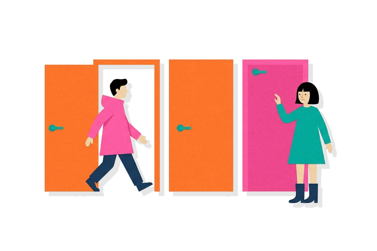
A website's logo, placed in the top-left corner and linked to the homepage, is a convention with no natural reason behind it beyond how many other sites already do it that way. Kathryn Whitenton at the Nielsen Norman Group tested what happens when a site breaks it: across 14 fashion-retail sites and 50 participants, "getting back to the homepage is about 6 times harder when the logo is placed in the center of a page compared to when it's in the top left corner" (Whitenton, 2016). Centering the logo did not make the site worse at anything a design review would normally catch. It broke one thing: the fast, unconscious click a returning visitor makes without reading the page first.
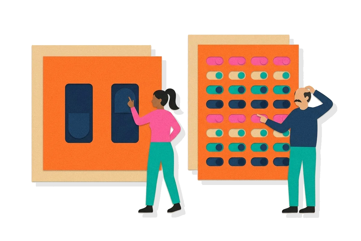
Form controls carry the same weight. A toggle, a radio button, and a checkbox each inherited its shape from a physical switch a person has operated somewhere else, and changing that shape forces a person to stop and work out what it does before they can use it — exactly the cost Jakob's Law describes. The same logic covers a magnifying-glass icon for search, a trash can for delete, a gear for settings: these are signifiers, and a signifier only works fast if it is the one a person has already learned to read.
None of this is about creativity. It is about which fraction of a person's attention a design is asking for. Spending that attention on a control nobody was going to notice anyway is a cost with no return.
052 min
The tension with differentiation
Jakob's Law creates a real conflict with differentiation, and the two are asking for different things. Following convention on a control lowers the cost of that control; being different from every competitor is often the entire reason a product exists. A team that reads Jakob's Law as a mandate to copy the market leader's interface everywhere ends up with a product that gives a competitor's user no reason to switch, because it does nothing the incumbent does not already do.
The way through is not to average the two, but to separate where each one applies. A product's core interaction — the one thing it does that a competitor cannot, or does noticeably better — is exactly where a new pattern earns the cost of learning it, because the person is willing to pay that cost once for something they could not get elsewhere.
Nielsen's own example of this trade-off, cited on lawsofux.com, is YouTube's 2017 redesign: rather than switching every user to its new Material Design interface at once, YouTube let desktop users preview it, use it, give feedback, and revert to the old version if they preferred it, so "the inevitable mental model discordance was avoided by simply empowering users to switch when they were ready." The redesign itself broke convention; the rollout respected it, by not forcing the switch on anyone before they chose it.
A product manager deciding where to spend a design team's originality budget for a release can use the same split: keep the login form, the search box, and the settings menu ordinary, and put the differentiation into the one screen a competitor cannot copy without becoming this product.
061 min
A convention broken and it worked
Amazon's 1-Click ordering, introduced in 1997, broke the checkout convention of its own era on purpose. The United States Patent and Trademark Office issued a patent for this technique to Amazon.com in September 1999. The standard pattern at the time — and the one Jakob's Law would predict a shopper expected — was a multi-step cart: add an item, review the cart, enter shipping and billing information, confirm the order. 1-Click removed all of it for a returning customer, completing a purchase from a single click using a stored address and card on file.
This worked because Amazon was not breaking a convention that governed how a person got from one website to another. It was replacing a slow version of the one thing Amazon's checkout existed to do, with a fast one, for people who had already trusted the site with their payment details once before. The new pattern did not need to feel familiar on first use, because it removed steps rather than rearranging them — there was nothing to relearn, only less to do. Amazon's U.S. patent expired on September 11, 2017, and one-click checkout is now close to a shared convention itself, offered under different names by most major retailers.
071 min
A convention broken and it cost usability
Windows 8, released in 2012, removed the Start button and Start menu that had shipped in every version of Windows since 1995 — a piece of navigation a person reached for without looking, in exactly the sense described above. Microsoft replaced it with a full-screen, tile-based Start Screen designed primarily for touch, reasoning from its own telemetry that the button was used rarely because people had learned to pin programs to the taskbar instead.
The removal cost more than that telemetry predicted. On a desktop used with a mouse and keyboard rather than a touchscreen, "many mouse and keyboard users complained that the new design was confusing," and the backlash was public enough that Microsoft brought the button back in Windows 8.1, an update aimed in part at "placating PC customers alienated by Windows 8" (Al Jazeera, 30 May 2013). The button that returned in 8.1 did not restore the old Start menu; it restored a single familiar click, in the corner where a person's hand already went, back onto an interface still built around the touch-first screen behind it.
081 min
Applying Jakob's Law
Three checks catch most of what goes wrong when a team is deciding whether to follow convention or break it.
- Ask whether the control is load-bearing or the differentiator. A control a person uses on the way to something else should match convention. A control that is the reason they chose this product over another is a candidate for something new.
- Test a new pattern with people who already use the closest competitor, not only with people who have never used anything like the product before. The gap Jakob's Law describes is between the new interface and what a specific person already knows, not against some average interface.
- When a familiar pattern is being replaced on purpose, offer a way back for a limited time, the way YouTube did in 2017. A person who can preview a change and revert it pays a much lower cost for being wrong about it than one who is switched over with no way back.
None of these checks say whether to be original. They say where originality is worth paying for, and where it is only a cost charged to the person using the product.
091 min
Jakob's Law vs. Affordance
| Jakob's Law | Affordance | |
|---|---|---|
| What it describes | Expectations a person carries in from other products | What a single element signals about its own function |
| Where the expectation comes from | Every other product the person has used | The shape, position, and visual cues of the element itself |
| A team addresses it by | Matching an established convention | Redesigning one control so it looks like what it does |
Affordance and Jakob's Law are easy to conflate because both describe a person correctly guessing how to use something before anyone explains it. The difference is where the guess comes from. An affordance is a property of one element — a button that looks pressable because it has a shadow and a border, independent of any other product. Jakob's Law is a property of the person, built from every other interface they have used: even a button with a strong affordance can still surprise someone if it behaves differently from every other button they have clicked before. A design can get affordance right on a control and still violate Jakob's Law, by inventing behavior for that control unlike anything the person has used elsewhere.
102 min
Frequently asked questions about Jakob's Law
What is Jakob's Law in UX?
Jakob's Law says a person expects a new product to work like the other products they already use, because most of their experience comes from elsewhere. Jakob Nielsen named it in a 2000 essay, "End of Web Design."
What is an example of Jakob's Law?
A website's logo, placed in the top-left corner and linked to the homepage, is a working example. Nielsen Norman Group found that navigation failures rose sharply when sites moved the logo to the center of the page instead.
Does Jakob's Law mean a product cannot be original?
No. It describes where a person's existing habits apply most strongly — routine controls like navigation, forms, and icons. It says nothing about the one feature that makes a product worth choosing over another.
How is Jakob's Law different from affordance?
Affordance is a property of a single control — what its shape and position signal about its own function. Jakob's Law is a property of the person, built from every other product they have used, independent of any one control's design.
Is Jakob's Law based on a study?
No single controlled experiment produced it. Nielsen generalized it from years of usability testing across many sites, which is why it works as an observation rather than a measured relationship like Fitts's Law.
Why do some redesigns break Jakob's Law and succeed anyway?
When the new pattern replaces the one thing a product exists to do, rather than rearranging a routine control, people are often willing to learn it once. Amazon's 1-Click ordering removed checkout steps instead of relocating them, and the new pattern eventually became a convention of its own.
?6 questions
Questions people ask
What is Jakob's Law in UX?
What is an example of Jakob's Law?
Does Jakob's Law mean a product cannot be original?
How is Jakob's Law different from affordance?
Is Jakob's Law based on a study?
Why do some redesigns break Jakob's Law and succeed anyway?
§5 sources
Sources
Nielsen, J. (2000). End of Web Design. Nielsen Norman Group.
Laws of UX. Jakob's Law.
Whitenton, K. (2016). Centered Logos Hurt Website Navigation. Nielsen Norman Group.
Wikipedia. 1-Click.
Show all 5 sourcesShow fewer sources
Al Jazeera (2013). Start button back for Windows after backlash.