011 min
Why early computer screens copied the office
An office worker in the early 1980s knew paper, folders and wastebaskets. A computer offered none of them. A file, a program and a command had no shape to recognise, so each one had to be learned from nothing. Designers could teach those ideas in the abstract, or show them as objects the person already knew.
The Xerox Star in 1981
Xerox took the second route with the Star, a workstation it introduced in 1981. The Star's designers set out to copy the office as closely as they could, so the machine would feel natural to people who worked there. Documents appeared as small pictures called icons, and folders held them. The Apple Macintosh brought the same approach to a mass audience in 1984, when it made the desktop a standard feature in place of typed commands. The trash can on that desktop is still on most computers.

022 min
What makes a design skeuomorphic
That copying has a name. Designers call it skeuomorphic design, from the Greek skeuos, a container or tool, and morphe, a shape. A skeuomorph is an object that keeps a decorative feature from an older version of itself, where the feature was needed in the older version.
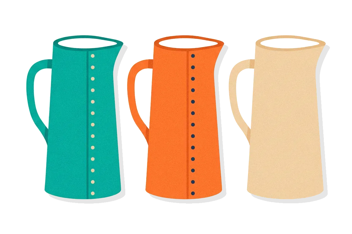
Pottery gives a clear case. Some clay pots carry imitation rivets, copied from earlier pots made of metal. The clay does not need them, but they make the pot look like the metal kind.
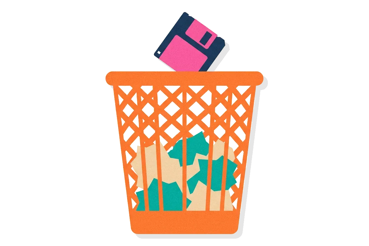
Software does the same. The icon for saving a file is a floppy disk, an object many users have never held. Many phones play a shutter click when they take a photo, the sound of a mechanical part the phone does not have. Nobody needs the click to take the picture. It tells the person that the picture was taken.
A test for what counts
Ask one question: did this detail do a job in the older object? If it did, and it does nothing now, it is a skeuomorph. The rivets, the click and the floppy disk all pass the test. The test applies to a detail, not to a whole product. A calendar app can be useful and still carry a stitched-leather edge that does nothing.
Realistic is not the same as skeuomorphic
Many people think the style means leather, wood and glossy textures. That is one way to do it, and the most visible one. A plain folder icon on a flat screen is also skeuomorphic, because it borrows a paper folder. The Nielsen Norman Group describes skeuomorphism as putting things from the physical world into screens so that new interfaces feel familiar. By that description, texture is optional and the borrowed object is what counts. The group also separates a copied object that helps people learn from extra realism added only for looks.
031 min
How skeuomorphic design helps people learn
Why does a copied shape make a new tool easier to use? Because the shape tells a person what they can do before they try. A button that looks raised invites pressing. A knob that looks turnable invites turning. The action a thing allows is called an affordance. The visible hint that points to it is a signifier. Skeuomorphic detail is a strong signifier, since the hint comes from an object the person has already handled.
The result is less effort at the start. A person meeting a folder on a screen does not have to build the idea of a folder, because the paper folder supplies it. The same habit explains why people expect a new product to work like the ones they already know, which Jakob's Law describes for software in general.
The approach helps most when the person has little experience with the technology. It also gives a product character. A music app with knobs and dials feels like the studio hardware it copies, and a musician who knows that hardware understands the controls at once.
The copying can be heard and felt as well as seen. The shutter click is one case. The page that curls as a reader turns it in an e-book app is another.
041 min
Skeuomorphic design on the first touchscreen phones
The style reached its widest use on the first touchscreen phones, because many people were learning a new kind of device at once. Apple went furthest. Under Steve Jobs, the company used the style across Mac OS X and its apps. On the iPhone, its Calendar app imitated the binding of a paper desk calendar, its Books app set books on a wooden shelf, and its Calculator looked like a handheld calculator. A person who had never used a smartphone could guess what each app did from its look.
051 min
Where skeuomorphic design goes wrong
Familiar objects came with costs, and the costs grew as the style spread.
- Clutter. Textures, shadows and highlights compete with the content for attention. They add visual noise, which cognitive load theory counts as effort spent on the screen instead of the task.
- Weight. Detailed graphics make larger files and take longer to draw on slow hardware.
- Dead references. An icon that copies an object a person never saw explains nothing to them.
- Little room to design. Each app can invent its own leather or wood, so apps look unlike each other and unlike the system around them.
The needle dial problem
Copying an object also copies its limits. Reading a value off a needle dial is usually less exact than reading the number itself. A screen can show the exact number, so the dial gives up precision to look familiar.
Microsoft Bob: a whole computer as a house
Microsoft Bob, released in March 1995, applied the idea to the entire computer. It showed a house. Each room held objects that opened programs, and a desk with a pen and paper opened the word processor. Critics disliked it, users did not take to it, and Microsoft dropped the product. Bob shows a limit of the approach: familiar surroundings do not make people want to work in them.
061 min
Why Apple dropped the style in 2013
In 2013 Apple made the break public. Apple unveiled iOS 7 in June 2013 as a full redesign built from subtle motion, a refined colour palette and layers with clear roles. The leather, felt and wood were gone. Buttons became plain text and flat shapes.
This is what designers call flat design: no textures, no bevels, no realistic shadows, and simple blocks of colour. Flat screens draw faster, use smaller images and are easier to keep consistent across a whole product. Those were real gains, and they came with a price that took a few years to measure.
072 min
What flat design took away
Removing the textures also removed the hints they carried. A shadow or a raised edge told a person where to press. A flat page has to say the same thing with colour, position or underlines, and often it does not. When a person cannot tell what is clickable, the controls are harder to find, which is a problem of discoverability.
The Nielsen Norman Group eyetracking test
In 2017 the Nielsen Norman Group tested this directly. Researchers took nine real web pages and made two versions of each. The versions had the same layout and content. They differed only in how strongly buttons and links signalled that they could be clicked. A strong signal was an underlined blue link or a slightly 3D button. A weak signal was link text styled like plain text, or a ghost button, which is a button drawn as a faint outline.
The group recruited 71 web users, showed each person one version of every page, and tracked their eyes while they looked for the element to click. On average, the pages with weak clues took 22% longer to look through than the pages with strong clues. People also paused their gaze 25% more often on them. The researchers point out that this measures only the time spent finding where to click, so a whole task would slow by less.
When flat design works
The result was not the same on every page. On three of the nine pairs, the two versions drew the same gaze pattern. Two of those pages had little content, a standard layout and targets that stood out from their surroundings. On the third, in-line links used a contrasting colour, and people recognised them without an underline. Flat design is safe where the page is sparse, follows convention and gives each target strong contrast.
Apple's Button Shapes setting
Apple's own software shows the same trade. iOS 7 removed the embossed button outlines of iOS 6 and left text and icons bare. In iOS 7.1, Apple added an accessibility setting called Button Shapes that puts a shape behind bare buttons and underlines bare text buttons. Anyone who has trouble judging where a tap will land can switch it on.
081 min
Material Design, neumorphism and other middle paths
Designers did not stay at either extreme for long. Google's Material Design, introduced in 2014, kept flat colour but used shadows to show which layer sat above which. A button looked raised only as much as needed to show it could be pressed.
Neumorphism, a style that spread around 2019 and 2020, went further. It made controls look pushed out of or into the surface, using soft shadows on a surface of one colour. Glass effects were not new: Windows Vista had used them in its Aero interface. Glassmorphism, a later style, used frosted, see-through panels. Each of these keeps one idea from skeuomorphic design: depth helps people see what is a control. Design trends repeat in this way, as designers respond to the weaknesses of the last style.
091 min
Accessibility and depth cues
Depth cues only help people who can see them. WCAG 2.2 success criterion 1.4.11, Non-text Contrast, asks that the visual information identifying a control have a contrast ratio of at least 3:1 against the colours next to it. A soft shadow on a surface of the same colour can easily fall below that ratio. Then a person with low vision may not see that a control is there. Flat designs fail the same test when a ghost button's outline is faint. A strong raised edge passes it, and so does a clear underline.
101 min
Depth returns: Liquid Glass and headsets
Depth came back more strongly in 2025. In June 2025 Apple showed Liquid Glass, a translucent material that it said acts as real glass does. Apple also said the design draws on the depth of visionOS, the software of its Vision Pro headset. In a headset, interface elements sit in the room around the person, so depth and material cues are part of the display. Wearables follow a similar path: smartwatch faces often copy analog clocks.
111 min
Deciding when to copy a real object
That history leaves a working question: when is copying worth it? New technology often starts by borrowing the shape of the old one. Early cars were built to look like horse-drawn carriages. A designer can use that pattern on purpose. Take a product designer adding a voice-note feature to a note-taking app, as an illustration. They might weigh a recording meter drawn as a needle dial against a plain level bar with a number. These steps help with that choice.
Start with the user.
Copy a real object when the person is new to the technology or the task. Skip it when the audience already knows the digital habit.
Copy the part that carries meaning.
Keep the hint that shows an action, such as a raised edge on a button. Drop the leather. Let the function decide the form.
Pick an object the audience knows.
Check that the reference still exists in their lives. Test with the youngest people who will use the product.
Check the numbers.
Where people must read a value, show the number. Keep any depth cue at 3:1 contrast or more.
Build it in layers.
A skeuomorphic element is usually made from a flat base shape, then texture, then shadow and highlight. Stop when the next layer would only decorate.
121 min
Skeuomorphic design vs nearby concepts
The nearest neighbour is flat design, which removes copied detail. Two other styles are often mixed up with it.
| Style | Depth cues | Copies a real object? | Main risk |
|---|---|---|---|
| Skeuomorphic | Realistic texture, shadow, highlight | Yes, closely | Clutter, dead references |
| Flat | None | No | Unclear what is clickable |
| Neumorphism | Soft shadows on one colour | Loosely | Low contrast |
Skeuomorphic design also differs from metaphorical mapping, the practice of explaining a new idea through a familiar one. A metaphor can sit in the structure of a product, like a desktop, without copying how any object looks. Skeuomorphic design is the version that copies the look or the sound.
?3 questions
Questions people ask
How do you pronounce skeuomorphic?
Is every drop shadow skeuomorphic?
What is the opposite of skeuomorphic design?
§10 sources
Sources
Show all 10 sourcesHide sources
Wikipedia, "Skeuomorph".
Wikipedia, "Xerox Star".
Wikipedia, "Desktop metaphor".
Wikipedia, "Microsoft Bob".
Apple Newsroom, "Apple Unveils iOS 7 Completely Redesigned With Stunning User Interface & Great New Features", June 10, 2013.
Kate Moran, Nielsen Norman Group, "Flat UI Elements Attract Less Attention and Cause Uncertainty", 2017.
iMore, "iOS 7.1 lets you take some of the magic out of your iPhone and iPad", a report on the Button Shapes setting.
Nielsen Norman Group, "Skeuomorphism".
W3C, "Understanding Success Criterion 1.4.11: Non-text Contrast", WCAG 2.2.
Apple Newsroom, "Apple introduces a delightful and elegant new software design", June 9, 2025.