011 min
Why designing the desktop first goes wrong
Picture a team that has built the account page of a subscription app on a wide desktop screen. The page has a long menu down the left side, a table of past invoices, and small tooltips that appear when the mouse pointer rests on an icon.
Late in the project, someone asks for the phone version. The team folds the menu into a hidden button and wraps the table. Then they find that the tooltips cannot work on a touch screen, because a finger has no way of resting on an icon without tapping it. The phone page ends up as a shrunk copy of the desktop page.
Most people who open this page want one of three things: change their plan, update a card, or pause the subscription. On the shrunk page, each of those is now several taps away.
The order of the work caused this. When the largest screen comes first, every item gets in, and cutting later is hard because each item already has someone who wants it kept. Mobile first design reverses the order. The team starts with the phone and treats each larger screen as an addition.
022 min
Where mobile first design comes from
The method has a known author, and it rests on an argument rather than an experiment. Luke Wroblewski, a product designer, published a post called Mobile First on 3 November 2009. No lab study proved the method. He reasoned from how quickly phone use was growing and from what phones are like to build for, and many designers found the reasoning convincing.
His post gave three reasons. The first was growth: phones were reaching more people than any earlier computing device, so a team that ignored them was ignoring a very large audience.
Wroblewski's second reason was that a phone screen, at the time 320 by 480 pixels, leaves room only for the most important data and actions, so the team has to rank them. Teams that start from the phone, he argued, end up with a product built around the key tasks people want to finish.
The third reason: what phones could do
His third reason was that phones offered sensors and inputs that desktop browsers of the time lacked, such as GPS location, a compass, multi-touch gestures and an accelerometer. An accelerometer measures how the device is positioned. A team that designs for the desktop first tends to leave these features out, and a team that starts on the phone can plan around them from the first sketch.
Google adopts the phrase
The phrase spread outside design within months. In February 2010, Eric Schmidt, then Google's chief executive, told the Mobile World Congress in Barcelona that Google's developers were doing their work on mobile first. Schmidt was describing how Google's engineers chose their projects, not how pages were laid out. Still, a company of that size using the phrase moved it from a design opinion to a business plan.
032 min
How mobile first works
Return to the account page. A mobile first team starts by asking what people open the page to do, and then ranks the answers. The three tasks from the first section go at the top, in a single column, each reachable in one tap. Everything else moves below them or behind a clearly labelled control, a pattern covered in progressive disclosure.
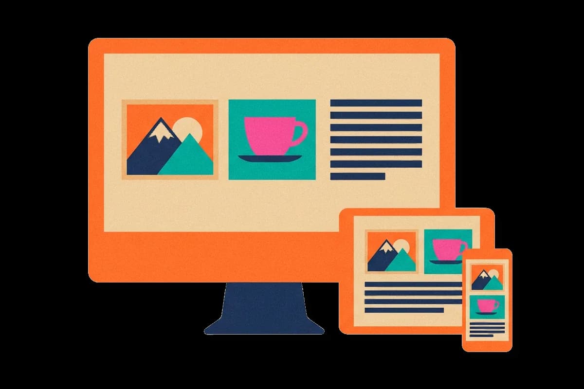
Once the phone version works, the team widens the screen in the design tool and looks at what the extra space allows. On the wide screen, the team adds the side menu and the extra settings back. The phone version is the core, and each larger layout adds to it.
This order is called progressive enhancement: a basic version that works everywhere, then additions for devices that can use them. The older opposite is graceful degradation, which starts from the full desktop version and removes parts for smaller or weaker devices.
How it shows up in the code
The same order is used when writing the page's CSS, the language that styles a web page. The rules written without any condition describe the phone layout. The team then adds media queries, which are rules that apply only when the screen is at least a stated width. The widths where the layout changes are called breakpoints.
MDN, the Mozilla web documentation, describes the common pattern as a simple single column for narrow screens first, then more columns once the screen is wide enough. Responsive design covers fluid grids, flexible images and media queries in full. Mobile first adds one decision to it: which size is written first.
042 min
Designing for fingers, thumbs and one hand
A narrow layout is half of the change. The other half is how people operate a phone. A mouse pointer can rest on an icon and show a tooltip, but a finger cannot rest on anything without tapping it. Anything that appears only on hover is out of reach on a touch screen, so mobile first teams remove hover-only controls and make every control something a person can tap.
Hands matter too. The designer Steven Hoober and a few other researchers made 1,333 observations of people using phones on streets, in airports, at bus stops and on trains, over two months that ended in January 2013. Of the people he saw touching their screens, 49% used one hand. The other 51% used both hands, either to type with two thumbs or to hold the phone with one hand while tapping with the other.
That split affects where controls go. A thumb reaches some parts of a screen easily and others hardly at all, which is the subject of thumb zone.
How large a tap target must be
Fingers are less exact than a pointer, so a tap target, meaning any button or link a person taps, needs room around it. WCAG, the Web Content Accessibility Guidelines, is the widely used accessibility standard for the web. WCAG 2.2 success criterion 2.5.8, Target Size (Minimum), sets the AA level at 24 by 24 CSS pixels for pointer targets, with exceptions such as enough spacing between small targets.
A common misreading of the 44 pixel rule
Many mobile first guides say a tap target must be 44 pixels. WCAG does not make that the minimum. The 44 figure appears at level AAA, the strictest level, in success criterion 2.5.5, Target Size (Enhanced), which asks for 44 by 44 CSS pixels. A team that treats 44 as a fixed rule may be stricter than needed in a dense table. A team that stops at 24 may be below what a thumb needs on the main button. Choose the size by how often a control is used and how costly a wrong tap is.
051 min
Mobile first indexing in Google Search
Mobile first has a second meaning in search. Google uses the phone version of a page, fetched by its smartphone crawler, to decide what the page contains and how to rank it. This is called mobile-first indexing. A site whose phone page holds less than its desktop page is ranked on the smaller amount.
Content that exists only on the desktop page
Suppose the account page team cut the table of past invoices from the phone version to save space. Google reads the phone version, so the table counts for nothing in search. Google advises site owners to make the phone version hold the same primary content as the desktop version.
The phone page does not have to look the same. Google's guide says a different design on mobile is fine, for example moving content into accordions or tabs. The content has to be there, though.
How long the switch took
The change was slow. Google began mobile-first crawling and indexing in 2016, and on 31 October 2023 it announced that the move was complete. Sites moved over one at a time, so for several years some were indexed from their phone page and others from their desktop page.
061 min
Mobile first and accessibility
A narrow layout also helps people who never use a phone. Some people with low vision zoom a desktop page to 400%. At that zoom, a window 1280 pixels wide shows the same amount of page as a 320 pixel window.
WCAG 2.2 success criterion 1.4.10, Reflow, treats a width of 320 CSS pixels as equal to a window 1280 CSS pixels wide at 400% zoom. A page whose base layout is a single column for a narrow screen already fits that width, so the same CSS serves the phone user and the person who zooms. The wider subject is covered in accessibility.
072 min
Where mobile first goes wrong
Suppose the account page team now ships the phone layout on every screen. On a large monitor the menu is a small icon in a corner and most of the page is empty. This has been measured on real sites.
In 2016 Nielsen Norman Group, a user experience research firm, tested 179 users on six sites: 7digital, BBC, Bloomberg Business, Business Insider UK, Supermarket HQ and Slate. Several desktop versions had borrowed phone patterns, such as a menu hidden behind an icon and a search icon in place of a search box. Nielsen Norman Group concluded in 2016 that the desktop versions of the sites it tested had suffered because they were likely built mobile first.
The firm's advice was that content and features can match across devices while the interface does not, because each platform has different capabilities. The lesson is not to avoid mobile first. Each larger layout is a design step of its own.
When the phrase means something else
The phrase has several uses, and they get mixed up. In 2012 the web designer Brad Frost listed them under the headings culture, strategy and design. In the strategy sense, the phrase is sometimes used for the choice between a native app and a website. Brad Frost wrote in 2012 that using mobile first to mean building a native app before a website is incorrect. Both an app and a website are used on phones, so the choice between them is a separate decision.
The mobile-first population
In the cultural sense, Frost describes people who reach the internet mostly or only through a phone. That describes who the users are, not the order of design work. A team that knows many of its users have only a phone has a stronger reason to start there.
When your audience is not on phones
Mobile first assumes that most people arrive on a phone, and that assumption depends on where the users are. StatCounter, a web analytics company, reported that mobile and tablet use passed desktop use worldwide for the first time in October 2016. In the same month, desktop still led in the UK, at 55.6%, and in the US, at 58%.
Those figures are StatCounter's page views across its own sample of sites. Check your own analytics before assuming. A tool people use at work may see mostly desktop visits, and then the wide layout deserves more design time than the method's default suggests.
081 min
Mobile first design vs. nearby concepts
Four neighbours are often mixed up with mobile first. They differ on one axis: the question each one answers.
| Concept | The question it answers | How it differs from mobile first |
|---|---|---|
| Responsive design | How can one page change its layout to fit any width? | A technique. It does not say which size to design first, and a responsive site can still be designed desktop first. |
| Desktop first | What if we start with the full version? | The reverse order. Parts are removed for small screens, which is graceful degradation. |
| Mobile only | Do larger screens need a layout at all? | Mobile first still builds the wide layouts, as additions to the phone version. |
| Native first | Should the app or the website come first? | A choice of platform, not of screen size. |
A team can be responsive and mobile first, responsive and desktop first, or neither. The two ideas answer different questions, which is why they are used together so often.
091 min
Applying mobile first
Pick one product area and work through it in this order this week.
- List the tasks people come for, using analytics or support tickets, and rank them. Keep the top three to five.
- Design the phone screen with only those tasks, in one column. Put the most-used action where a thumb reaches it.
- Set tap targets by use: at least 24 by 24 CSS pixels everywhere, and larger for the main action. Remove anything that works only on hover.
- In the CSS, write the unconditional rules for the phone and add media queries for wider screens. Set breakpoints where the content starts to look wrong, not at the width of one particular device.
- Design the wide layout as its own step. Ask what the extra space makes possible, and give wide screens the navigation that suits them.
- Check that the phone page holds the same primary content as the desktop page.
- Test on real phones with usability testing. A browser window resized on a desktop does not show how a thumb behaves.
The decision to make first is the ranking in step 1. If the team cannot agree on the top tasks, no layout will fix that.
?4 questions
Questions people ask
Does mobile first mean the desktop version gets less attention?
What units should breakpoints use?
Does mobile first make a site faster?
Can an existing desktop site be converted to mobile first?
§13 sources
Sources
Luke Wroblewski (2009). Mobile First. LukeW Ideation + Design.
Matt Kapko (2010). MWC: Google CEO outlines search giant's mobile efforts. RCR Wireless News.
MDN Web Docs. Responsive web design.
MDN Web Docs. Mobile first.
Show all 13 sourcesShow fewer sources
Steven Hoober (2013). How Do Users Really Hold Mobile Devices? UXmatters.
W3C (2023). Understanding Success Criterion 2.5.8: Target Size (Minimum). WCAG 2.2.
W3C (2023). Understanding Success Criterion 2.5.5: Target Size (Enhanced). WCAG 2.2.
W3C (2023). Understanding Success Criterion 1.4.10: Reflow. WCAG 2.2.
Google Search Central. Mobile site and mobile-first indexing best practices.
Google Search Central Blog (2023). Mobile-first indexing has landed.
Nielsen Norman Group (2016). Mobile First Is NOT Mobile Only.
Brad Frost (2012). The Many Faces of Mobile First.
StatCounter (2016). Mobile and tablet internet usage exceeds desktop for first time worldwide.