011 min
Why salience decides what gets seen first
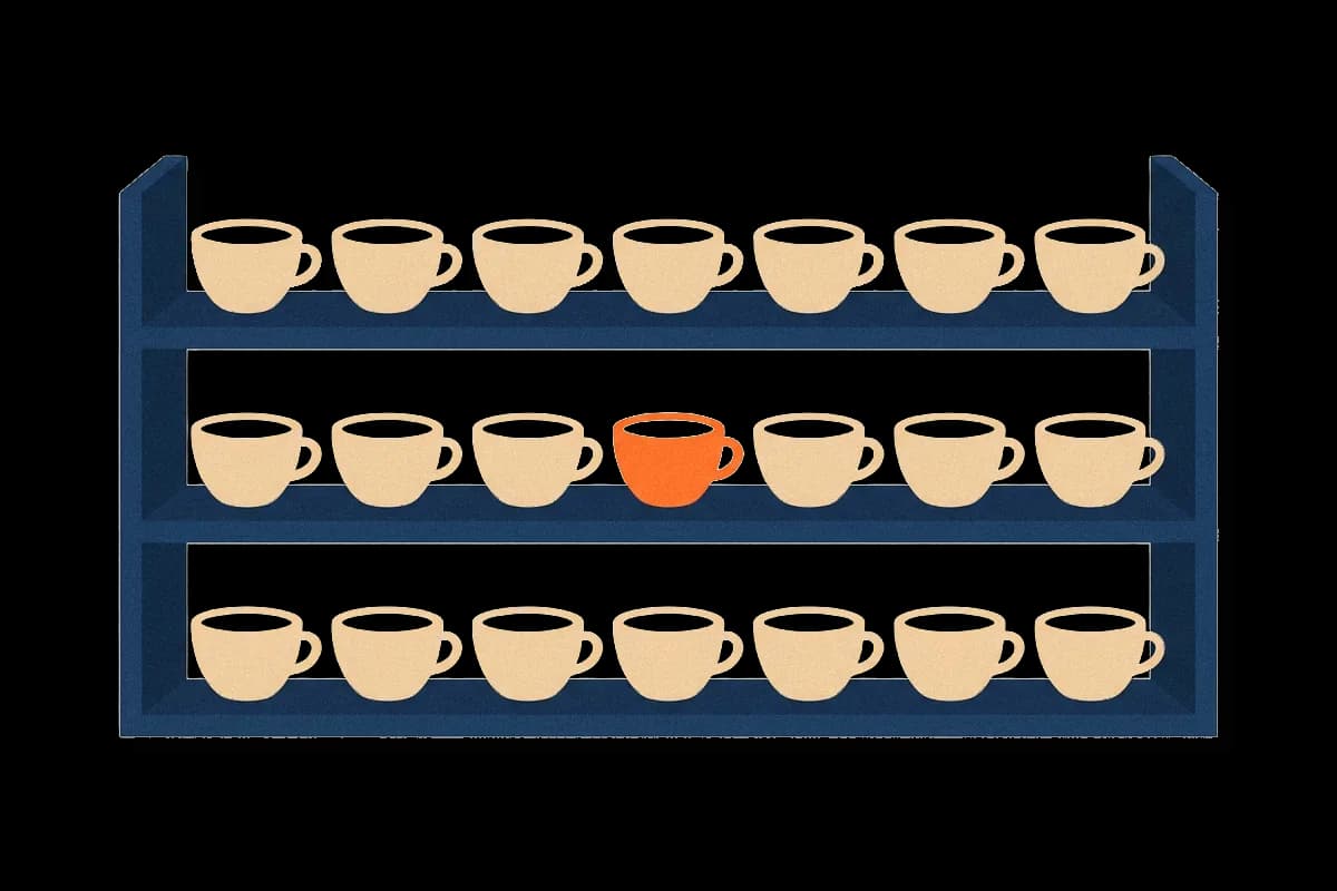
Say a designer is reviewing the payment screen of a subscription app. The "Apply coupon" link has a bright orange background. The "Pay now" button is grey, and so is every field around it. In testing, people keep stopping at the coupon link, and a few never find the button.
Both labels are clear. The coupon link wins because it differs from its surroundings and the button does not. Perception researchers call that difference salience, and they have measured it for decades. Designers use the same idea each time they decide what a viewer should see first.
This article follows the payment screen through four questions. How does a visual system score a scene? What raises the score? When do goals and habits override it? And when does a high score point at the wrong thing?
023 min
How salience is worked out
The best-known model of this scoring was published in 1998 by Laurent Itti, Christof Koch and Ernst Niebur. It splits an image into separate maps for colour, brightness and orientation. In each map, every location is compared with the area around it, so a spot that differs from its neighbours gets a high score. The maps are then added into one saliency map, and attention goes first to its highest point.
One consequence matters for the payment screen. A feature that is everywhere scores nothing. If every item on the screen has an orange background, the colour map has many equal peaks and none of them wins. Salience belongs to the scene, not to the element. A viewer with colour-blindness receives a different colour map from the same screen, so the scores differ for them too.
Across photographs from outdoor scenes to paintings, the places the model attended were mostly things of interest to a viewer, such as faces, flags, people, buildings and vehicles. Software already uses such scores to crop photos around the interesting part and to compress the rest harder.
Single differences are found at once, combinations are not
In Itti's tests, a target that differed from the others by orientation, colour, brightness or size alone was the first place the model looked, however many other items were shown. A target that differed by a combination behaved differently. Say the target is the one red horizontal bar, and the other bars are either red and vertical or green and horizontal. When a target differed only by a combination of features, the time to find it grew with each extra item. Human searchers show both patterns. The first pattern is called pop-out. On the payment screen the orange coupon link pops out, because colour alone separates it from everything near it.
Attention moves on after each pick
The model needs a rule for what happens after it picks the highest point. After each pick the model suppresses that region for a short time, so the next-highest point wins and attention cannot go straight back to the place it just left. Itti's team called this inhibition of return, and it had already been shown in human experiments.
Colour cues fail in the dark
The model ignores hue differences in very dark regions, because hue cannot be seen there. This is a warning for dark themes and dim rooms. A coloured accent on a near-black surface may not be noticed through its colour at all, so brightness or size has to carry it.
A busy area is not a salient area
Itti's team also compared the model with a measure of local detail. Areas with strong variation that was the same everywhere, such as speckle noise, scored high for detail but low for salience. A busy texture therefore does not get noticed first. A single break in the texture does.
031 min
Where the idea of salience comes from
The experiments came first. Anne Treisman's feature integration theory, built on experiments she ran with Garry Gelade in 1980, held that a unique feature is found no matter how many other items are present. Her explanation was an early stage of seeing that handles basic features, such as colour and orientation, across the whole visual field at once, before attention selects anything.
In 1985 Christof Koch and Shimon Ullman proposed a circuit design in which attention follows a map of local differences. Itti, Koch and Niebur turned that design into a working computer model in 1998, one that could be run on any image. From 1989, Jeremy Wolfe and colleagues built guided search models that add the viewer's goals, which the section on goals returns to.
Where the first theory fell short
The first theory said that a combination of two features has to be searched one item at a time. During the 1980s, researchers found that searches for a combination of two features were often faster than the theory allowed. Viewers can use what they know about the target, such as its colour, to narrow the search before they look. That makes salience one input among several.
042 min
What raises the salience of an element
Back to the payment screen. The coupon link wins because it differs on a feature the visual system measures early. A designer has a short list of such features to work with:
- Colour: a hue that few nearby items share.
- Brightness contrast: an item much lighter or darker than its surroundings.
- Size: larger or smaller than the neighbours.
- Shape, orientation and texture: the odd form in a group of similar ones.
- Motion: change over time, the feature that is hardest to ignore.
- Position and white space: an item with empty space around it differs from a crowded neighbourhood.
Each lever works only against its context, so the useful question is never "is this bright?" but "is this brighter than what is around it?". Levers can be combined. If the coupon link were both orange and larger, it would differ in two maps instead of one. The same rule governs a call to action, a price, a navigation label, one highlighted bar in a chart, a product on a shop shelf and a title in a streaming row. Each competes with its neighbours for the first look. Reading paths such as the Z shape and the F shape, which designers often draw over layouts, describe where people tend to look. They are a reason to test placement, not a measure of salience.
Salience also works away from screens. In the men's washrooms at Schiphol Airport in Amsterdam, a small fly image was etched into the bowl of each urinal. The image is a small mark on plain porcelain, so it differs from its surroundings and gives the eye a place to settle. An airport manager told NPR in 2009 that spillage dropped by 80 percent after the flies were added. NPR's report also credits an urge to aim at a target, so contrast is probably only part of the effect.
051 min
When goals override salience
Testers on the payment screen came to pay, and a goal changes the scores. With no task, attention goes to the highest point of the saliency map. With a task, the viewer's knowledge of the target changes how much each map counts. Picture someone searching a bin of brightly coloured toys for one red plastic dragon. Before they decide what to look for, no single colour is noticed first. Once they decide, every red toy is noticed. Salience is the viewer's response to a scene, so it shifts when the viewer's purpose shifts.
Salience is one input among five
The 2021 version of Jeremy Wolfe's guided search model combines five sources of guidance into one priority map: the viewer's knowledge of the target, bottom-up feature differences, recent history, reward, and the structure and meaning of the scene. Attention goes to the highest point on that map. A screen designer controls only one of the five, the bottom-up differences. The other four belong to the viewer and the task, which is why a high score in a design review can still fail in use.
062 min
When salience and importance disagree
The payment screen has one more problem. Even after the coupon link is toned down, testers may miss the Pay button if they expect it somewhere else. Expectations are learned, and they can beat salience.
Meaning can outweigh salience
In 2017 John Henderson and Taylor Hayes had people view photographs of scenes. They compared where people looked with two maps: a saliency map, and a map of how meaningful each region was, rated by other people. The two maps overlapped a great deal. Once the overlap between the two was removed, only the meaning map explained where people looked. A fair reading is that salience matters because it often points at meaningful things, not because the eye follows contrast alone.
Phone screens
A 2020 study of mobile app screens asked the same question about interfaces. Luis Leiva and colleagues studied 30 participants viewing 193 screens. Viewers looked mostly at the top-left corner, at text and at images, colour and size mattered less, and models built for photographs fitted this poorly until they were retrained on screens.
Designers' own artefacts
A team led by Zoya Bylinskii separated salience, which is bottom-up, from importance, which also depends on what an element is, such as a title or an axis label. They trained models on human clicks across hundreds of graphic designs and data visualisations, so the models predict what viewers treat as important and not only what differs.
Banner blindness
The strongest case against raw salience is banner blindness, the habit of skipping items that look like ads or sit where ads usually sit. In a Nielsen Norman Group eye-tracking study, 26 people looked up how to remove a label from a jar. On that page, which had ads in the top banner and the right column, they read the text and looked very little at the ads. Ads are built to differ from the page around them, yet these viewers had learned to skip the places where ads appear.
071 min
Applying salience to a screen
For the payment screen, a designer can work in this order.
- Decide what must be seen first, before choosing any style. Here it is the Pay button.
- Give that item one clear difference from its neighbours, using one lever from the list above. Add a second only if the first is not enough.
- Reduce competition. The coupon link should differ less than the button, or sit lower on the screen.
- Check the result in poor conditions: a small screen, a dark theme and a colour-blind simulation.
- Test with real tasks. People in a hurry to pay behave differently from people looking at a screenshot.
Two limits apply. When many items differ strongly, none of them wins and the screen reads as noise. And the same lever can hide things. A bright "Accept" button beside a faint "Decline" link is a recognised dark pattern, a design that steers people against their own interest. Use salience on what the viewer came to do.
081 min
Salience and accessibility
Two WCAG 2.2 criteria bear directly on salience. SC 2.2.2 Pause, Stop, Hide (Level A) requires a way to pause, stop or hide any moving, blinking or scrolling content that starts automatically, lasts more than five seconds and sits beside other content. The W3C notes that continuous movement distracts some people with cognitive disabilities or attention deficits. Motion is the strongest lever, so it is also the one that can make the rest of a page hard to use.
SC 1.4.1 Use of Color (Level A) says colour cannot be the only way to carry information. That also protects viewers whose colour channel differs, such as people with colour-blindness, who receive a different saliency map from the same screen.
091 min
Salience vs. nearby concepts
Several neighbouring ideas share the word or the idea, and each answers a different question.
| Concept | What it describes | What separates it from salience |
|---|---|---|
| PsychologySalience bias | ||
| PsychologyVon Restorff effect | ||
| DesignVisual hierarchy | ||
| DesignPreattentive attributes |
Salience is the result of those inputs in one particular scene, and the first look it predicts. Visual hierarchy is what a designer builds with it. Salience bias is what a viewer may do with the outcome later.
The word has other senses too. Linguists use it for prominent words, political scientists for the issues voters care about, and clinicians for the importance a person gives to experiences. This entry covers the perception and design sense only.
?4 questions
Questions people ask
How can I measure the salience of a design?
Does salience affect everyone the same way?
Can a design have too much salience?
Does salience work for sound or touch?
§11 sources
Sources
Laurent Itti, Christof Koch and Ernst Niebur (1998). A model of saliency-based visual attention for rapid scene analysis. IEEE Transactions on Pattern Analysis and Machine Intelligence, 20(11).
Anne Treisman and Garry Gelade (1980). A feature-integration theory of attention. Cognitive Psychology, 12(1). (80)90005-5
Jeremy Wolfe (2021). Guided Search 6.0: An updated model of visual search. Psychonomic Bulletin & Review.
Laurent Itti (2007). Visual salience. Scholarpedia, 2(9):3327.
Show all 11 sourcesShow fewer sources
John Henderson and Taylor Hayes (2017). Meaning-based guidance of attention in scenes as revealed by meaning maps. Nature Human Behaviour, 1 (author reprint).
Luis Leiva and colleagues (2020). Understanding visual saliency in mobile user interfaces. MobileHCI 2020.
Zoya Bylinskii and colleagues (2017). Learning visual importance for graphic designs and data visualizations. UIST 2017.
Kara Pernice, Nielsen Norman Group (2018). Banner blindness revisited: users dodge ads on mobile and desktop.
W3C. Understanding SC 2.2.2: Pause, Stop, Hide (WCAG 2.2).
W3C. Understanding SC 1.4.1: Use of Color (WCAG 2.2).
Robert Krulwich, NPR (2009). There's a fly in my urinal.