011 min
Why preattentive attributes matter on a crowded screen
Picture a designer on an on-call tooling team. Their service table has forty rows, and each row has a status badge in one of five colours. During an outage, the engineers on call read the table row by row until they find the service that is failing. That takes too long, so the designer is asked to make the failing row easier to find.
The designer cannot answer this by asking which row matters most. Whether a viewer finds one item at once depends on which visual properties that item has and the other items lack. Psychologists measured this with letters and shapes long before dashboards existed, and the next section starts with their experiment.
022 min
Where preattentive attributes come from
Psychologists had asked the designer's question long before dashboards existed: how does a person find one object among many? In 1980 Anne Treisman and Garry Gelade tested it with hand-made cards. They drew letters with stencils and coloured inks on white cards, and they timed volunteers who said whether a target was on the card.
Some cards held a target that differed from the other letters in one feature, and other cards held a target that differed only in a combination of two features. A feature here means one value on one dimension, such as the colour blue or the shape S. In the one-feature task the target was a blue letter or an S, and the other letters were green Xs and brown Ts. In the combination task the target was a green T among those same letters. The green T had the colour of the Xs and the shape of the Ts, so only the pair was unique.
What the cards showed
The cards held 1, 5, 15 or 30 letters. With a one-feature target, each extra letter on the card added only about 3 milliseconds to the search time when the target was present. With the green T, the time rose steadily with every letter added. With the green T, each extra letter added far more, and the authors put the scanning rate at about 60 milliseconds per letter. On a card with a single letter there was no such gap, so the extra difficulty appears only when there are several letters to choose from.
Treisman and Gelade explained the difference with feature integration theory. The visual system, they proposed, sorts a scene into separate features such as colour and orientation, and it does this for the whole scene at once, with no effort. Only a later step, which needs focused attention, joins the features into objects. The properties that the first step can use alone are what designers now call preattentive attributes.
Béla Julesz, who studied textures, reached a matching view in 1981. Julesz proposed that the first stage of vision picks up certain basic features, which he named textons.
032 min
How preattentive attributes work
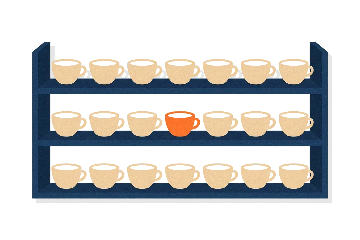
The experiment gives a rule about what a viewer finds in one glance. A target that has its own value on one dimension is found directly, however many other items surround it. Researchers say that such a target pops out, meaning that viewers find it at once without searching. A target defined only by a combination of values is not found directly, because each of its values is shared with other items. The viewer has to check the items one after another.
Christopher Healey, a computer scientist who studies perception in visualisation, gives a clean example. A red circle among blue circles pops out by colour, and a red circle among red squares pops out by shape. A red circle among a mix of red squares and blue circles does not pop out, because a search for red finds the squares and a search for circles finds the blue circles.
The search slope
Researchers measure this with a slope: the extra milliseconds that each added item costs. Jeremy Wolfe and Todd Horowitz, in a 2004 review, treat the slope as the main test. A slope close to zero makes it more likely that a feature guides attention to the target. The slope does not give a perfect verdict, because some combinations of features also produce shallow slopes.
Why the limit is about 200 to 250 milliseconds
Researchers usually call a task preattentive when viewers can do it on a large display in less than about 200 to 250 milliseconds. The time matters because eye movements take at least 200 milliseconds to start. A viewer who answers within that time has judged the whole display in a single look.
Why combinations need attention
Feature integration theory also predicts what goes wrong when attention is not available. If attention cannot reach the objects in a display, the theory allows features of different objects to be joined by mistake, and Treisman and Gelade called these errors illusory conjunctions. So a quick glance can show that something red and something round are present without showing that one item is both.
042 min
Which preattentive attributes have the best evidence
The next question is which properties belong on the list. In 2004 Wolfe and Horowitz reviewed the search studies up to that year and sorted the candidate attributes by how much evidence supports each one. Colour, motion, orientation and size are the attributes they call undoubted. The table shows the rest of their grading.
| Evidence | Attributes |
|---|---|
| Undoubted | colour, motion, orientation, size (including length) |
| Probable | flicker, luminance polarity, shape, line termination, closure, curvature, stereoscopic depth, pictorial depth cues |
| Possible | shading direction, glossiness, expansion, number, aspect ratio |
| Probably not | intersection, optic flow, colour change, faces, a person's own name, semantic category |
Many design guides sort the attributes into form, colour, position and motion instead. The groups differ, but the best-supported attributes appear in both lists. For a designer, the first four are safe choices, and any attribute from the lower rows needs a test with real viewers.
Search speed comes in degrees
A common rule says that a slope under about 10 milliseconds per item marks a feature search. When they pooled data from many studies, the search slopes formed one continuous spread, with no clear break between fast and slow searches. A designer should expect a scale from easy to hard, not two separate classes.
Meaning does not pop out
People often assume that important things, such as a face or one's own name, are found at once. The evidence mostly says no. Wolfe and Horowitz place faces, a person's own name and categories of meaning such as 'animal' or 'scary' among the probable non-attributes. Studies that seemed to show guidance by faces were usually followed by a study showing that another visual feature was at work. A warning icon works because of its colour and shape, not because of what it means.
051 min
Preattentive attributes in real interfaces and charts
Now the designer's table can be judged against the research, and it breaks the rule. Each row asks for attention with a colour, so no row has a value that all the others lack. The five colours also make the other badges differ from each other, and Wolfe and Horowitz note that mixed distractors make a search harder.
The designer removes the colour from every healthy row, so that the failing row is the only item that differs. The healthy rows share one quiet style, and the failing row keeps a strong badge. By the research above, the engineers should find it in one look. The row still needs clear text, because a pop-out only tells the viewer where to look.
A charting example
Healey shows how several attributes can work together in one image. In an election-results demonstration on Healey's page, colour shows the party that won each congressional district and saturation shows the winning percentage. The 435 districts are drawn together, and each data value has its own attribute, so one image carries several values and none of them takes the place of another.
061 min
Applying preattentive attributes
Five moves follow from the findings.
- Pick the one thing a viewer must find, and give it a value on one dimension that no other item has.
- Give every other item the same value on that dimension. Mixed distractors make search harder.
- Choose the dimension from the best-supported four: colour, size, orientation or motion.
- Make the difference large. A colour difference that is only just visible does not give an efficient search; it has to be much larger than that.
- Add a second cue for readers who cannot rely on colour, such as an icon or a word with the same meaning.
Then keep the strong cue for one thing. A screen where five items all have a strong cue gives the viewer five targets, and the next section explains why that backfires.
071 min
When one preattentive attribute hides another
Using two attributes on one screen brings a second problem, because some attributes interfere with others. Healey describes a feature hierarchy. When colour varies at random in the background, viewers have trouble seeing a pattern made of shapes. Random variation in shape does not stop viewers from seeing a pattern made of colour. So a screen that uses colour freely for decoration can make shape cues harder to see.
Healey's advice is to give the most important data the most salient attribute, and to avoid mappings where secondary values mask the one the viewer wants to find.
082 min
When preattentive attributes fail
Even a well-chosen attribute stops working under some conditions.
A second bright item slows the search
Jan Theeuwes asked volunteers to find the one diamond among circles. When one of the circles was also a different colour, volunteers took longer to find the diamond, even though the colour had nothing to do with the task. A screen with two strong cues gives each of them a worse chance, so reserve the strongest cue for one thing.
Targets between their distractors are hard to find
Search is also inefficient when distractors lie on both sides of the target in colour or orientation. Wolfe and Horowitz give a colour example: an orange target is easy to find among red distractors, and easy among yellow ones, but harder among a mix of both. The same holds for orientation. A vertical line is easy to find among lines that all tilt left, and difficult among lines that tilt both ways.
Practice does not turn a combination into one feature
A natural hope is that practice will make a combination as easy as a single feature. Treisman and Gelade tested it. Volunteers searched for the same green T over up to 13 sessions, and the search never became parallel. They concluded that joining colour and shape into one detector is difficult and may be impossible. Do not assume that users will learn to read a two-attribute code at a glance.
Colour alone leaves some readers out
Colour is the attribute designers use first, and some readers cannot use it. WCAG success criterion 1.4.1, Use of Color, says that colour must not be the only way to convey information, indicate an action, prompt a response or distinguish an element. People with colour deficiencies may not see the difference, so a failing row that differs only in colour needs a second cue. The accessibility page covers the wider standard.
091 min
Common misreadings of preattentive attributes
'Preattentive' does not mean 'without attention'
The word suggests that attention plays no part. Healey notes that attention matters even in this early stage of vision, and that the word stays in use because it describes how quick and easy the detection is. Wolfe and Horowitz go further and avoid the word in their review, because they treat these attributes as ones that guide where attention goes. A useful reading for a designer is practical: these are the properties that tell a viewer where to look first.
A pop-out does not always capture attention
A second misreading says that a pop-out item always pulls the eye, whatever the viewer wants. Theeuwes concluded that the most salient item captures attention automatically, whatever the viewer is trying to do. Other researchers disagree. In the contingent-capture account of Folk and colleagues, only items that match what the viewer is looking for capture attention. The dispute is still open, so do not count on a bright item to interrupt someone who is concentrating on something else.
Noticing fast is not reading exactly
Spotting that one item differs is quicker than judging by how much. A bright badge says where to look. It does not say how large the difference is, so a chart that needs readers to compare values should show them with a scale or labels.
101 min
Preattentive attributes vs. nearby concepts
Four neighbouring ideas are often mixed up with this one. Salience is how strongly an item stands out, and preattentive attributes are the properties that produce it. Visual hierarchy is the order in which a whole layout is read, and it uses these attributes as one of its tools. The Von Restorff effect is about memory for the item that differs. Gestalt principles describe how the eye groups items.
| Concept | What it describes | The one difference |
|---|---|---|
| PsychologySalience | ||
| DesignVisual hierarchy | ||
| PsychologyVon Restorff effect | ||
| DesignGestalt principles |
?3 questions
Questions people ask
Can I use more than one preattentive attribute on the same item?
Do preattentive attributes work on paper as well as on screens?
How can I test that a highlight really pops out?
§6 sources
Sources
Show all 6 sourcesHide sources
Anne M. Treisman and Garry Gelade, "A Feature-Integration Theory of Attention", Cognitive Psychology 12 (1980). cs.princeton.edu
Béla Julesz, "Textons, the elements of texture perception, and their interactions", Nature 290 (1981). nature.com
Jeremy M. Wolfe and Todd S. Horowitz, "What attributes guide the deployment of visual attention and how do they do it?", Nature Reviews Neuroscience 5 (2004). search.bwh.harvard.edu
Christopher G. Healey, "Perception in Visualization", North Carolina State University. csc2.ncsu.edu
Jan Theeuwes, "Top-down search strategies cannot override attentional capture", Psychonomic Bulletin & Review 11 (2004). research.vu.nl%202004b%20u.pdf)
W3C, "Understanding Success Criterion 1.4.1: Use of Color", Web Content Accessibility Guidelines 2.2. w3.org