012 min
What closure says
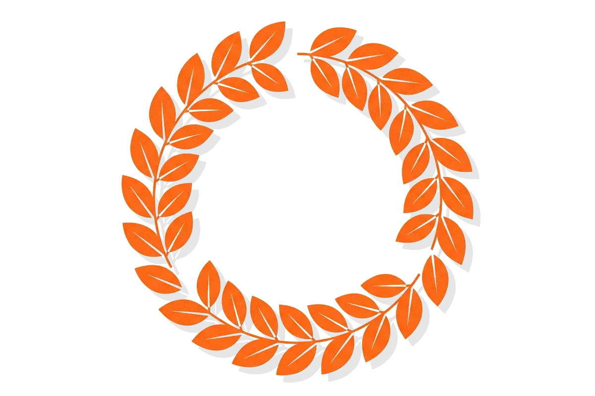
Closure describes what a viewer does with a gap. If the parts of a shape are close enough and arranged so that a whole shape is the simplest explanation, the viewer sees the whole shape. The gap does not stop them from recognizing it.
Three conditions make this happen. First, the visible parts must suggest one outline, such as the edge of a circle or the corner of a square. Second, the gaps must be small compared with the parts. Third, no other shape must explain the parts better. When any of these fails, the viewer sees fragments again.
A shape with part of its outline missing is still read as one shape, as long as the visible parts point to a single outline.
Closure works at two levels, and the two are often mixed up.
Closure as grouping
The original statement is about grouping. When elements form a closed unit, they are seen together. Two lines that are each part of a box belong to the box. Two lines that are only close to each other do not.
Closure as completion
The common design meaning is about completion. A circle drawn with a small gap is still seen as a circle. Researchers call the edge that people see across the gap an illusory contour, which is a perceived edge with no change in brightness or color along it.
Both meanings follow the same idea. The visual system prefers one whole object to several unrelated pieces. In some patterns closure competes with continuity.
022 min
Where closure comes from
Closure belongs to Gestalt psychology, a school of researchers in early twentieth-century Germany. They argued that people see organized wholes first and parts second. Max Wertheimer set out the grouping laws in a 1923 paper, "Laws of Organization in Perceptual Forms". Wolfgang Kohler and Kurt Koffka were the other founders of the school.
Max Wertheimer named the factor of closure in 1923: if four elements form two self-enclosed units, people see those two units rather than another pairing. He added a limit in the same passage. Closure is not always the strongest cue. In one of his figures a smooth, continuous curve wins over three closed areas. He called that cue the "good curve", the idea behind what designers now call continuity.
In the passage above, Wertheimer did not describe closure as filling a gap. That reading came later, from the study of illusory contours. Gaetano Kanizsa separated modal completion from amodal completion in 1955. Modal completion means the viewer sees the missing edge itself. Amodal completion means the viewer sees a partly hidden object as whole, with no visible edge across the hidden part.
Most popular lists of design principles combine the two ideas under one name. That is why a page about closure can show either a grouping diagram or a broken circle. Both are correct uses of the word, and a designer should know which one they mean.
031 min
The Kanizsa triangle: closure with nothing drawn
The standard demonstration is the Kanizsa triangle. It shows three black discs, each with a wedge removed, and three open V shapes. Most viewers report a bright white triangle lying on top of the discs, and a second triangle with a black outline behind it. None of the triangles that people report seeing in the figure is actually drawn.
The upward triangle is a case of modal completion, because viewers also report that it looks brighter than the page around it. The downward triangle is a case of amodal completion, because it seems to continue behind the discs without a visible edge.
A common explanation is that the visual system rejects coincidence, because one surface occluding another is a more likely cause of the pattern than a precise arrangement of unrelated fragments. The figure matches that cause. Three discs with matching wedges missing, all pointing at one center, are unlikely to be an accident. One triangle covering three discs is a simpler explanation, so that is what the viewer perceives.
The demonstration also shows the limits. If the wedge angle changes, the sides of the illusory shape bend inward or outward. If the black elements are too thin, the shape disappears. Closure needs inducers that are strong enough and aligned well enough to point at one outline.

041 min
What happens in the visual system
Closure is not only a habit of attention. Neurons respond to the missing edge.
In 1989, von der Heydt and Peterhans recorded from the visual cortex of alert rhesus monkeys and found that 45 of 103 neurons in area V2 signaled the orientation of an anomalous contour. Almost no neurons in the earlier area, V1, did so. The stimulus in that study was two gratings of thin lines offset by half a cycle. Human observers perceive an edge at the border between the two, although no line is drawn there. In this study the edge was signaled in V2 and, with one exception, not in V1.
A 1999 brain imaging study by Mendola and colleagues found that illusory and real contours activate overlapping areas of the human visual cortex. The same study found differences across areas, so the two kinds of contour are processed in similar places but not in the same way.
A practitioner should take two points from this. First, closure is a property of early perception, not a learned taste. A viewer does not need training or a cultural reference to see the complete shape. Second, because it runs before the viewer thinks about the image, it can be tested. If a group of people look at a mockup for one second and most of them name the object correctly, the gaps are small enough.
052 min
How closure shows up in real interfaces and logos
Closure is easiest to check in logos, because the logos are public and the gaps are visible.
NBC peacock
In the NBC logo, the white space between the colored feathers holds no outline of a peacock, yet people see a peacock. The shape of the bird comes from the arrangement of the feathers and the negative space around them. Nielsen Norman Group uses this logo as its example of Gestalt closure in design.
WWF panda
The WWF panda logo was redrawn in 1986 so that the viewer completes the symbol. The San Francisco office of Landor did the 1986 work. The black patches are drawn, and the outline of the body is partly left open between them. The viewer perceives a complete panda from patches of black. The logo prints in one color, works at small sizes and does not need an outline to do so.
Olympic Games marks
Olympic Games logos from 1972, 1984, 1988 and 1994 all use illusory contours. Logos for the games are designed to work on flags, tickets and screens of very different sizes, so a mark that survives missing detail is useful.
A second case: closure versus figure and ground
The FedEx wordmark, designed in 1994 by Lindon Leader of Landor Associates, contains a right-pointing arrow in the negative space between the E and the X. That arrow is a different effect. It comes from figure-ground, where the space between two letters becomes a shape of its own. In the NBC and WWF cases, the viewer completes a missing edge. In the FedEx case, the viewer reads the empty space as an object. The two logos look similar in spirit and work differently.
The violated case: the false floor
Closure can also hurt an interface. Nielsen Norman Group warns that a page that looks complete can stop people from scrolling, and advises cut-off text as a signifier that more content is below the fold. A full-width hero image that ends exactly at the bottom of the screen looks like the end of the page. The viewer perceives a finished composition and stops. The remedy is to break the shape on purpose, so that it no longer looks closed.
A card list
A product designer builds a horizontal list of cards on a phone. If the last visible card is cut by the screen edge, the viewer sees a card that continues. If every card fits exactly, the list looks complete, and users may not swipe. This is not a measured result, so test it with users before relying on it.
062 min
Applying closure
These moves are small enough to try this week.
Remove the outline you do not need.
In an icon or logo, delete the part of the outline that the remaining shapes already imply. Keep the parts that carry the shape's identity.
Keep the gaps small and consistent.
Gaps of similar size read as a design choice. One large gap among small ones reads as a mistake.
Let content run past the edge.
In a carousel or a list, cut the last item at the edge of the screen to show that there is more.
Close a group on purpose.
If elements must read as one unit, such as a card or a form section, give the group a closed boundary. Enclosure, a region drawn around the items, is a stronger cue than most gaps.
Test at the smallest size.
Show the mark at the size it will actually be used, for one second, and ask what people see.
Where applying closure backfires
Closure depends on a viewer being able to name what the shape should be. A new brand mark with no known reference has no complete shape to return to. Gaps that look elegant at a large size can become noise at 16 pixels, where two small parts merge into a blob. A control that relies on closure, such as a button drawn as a partial outline, can also be read as broken.
071 min
How to spot closure going wrong
A reviewer can check for these in a usability session or a design review.
- Participants name the wrong object when they see a logo or icon for one second.
- A control drawn as an open outline is skipped, or tapped by mistake as decoration.
- A list or page ends with a clean edge, and the session recordings show no scrolling past it.
- Two small shapes at a reduced size merge, and the icon looks like a different symbol.
- Participants ask whether a shape is finished, which means the gaps look like a fault.
081 min
Accessibility
Closure helps people with some kinds of vision, because a viewer can recognize the whole shape from partial information. It also assumes that the viewer can see the parts. WCAG 2.2 Success Criterion 1.4.11, Non-text Contrast, asks that meaningful visual cues reach a contrast ratio of at least 3:1 against the background. If the parts that induce closure are drawn in a pale gray on white, a low-vision viewer sees fewer of them and the shape does not form. Screen-reader users get no benefit from closure at all, so a shape that carries meaning needs a text alternative.
091 min
Closure vs. nearby concepts
Closure is one of several grouping and shape principles from the same school. The table separates them by the question each one answers.
| Concept | The question it answers | Example |
|---|---|---|
| This pageClosure | ||
| PsychologyContinuity | ||
| DesignFigure-ground | ||
| DesignProximity | ||
| Not in the library yetSimilarity |
The most common mistake is to call any hidden shape closure. If the hidden shape is formed by the empty space between objects, the effect is figure-ground. If the hidden shape is a missing part of an object that is drawn, it is closure.
Two other terms share the word. Choice closure is the relief a person feels after a decision is made, which comes from psychology and has no link to visual shape. Closure in programming means a function that keeps access to the variables around it. Neither is covered here.
?7 questions
Questions people ask
What is closure in design?
What is an example of closure?
How is closure different from figure-ground?
Who discovered the closure principle?
How big can a gap be before closure fails?
Does closure work for everyone?
Can closure make an interface worse?
§10 sources
Sources
Show all 10 sourcesHide sources
Max Wertheimer, "Laws of Organization in Perceptual Forms" (1923), translated in Ellis, A Source Book of Gestalt Psychology (1938). Classics in the History of Psychology.
Dejan Todorovic, "Gestalt principles", Scholarpedia.
The Illusions Index, "Kanizsa Triangle".
R. von der Heydt and E. Peterhans, "Mechanisms of contour perception in monkey visual cortex. I. Lines of pattern discontinuity", Journal of Neuroscience, 1989.
J. D. Mendola, A. M. Dale, B. Fischl, A. K. Liu and R. B. H. Tootell, "The Representation of Illusory and Real Contours in Human Cortical Visual Areas Revealed by Functional Magnetic Resonance Imaging", Journal of Neuroscience, 1999.
Nielsen Norman Group, "5 Principles of Visual Design in UX".
Nielsen Norman Group, "Scrolling and Attention".
Logo Design Love, "World Wildlife Fund logo".
Wikipedia, "Illusory contour" and "FedEx".
W3C, "Understanding SC 1.4.11: Non-text Contrast", WCAG 2.2.