011 min
The Olympic rings and the Law of Prägnanz
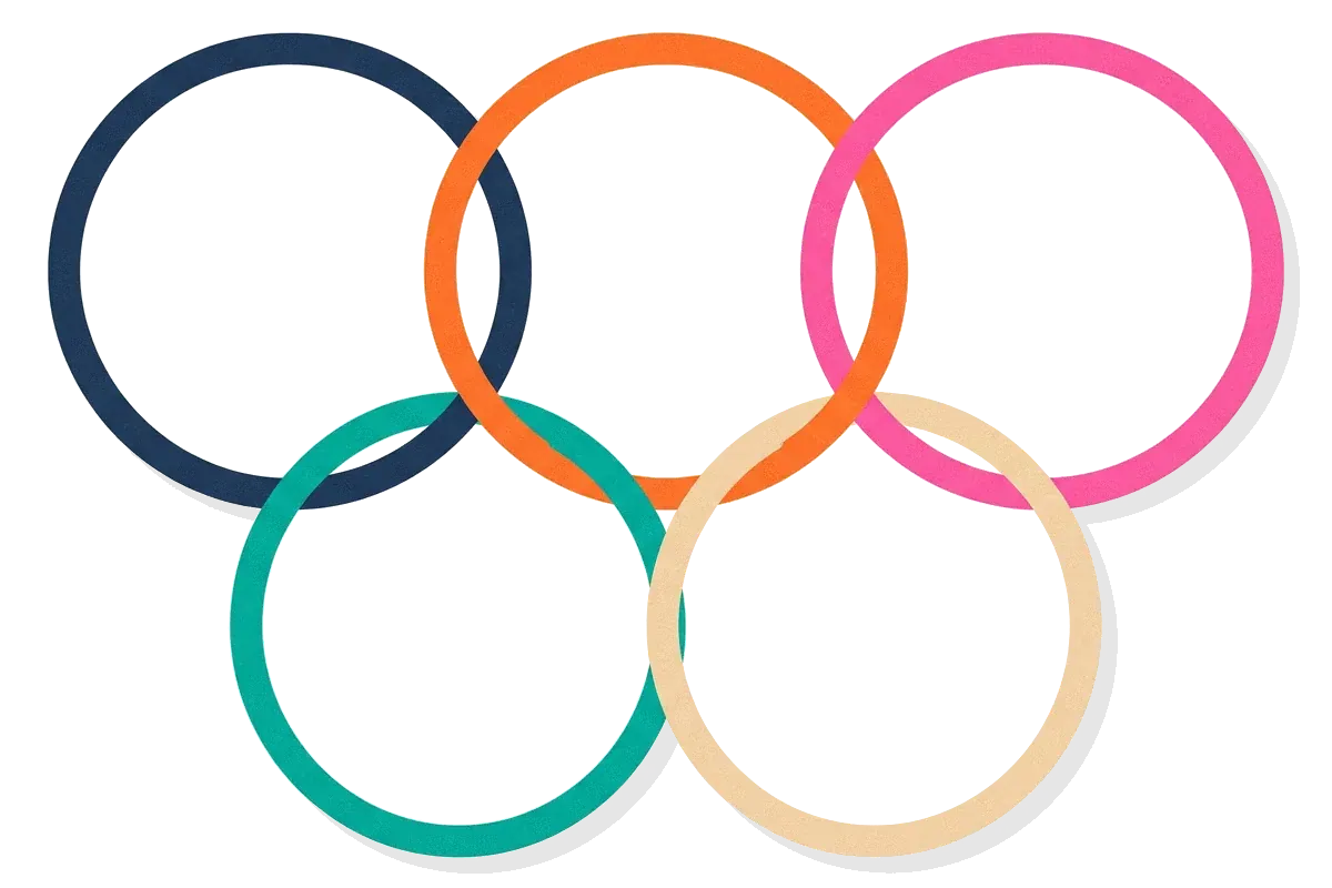
The Olympic rings are five rings that interlock. Where two rings cross, each one passes over the other once and under it once, so the picture is made of arcs and small slivers. Pierre de Coubertin created the symbol in 1913.
Describe the logo and you will probably say five circles. Nobody lists the arcs. The viewer received a complicated pattern of curved pieces and chose one simple form for it, five whole circles. Psychologists call this tendency the law of Prägnanz. Design guides also call it the law of good form, the law of good figure or the law of simplicity.
The word comes from a German verb that means to mint a coin and a Latin verb that means to press a point, and it refers to a form that is sharp, clear and distinct.
A designer cares because the choice happens before any thought. People do not decide to see five circles. They see them. A designer who can predict which form viewers will pick can arrange a layout so the intended form wins. The rest of this article follows the idea from its start, through what it claims, to the places where it stops working.

021 min
Where the Law of Prägnanz comes from
The idea has a recorded start. The first written mention of a law toward Prägnanz is credited to Max Wertheimer, in a text by Schumann dated 1914. That text reports that Wertheimer had found a general tendency toward simple forms among several Gestalt laws.
Wertheimer set the idea out in full in a 1923 paper. It opens with a plain observation. Standing at a window, he sees a house, trees and sky. He does not see 327 separate patches of brightness and colour, though a physical description could list them that way. The paper then names the factors that decide which wholes a viewer sees, such as nearness and a smooth path.
Kurt Koffka stated in his 1935 book Principles of Gestalt Psychology that the organization a mind produces is as good as the conditions permit. That sentence is the version English-language texts quote most.
033 min
What the Law of Prägnanz actually says
Koffka's statement has two parts that matter. The first is the word good. Koffka left it undefined, but it covers regularity, symmetry and simplicity. The second part is the phrase prevailing conditions. The result is only as good as the picture, the viewer and the surroundings allow. A scatter of dots with no regular form cannot be seen as a perfect shape, so viewers see the best form that is available.
The simplicity in question belongs to the whole as the viewer sees it. A picture can have many parts and still be seen as one simple form, as the rings show.
Wertheimer treated the law as the general rule behind the more specific grouping rules. Each of those says what makes a grouping best in one kind of scene. Proximity says that parts closer together are seen as a group. Continuity says that parts along one smooth line are seen as one path. Closure says that a shape with a small gap is seen as complete. In each case the rule names the organization that counts as the simplest.
The physics comparison
In 1920 Wolfgang Köhler, another founder of the Gestalt school, compared Wertheimer's tendency with a pattern in physics. A physical system that ends in a stable state tends toward the lowest structural energy its conditions allow. Köhler treated the tendency toward Prägnanz and this physical tendency as equivalent. For design, the useful part is the direction: perception moves toward a stable organization, so a layout with one clear, stable form leaves the viewer little to choose between.
Steps, not a smooth scale
When Wertheimer moved a dot between two other dots in equal physical steps, the viewer's impressions did not change in equal steps. They jumped between a small number of clear forms, which later writers call Prägnanz steps. Between two clear forms lie in-between positions that look less definite, or that flip between two forms. A layout whose spacing falls in that in-between range is likely to look unclear.
What the viewer sees differs from the page
Psychologists describe two effects. The first happens before the viewer is aware of anything: the percept already differs from the stimulus. A parallelogram, for example, tends to be seen as more rectangular than it is, and the viewer cannot notice the change. The second effect comes later, when the viewer compares what they see with a clean form and judges it to be almost a rectangle. Researchers call these primary and secondary Prägnanz.
Simplifying and sharpening
Simplifying is not the only direction. Rudolf Arnheim described simplification and complication as opposite but complementary tendencies. Simplifying removes unessential detail. Complication strengthens the features that make a form what it is. Piet Mondrian's late paintings show both: rectangles and primary colours simplify, and the irregular spacing complicates and makes the work more dynamic. A good form is therefore not always the plainest form.
042 min
How the Law of Prägnanz shows up in interfaces
The Olympic rings follow the law because their parts are regular. All five rings are the same shape and size, so a viewer does not need to work out how the pieces fit. The regularity points to five circles.
Now take a case in an interface. A designer in a design review lays out a toolbar of six icon buttons. Three actions belong together, and the other three belong together, but the gaps between all six buttons are equal. Viewers see six separate items, because equal gaps offer no simpler form. The designer narrows the gap inside each group of three and widens the gap between the groups. Now viewers see two groups. The icons did not change. Only the spacing did, and with it the form that is simplest.
Where design guides apply the law
Guides apply the law in a few repeated places. A logo made of a few regular shapes is seen as one mark. White space around a group of items separates it from its neighbours, which is distance doing the work, as in the toolbar. Google's home page puts a logo and one search box in the middle of mostly empty space, so the page offers one form to see. Wireframes, which are rough layouts with little detail, are a cheap place to check which grouping viewers see before colour and images are added. Guides also link the law to cognitive load, the effort of keeping information in mind: fewer competing forms leave less to sort out.
Grouping that only sighted users get
The groups in the toolbar exist only for people who can see the layout. A person using a screen reader gets no cue from the spacing. WCAG 2.2 success criterion 1.3.1, Info and Relationships, asks that structure and relationships shown through presentation can also be determined by software or are available in text. For the toolbar, that means marking each group of buttons as a group in the page code and giving the group a label.
051 min
The Law of Prägnanz and an icon nobody clicked
The law helps a viewer see a form quickly. It does not tell the viewer what the form means. Aurora Harley of the Nielsen Norman Group described a usability study of a website that used a clock icon in its main navigation bar. The icon opened a list of the pages the visitor had seen most recently. The graphic was easy to recognise as a clock. Its purpose was not clear, because the site used the clock in an unusual way. Not a single test participant clicked the icon.
The two cases differ in one variable. In the toolbar, the simplest form was the intended message, because grouping was the message. In the clock icon, the simplest form was a clock, and that was the wrong message. Harley's remedy is a visible text label next to every icon. Only a few icons, such as home, print and the magnifying glass for search, are widely understood without help.
062 min
Applying the Law of Prägnanz
Start from the question the law answers: of the forms a viewer could see in this layout, which is the simplest? Write the options down, then check that the simplest option is the one you intend. These moves put that into practice.
List the forms.
For each screen, write the two or three ways a viewer could group the items. If the simplest grouping is not the intended one, change the layout, not the viewer.
Use distance first.
Put items that belong together close, and give other groups more space, as in the toolbar. Make the gap inside a group clearly smaller than the gap between groups.
Repeat forms.
Use one size, one alignment and one spacing for items of the same kind. Regular parts are easy to see as one whole, and a consistent pattern is easy to recognise on the next screen.
Label icons.
Add text to every icon except the few that people already know.
Rank the groups.
Use size and contrast, as described under visual hierarchy, to tell viewers which group to look at first.
Test with a short look.
Show the screen for a few seconds, then ask people to describe or sketch what they saw. If their groups differ from yours, another form is competing.
The moves work until simplifying removes information a viewer needs. Removing the label from an icon makes a toolbar look cleaner and makes the icon harder to use, as the clock icon showed. Treat a cleaner look as a cost when it hides what a control does.
Signs a layout is working against the law
- In a session recording, people hesitate between two controls that look like a pair.
- A visible control gets almost no clicks, as the clock icon did.
- Viewers asked to sketch the screen draw different groups than you planned.
071 min
What the Law of Prägnanz does not mean
Many design guides call the law the law of simplicity and then advise using as few elements as possible. That advice is reasonable, but it is not what the law says.
Simple parts, complex whole
Van Geert and Wagemans, in a 2023 review of the history of the idea, stress that the law concerns the simplicity of the whole as the viewer sees it, and that simple parts do not guarantee a simple grouping. A page with only five elements can look disordered if the elements have different sizes and share no alignment. A dense table of identical rows and columns can look orderly, because the viewer sees one regular form.
Nearness does not always win
Wertheimer showed that nearness alone does not decide which dots are grouped. In one drawing, the dots of group B lay closer to the dots of A and of C than the dots of A and C lay to each other. If distance alone decided, B would join one of them. Viewers instead saw A and C as one group and B as another, a horizontal line and a vertical line. The better whole outweighed the shorter distance.
081 min
When Prägnanz and other grouping cues disagree
Real layouts send more than one cue at a time. When the cues agree, the grouping looks sharper. When they disagree, Metzger listed five possible outcomes in 1941: one cue wins, the viewer's perception flips between two groupings, the result looks unclear, a richer organization forms that uses both cues, or one cue wins and the other changes it slightly.
Return to the toolbar. Suppose the spacing suggests two groups of three, but the icon colours alternate across all six. The cues disagree. Some viewers will see two groups, some will see alternating colours, and the same viewer may switch. The fix is to make the cues agree by giving the icons in a group the same colour. Experience also matters: the review by Van Geert and Wagemans lists expertise and energy level among the differences between viewers that change which outcome appears.
092 min
Where the evidence on Prägnanz is contested
The law began as a description built from demonstrations, and it has never had one agreed measure. Researchers have tried to supply one.
Hochberg and McAlister in 1953 and Attneave in 1954 equated Prägnanz with high redundancy, which means a form that needs little information to describe. These measures work for specific sets of shapes, and they have limits. Hochberg later admitted that a method based only on the stimulus was too simple, because attention, meaning and familiarity also change what people see. Metzger doubted that the results would carry over from one set of stimuli to another. Van Geert and Wagemans conclude that the measures are too early-stage and too tied to specific stimuli and contexts to replace the broader idea.
Simplicity or likelihood?
A second dispute asks why viewers see the simplest form. One view says the visual system prefers simplicity. The other says it prefers the interpretation most likely to be true in the world. Researchers have usually presented simplicity and likelihood as competing explanations of why viewers see the forms they do, although the two views overlap in what they predict. In 1968 Hochberg pointed out that neither side had a quantitative measure, because simplicity is not measured and neither is likelihood.
Where that leaves a practitioner is clear enough. Use the law to form a hypothesis about what viewers will see, then test the layout with people. Do not use it as proof that a design works.
101 min
The Law of Prägnanz vs. nearby concepts
The nearest neighbour is figure-ground, which asks which region a viewer takes as the object and which as the background. The law of Prägnanz asks which overall organization wins. The other concepts below are either special cases of the law or a different kind of idea.
| Concept | What it decides | Relation to the law of Prägnanz |
|---|---|---|
| DesignProximity | ||
| PsychologyClosure | ||
| DesignFigure-ground | ||
| Not in the library yetMinimalism |
The last row is the one people mix up. A minimal page can look disordered, and a busy page can look orderly if its parts form one regular whole.
?4 questions
Questions people ask
Is the law of Prägnanz the same as the law of simplicity?
Does the law of Prägnanz apply to sound as well as sight?
Can the law of Prägnanz be measured?
Does the viewer's experience change what the law predicts?
§5 sources
Sources
Show all 5 sourcesHide sources
Van Geert, E., & Wagemans, J. (2023). Prägnanz in visual perception. Psychonomic Bulletin & Review. A review that quotes Koffka's 1935 wording and traces the idea from Wertheimer to current research.
Wertheimer, M. (1923). Laws of organization in perceptual forms, in W. Ellis's 1938 translation.
Olympic symbols, an encyclopedia entry covering the rings and their creation by Pierre de Coubertin in 1913.
Harley, A. (2014). Icon usability. Nielsen Norman Group.
W3C. Understanding Success Criterion 1.3.1: Info and Relationships, WCAG 2.2.