011 min
Digital nudging in a consent notice
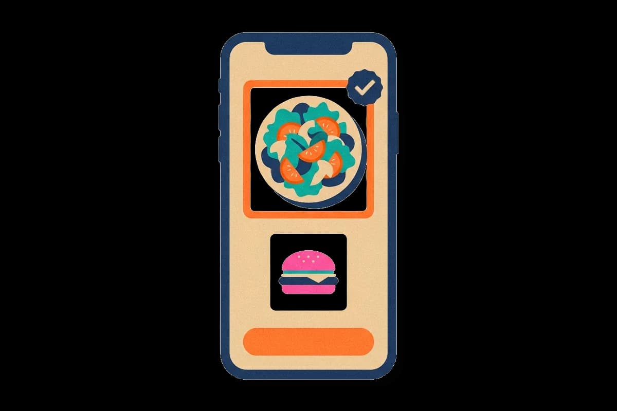
Digital nudging shows up in small layout decisions. Picture a product team that has to add a tracking consent notice to a news site. The legal wording is fixed, but the layout is not. In the first draft the notice has two buttons of equal size, one to accept and one to refuse.
Then a designer proposes a change. The accept button becomes large and filled. The refuse option becomes a small text link under it. Nothing is removed, and every visitor can still refuse. Even so, the team expects more visitors to accept, because the accept path now looks easier than the refuse path.
That change is a digital nudge. The team did not argue with visitors, pay them or hide the refuse option. They only changed how each choice looks and how much effort it seems to need. The sections below explain what makes a change count as a nudge, where the idea came from, what studies have measured, and where a nudge becomes something harmful.
022 min
What counts as digital nudging
The consent notice raises a practical question: when is a design decision a nudge, and when is it only a layout? In a 2018 article in Communications of the ACM, Schneider, Weinmann and vom Brocke gave the working answer. They define digital nudging as steering people's behavior in digital choice environments with the design elements of the user interface. A digital choice environment is any screen where a person picks between options, such as a website or an app.
Their starting point is that no screen presents choices neutrally. One option is always first, larger, preselected or easier to reach. So the person who builds the screen is a choice architect, whether they intend to be one or not.
Two limits keep a design inside the idea. First, every option stays available. Second, the price, reward or penalty of each option stays the same. Removing the refuse button would be a block, not a nudge. A discount for accepting would be an incentive, not a nudge. Both limits come from the original definition of a nudge, described in nudge theory, which digital nudging applies to screens.
Screens add three things that a printed form does not have. A change costs almost nothing to ship. The result can be measured on every visitor. And the interface can show different people different versions, using what it knows about them. That last point has a price: the more data a service holds about a person, the better it can fit a nudge to that person, and the more privacy the person gives up.
032 min
Where digital nudging comes from
Digital nudging joins two older lines of work. The first is nudging itself, which Richard Thaler and Cass Sunstein described in their 2008 book Nudge as any change in how choices are arranged that alters behavior in a predictable way without forbidding options. The second is the study of interfaces that change what users do, which researchers had examined for years under other names.
The term itself is newer. Markus Weinmann and colleagues were among the first to bring digital nudging into information systems research in 2016. In 2019, Ana Caraban and colleagues reviewed nudging studies in human-computer interaction and found 23 distinct mechanisms, grouped in 6 categories, that use 15 different cognitive biases. A cognitive bias is a regular pattern in how people judge or decide, such as keeping whatever is already selected.
An online test before the name existed
The first clear test of a digital nudge came before the term did. In 2003, Eric Johnson and Daniel Goldstein asked 161 people in an online experiment to imagine that they had moved to a new state, and to say whether they would be organ donors. One group was told the default was not to be a donor, and could confirm or change that. A second group was told the default was to be a donor. A third group had no default and had to choose. Changing the answer took one mouse click in every version.
The donation rate was about twice as high when donating was the default as when it was not. The group with no default answered much like the group whose default was to donate.
042 min
Why digital nudging works
The online experiment leaves a question: why would a preselected answer change what people do, when changing it takes one click? The reason is how people decide. Few decisions come from weighing every option. People have limited time and attention, so they use shortcuts. They accept what is already selected, take what is easiest to reach, copy what others do, and respond to what stands out. Researchers call this limit on careful reasoning bounded rationality. A nudge arranges the screen so that the shortcut leads to a particular outcome.
Designers have a small set of tools for this. The table lists the common ones.
| Nudge | What it changes | Where it appears |
|---|---|---|
| Default | Which option needs no action | A preselected checkbox, automatic renewal |
| Salience | What the eye reaches first | The size, colour and position of a button |
| Reminder or prompt | When the person is asked | A message sent before an appointment |
| Social norm | What the person thinks others do | A label saying most teams pick this plan |
| Friction | How many steps an action takes | A confirmation before deleting an account |
| Feedback | What result the person sees | A step counter or progress bar |
| Progress and commitment | How far along the person feels | A checklist with two of five steps done |
| Planning prompt | Whether the person decides when to act | A field asking which day they will start |
The default is the best studied of these, and default effect covers it in full. Other tools include scarcity and urgency messages, such as a notice that two items are left, and game elements such as streaks, which belong to gamification. Fitness apps show a ring that fills as a person nears a daily goal, and security tools show a warning before a person opens a link from an unknown sender. Recommendation lists are nudges as well, because their order decides what a person sees first.
Products deliver nudges in a few formats: a tooltip beside a control, a banner at the top of a screen, a modal window over the page, a badge on an icon, or an empty state that explains what to do first. Format and timing matter. A tip shown at the moment a person needs a feature supports onboarding and feature discovery. The same tip shown at launch is easier to ignore.
052 min
Digital nudging in studies and products
Studies of real services show these tools at work. Two of them match the news site from the start of this article.
Consent notices
The team's notice has a real counterpart. In 2019, Christine Utz and colleagues ran three experiments with more than 80,000 visitors to a German website. They varied where the notice appeared, whether it offered one yes-or-no choice or a separate choice for each category of cookie or company, and how the wording was framed. Visitors interacted more with notices placed in the lower left part of the screen. A single yes-or-no choice produced more acceptance than a notice that asked for each category separately.
Across the experiments, the authors found that the common practice of nudging had a large effect on what visitors chose. Small layout decisions, not the legal text, decided much of the outcome.
Autoplay on a streaming service
Streaming video shows a default in daily use. When the countdown ends, the next episode starts unless the viewer acts. The countdown lasts about five seconds. Infinite scroll works the same way: new items load unless the person stops.
In an experiment with 76 Netflix users in the US, Brennan Schaffner and colleagues studied what happens when autoplay is switched off. Viewers without autoplay watched, on average, 21 fewer minutes per day, and their sessions were 17 minutes shorter. The viewers did not agree on whether autoplay's benefits outweigh its effects. That split is why this nudge needs a closer look at its goal, which the next section does.
062 min
Designing a digital nudge
Knowing the tools does not tell a team which one to use. Researchers who propose design processes for digital nudging describe similar steps: define, diagnose, select, implement and measure. Say a product team sees that many people start a profile form and never finish it. The steps would run like this.
- Define one behavior and one group. "More people finish the profile form" is a target. "Improve engagement" is not.
- Diagnose the barrier. Look at where people stop and ask why. The form may be long, a field may be unclear, or people may plan to return and forget. A nudge fits a barrier of effort, attention or timing. It does not fix a feature that people do not want.
- Pick the smallest change that addresses that barrier. A long form suggests fewer fields or a progress indicator. Forgetting suggests a reminder. Clear wording and a low-risk first step also help, because people hesitate when a step seems risky for their money, privacy or time.
- Build it with an easy exit. Declining or skipping must be as simple as accepting.
- Measure against a control group. Show the new version to some people and the old one to the rest, and compare the behavior you defined, plus later behavior such as cancellations and support requests. A nudge that raises sign-ups and also raises cancellations has only delayed the problem.
072 min
Where digital nudging ends and dark patterns begin
Return to the news site. The large accept button is a nudge only under certain conditions. The same layout can serve the visitor or work against them, and the difference lies in the goal and in the cost of saying no.
Three questions separate the two:
- Does the change move people toward something they already want?
- Would it still work if the person saw exactly how it works?
- Is saying no as easy as saying yes?
A design that fails these questions is a dark pattern, an interface built to get people to do something they did not intend. The page on dark patterns lists the common types. Friction shows where the line sits. A confirmation step before deleting an account protects the person. A cancellation flow with six screens protects only the company's revenue. Researchers call needless friction of this second kind sludge.
The distance between a poor nudge and a dark pattern is small, and the harm has been measured.
Dark patterns on shopping sites
Arunesh Mathur and colleagues built automated tools to find dark patterns and applied them to shopping websites. Analysing around 53,000 product pages from around 11,000 shopping websites, they found 1,818 dark pattern instances, of 15 types in 7 broader categories. They also found 22 outside companies that sell dark patterns to shops as a ready-made service.
Mild patterns, large effects
Jamie Luguri and Lior Strahilevitz tested the effect in an experiment. Participants were offered a fake identity-protection service, and the design changed what they had to do to decline. Participants who met aggressive dark patterns signed up at more than four times the rate of those who met none. Milder patterns doubled the rate.
Informed users are not safe users
A later experiment from the same group used more than 1,700 participants who signed up for a video streaming site to test it. Half were told to make the most privacy-protective choices at every step. Dark patterns still changed the privacy choices of people in that half, so a careful and informed user is not protected by being careful.
When an unfair nudge reverses
Unfair nudges can also fail on their own terms. In an online shopping experiment, Costello and Yun studied nudges that favor the seller's profit over the buyer's interest, which they call digital dark nudges. Consumers reverted to their status quo and were less likely to buy.
The news-site team now has a decision. If the large accept button comes with a refuse option that is just as easy to find, the design can pass the three questions. If refusing takes several screens, it cannot.
082 min
How well digital nudging works
Even a fair nudge does not always do what its designers hope. The evidence is mixed in three ways.
Published effects shrink at scale
Stefano DellaVigna and Elizabeth Linos compared nudge studies published in academic journals with 126 trials from two nudge units, teams that run behavioral experiments for governments, covering over 23 million people. Journal studies averaged an 8.7 percentage point increase in take-up. The nudge-unit trials averaged 1.4 percentage points. Publication bias, made worse by small samples, could account for the full difference. A team that plans around a published effect size will probably expect too much.
Results vary from study to study
A review of studies on nudges that affect how much personal information people disclose online looked at 78 papers, with 54 in its meta-analysis. The average effect was small to medium (Hedges' g = 0.32), and results differed a great deal between studies. Nudges that raised disclosure worked better than nudges that lowered it.
Defaults can work less well online
In an interview published by the Communications of the Association for Information Systems, Weinmann said that defaults appear to work less well online than offline. His suggested reason is that people meet default options so often on screens that they have become more cautious. A result from a paper form or a cafeteria may therefore not carry over to a website. Test each nudge in the setting where it will run.
091 min
Digital nudging vs. nearby concepts
People often confuse digital nudging with the ideas next to it.
| Concept | How it relates | What separates it |
|---|---|---|
| DesignNudge theory | ||
| PsychologyPersuasion | ||
| DesignDark patterns | ||
| DesignGamification |
Digital nudging is not persuasion
The boundary with persuasion is argued by the researchers themselves. Weinmann said that persuasion seeks to change attitudes, and thereby behavior, while nudging seeks to change the decision environment. Alexey Voinov replied that nudging is a gentler subset of persuasion. Both agreed that the two overlap in practice. For a designer, the useful test is what the change acts on: a person's mind or the screen in front of them.
?4 questions
Questions people ask
Is a preselected checkbox always a dark pattern?
Is digital nudging the same as A/B testing?
Does digital nudging apply to work software?
How is a digital nudge different from a notification?
§12 sources
Sources
Schneider, C., Weinmann, M. and vom Brocke, J. (2018). Digital nudging: guiding online user choices through interface design. Communications of the ACM 61(7), 67-73 (publication record with abstract).
Weinmann, M., Schneider, C. and vom Brocke, J. (2016). Digital Nudging. Business & Information Systems Engineering 58(6).
Caraban, A., Karapanos, E., Goncalves, D. and Campos, P. (2019). 23 Ways to Nudge: A Review of Technology-Mediated Nudging in Human-Computer Interaction. CHI 2019.
Johnson, E. and Goldstein, D. (2003). Do Defaults Save Lives? Science.
Show all 12 sourcesShow fewer sources
Utz, C. and colleagues (2019). (Un)informed Consent: Studying GDPR Consent Notices in the Field. ACM CCS 2019.
Schaffner, B. and colleagues (2024). An Experimental Study of Netflix Use and the Effects of Autoplay on Watching Behaviors (preprint).
Mathur, A. and colleagues (2019). Dark Patterns at Scale: Findings from a Crawl of 11K Shopping Websites. CSCW 2019.
University of Chicago Law School. Dark Patterns: Can Consumers Break Out? A summary of Luguri and Strahilevitz's experiments.
Costello, F. J. and Yun, J. H. (2022). Digital Dark Nudge: An Exploration of When Digital Nudges Unethically Depart. HICSS 2022.
DellaVigna, S. and Linos, E. (2020). RCTs to Scale: Comprehensive Evidence from Two Nudge Units. NBER Working Paper 27594.
Ioannou, A. and colleagues (2021). Privacy nudges for disclosure of personal information: a systematic literature review and meta-analysis. PLOS ONE.
Status quo, critical reflection and road ahead of digital nudging in information systems, including an interview with Markus Weinmann and Alexey Voinov. Communications of the Association for Information Systems 46.