011 min
The Macintosh Trash: a metaphorical mapping that broke
On the first Macintosh in 1984, the Trash sat near a corner of the screen. You dragged a document onto it to throw the document away. People understood this at once, because a real wastebasket works the same way: what goes in is meant to be gone.
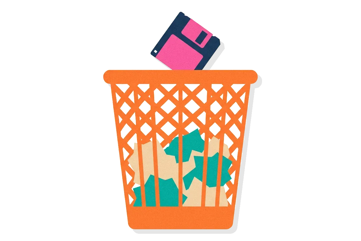
The Trash also had a second job. On the Macintosh, from Mac OS 1 through Mac OS 9, you ejected a floppy disk by dragging its icon into the Trash. Dragging a document into the Trash deleted it, but dragging a disk into the same Trash ejected it. The disk and everything on it were safe. Nothing in a real office prepares anyone for that.
The interface designer Bruce Tognazzini lists this in his Bug Hall of Fame. He dates it from January 1984 to March 2001, a little over 17 years. New users struggled to make sense of a Trash with two opposite jobs. Expert users made a different mistake. A floppy disk often held a single document, and both icons sat on the screen with similar names. So people sometimes dragged the document to the Trash when they meant the disk.
Nothing in the program code was wrong. The trouble was in what users brought with them from wastebaskets to the screen. That transfer of knowledge from one domain to another has a name: metaphorical mapping.
023 min
How metaphorical mapping works
The Trash problem becomes clear once you list what the Trash was paired with. Every metaphorical mapping has three parts. The source domain is the thing people already know, such as the office wastebasket. The target domain is the new thing they are trying to understand, such as deleting files on a computer. The mapping is the list of pairs between them: this part of the source stands for that part of the target.
Users do not learn a Trash icon from zero. They bring a whole set of expectations and test them one by one. The table lists the pairs the Macintosh Trash set up.
| In an office wastebasket | On the Macintosh | Does the pair hold? |
|---|---|---|
| Put paper in to get rid of it | Drag a file in to delete it | Yes |
| Take paper back out before the bin is emptied | Open the Trash and drag the file out | Yes |
| The bin is emptied and the paper is gone | Choose Empty Trash and the file is gone | Yes |
| Nothing you put in comes out somewhere else | Drag a disk in and it comes out of the drive | No |
The first three pairs make the Trash easy to learn. The fourth pair attaches a function the computer needs, ejecting a disk, to an object that means the opposite. Users learn the rule from the pairs that hold, so the one that does not hold surprises them.
A mapping never covers everything. Some parts of the source do not carry over: a real wastebasket can tip over, and nobody expects the Trash to spill. Some parts of the target have no source at all: you can search the Trash for a file by name, which nobody does with a paper bin. The choice of source also decides what users notice. Thomas Erickson of Apple observed in 1990 that most Macintosh users believe they move the document itself when they drag its icon to another folder. In fact the computer only moves a pointer to the file. The folder mapping shows the move and hides the pointer.
The result of all these pairs is the user's mental model: their working idea of how the system behaves. A good mapping gives users a correct model without training. A bad one gives them a wrong model that they feel sure about.
Which relations survive a metaphorical mapping
Psychology explains which pairs users actually keep. Dedre Gentner's 1983 structure-mapping theory says that an analogy carries over the relations between objects, not the look of the objects. Her example was the old comparison of an atom to the solar system. The relation heavier than, between the sun and the planets, carries over to the nucleus and its electrons. The relation hotter than does not.
Gentner's rule for choosing is systematicity. People keep relations that belong to a connected system and drop the ones that stand alone. Heavier than is part of the system that explains the orbit, so it carries over. Hotter than explains nothing about the orbit, so it is left behind. For a designer, this explains why a Trash icon that looks exactly like a bin is not the important part. Users carry over the connected rule, what goes in is gone, and not the shape.
The target domain sets limits on metaphorical mapping
The linguist George Lakoff added a limit from the other side. Lakoff called this the Invariance Principle: a mapping keeps the source's structure only where the target's own structure allows it. His example is the English phrase give someone a kick. A gift normally stays with the person who receives it. A kick is an action, so it cannot stay with anyone, and that part of giving never maps. Ejecting a disk has the same problem. It is a disk leaving a drive, and no part of throwing something away matches that action.
032 min
Where metaphorical mapping comes from
Mappings like these were first described in linguistics, not in interface design. Lakoff traces the modern idea to Michael Reddy's 1979 paper The Conduit Metaphor, which showed how English describes communication as sending ideas inside words. In their 1980 book Metaphors We Live By, Lakoff and the philosopher Mark Johnson argued that such patterns are not decoration. People use them to think. Saying someone demolished your case treats an argument as a kind of war.
Lakoff's 1993 essay The Contemporary Theory of Metaphor gave the idea its exact form. Lakoff's 1993 essay treated each metaphor as an exact mapping, like a function in mathematics, that pairs parts of a source domain with parts of a target domain. In LOVE IS A JOURNEY, for example, the lovers are the travellers and the relationship is the vehicle.
Later work counted these mappings in large numbers. The Metaphor Map of English, finished at the University of Glasgow in 2015, records well over 10,000 metaphorical links between areas of meaning, such as light standing for knowledge. In 2017, Yang Xu, Barbara Malt and Mahesh Srinivasan studied about 5,000 mappings from 1,100 years of English. Most ran one way, from concrete, physical, outward experience toward abstract ideas. “Grasp” moved from holding an object to understanding an idea, not the other way round.
Designers took two lessons from this research. Users already think in mappings without being asked to. And a good source is something concrete and familiar, which the target usually is not.
The name of a metaphor is not its mapping
A common misreading treats the label as the whole idea. Lakoff warned that LOVE IS A JOURNEY is only a short name for a set of correspondences, and that people often mistake the name for the mapping. Design teams make the same mistake. A team calls a screen a desktop or a cart and stops there. The label does not say what happens when a user drags a disk to the bin, or what a cart does when an item sells out. Only the list of pairs says that.
042 min
How metaphorical mapping shows up in real interfaces
Interface designers used these ideas long before most of them had read the linguistics. Xerox released the 8010 Star in April 1981. It was one of the first commercial computers built around a desktop metaphor. Its screen showed small pictures of documents, folders, file drawers, in-baskets and out-baskets, and users arranged them as they would on a real desk.
Documents first, programs second
The Star team mapped more than pictures. On the Star, people opened documents and did not have to think about which program handled them. The team contrasted this with the Tools metaphor used by most systems of the time, where users start a program and then load a file into it. In an office, nobody picks up a word processor; they pick up the memo. The Star copied that relation between a worker and a document, not just the look of a memo.
Mappings that worked and mappings that did not
Other mappings worked as well. The online shopping cart holds items you plan to buy, lets you take them out again, and leads to one checkout. Jakob Nielsen wrote in 2025 that people no longer think of a cart page as being like a cart at all; to them it simply is their cart. Cut, copy and paste through a clipboard follow the same pattern. Some mappings even outlive their source. The floppy disk icon still means Save, although few people still use floppy disks.
Other mappings were copied too literally. Lotus Organizer, first shipped in 1991, drew a bound paper organizer on the screen. William Hudson, a usability consultant, notes that its binder rings took up screen space. Its section tabs also moved from one side to the other depending on the open page, as tabs on paper must. Software has no such limit, so the tabs could have stayed on both sides.
Microsoft Bob asked users to walk through a cartoon house to reach their programs, which added steps to every task. Magic Cap and eWorld, from the same years, used whole towns as menus. Nielsen lists all three among the failed metaphors.
The Macintosh Trash belongs in both groups. Its deletion pairs worked so well that later desktop systems copied the bin. Its eject pair is the standard example of failure. The design researcher William Gaver argued in 1995 that this is normal. The links between screen pictures, computer functions and everyday objects are more complex than the phrase desktop metaphor suggests. A real desktop interface contains many mappings at once, and some can contradict others.

051 min
Metaphorical mapping without pictures: voice mail
The Trash case could suggest that metaphorical mapping is about icons. It is not. In 1990, Erickson described a voice mail system at work that had no screen at all.
A visitor arrived and, as agreed, phoned Erickson from the lobby. He had stepped away from his desk, so the system played his recorded voice saying he was out, followed by a beep. The visitor left a message. The recording and the beep behaved like an answering machine on a desk, and the manual spoke of messages left in a mailbox. So the visitor expected him to hear the message within minutes. Under heavy use, the voice mail system could take up to half an hour to tell its owner that a message had arrived. Erickson came down to the lobby half an hour later and found a visitor who was, reasonably, annoyed.
The answering-machine mapping had no pair for delay. A machine on a desk records and plays back in the same place, so nobody thinks about transit time. The real system ran on a computer in another building. Erickson's point was that the metaphor failed, not the hardware. It also failed through words and sounds alone. Every greeting that tells the caller the owner is out sets up the mapping before the caller has seen anything.
062 min
Spatial metaphorical mapping: up, down, left and right
Not every mapping uses an object like a bin or a mailbox. Some use directions. English speakers say their spirits are soaring or that someone is feeling low, which pairs up with good and down with bad. The thumbs-up gesture and the Like button use the same pair. Benjamin Pitt and Daniel Casasanto argued in 2022 that spatial mappings like these shape how people read layouts and objects, even when no words point to them.
Many spatial mappings depend on a person's reading habits. English readers tend to place earlier times and smaller numbers on the left, and later or larger ones on the right. For readers of Hebrew, Arabic and Farsi, that preference weakens or reverses. In a study reviewed by Pitt and Casasanto, English speakers learned letter-shape pairs better when they were shown left to right, and Hebrew speakers learned them better right to left. Hand use matters too. Right-handed people tend to link good with the right side, and left-handed people with the left.
So a progress bar that fills to the right, a timeline that runs left to right, and a Next arrow that points right are all mappings. They feel natural only to users whose habits match them. Pitt and Casasanto give Microsoft Excel as one product that changes its layout for Hebrew users, so the first highlighted cell is at the top right. They also note that complete right-to-left layouts like this are rare.
Some researchers see these spatial habits as part of a wider process. In 2014, Cristóbal Pagán Cánovas and Javier Valenzuela argued that the mental number line and timeline are better explained by conceptual blending. In blending, people combine two inputs into a new structure, instead of copying one domain onto another.
072 min
Where metaphorical mapping breaks
Spatial and object mappings fail in a few repeated ways. The Trash showed the first: a target function attached to a source object that means the opposite. Hudson describes two more from industry practice.
A mapping can be copied too literally, as the Organizer's moving tabs showed. It can also fail to scale. A paper desk offers no way to find a document except remembering where you put it. Hudson points out that the Windows desktop copied this limit instead of adding what software makes easy, such as an automatic list of recent documents by date, type or contact.
Novices and experts also want different things from one mapping. A newcomer depends on the familiar source. An expert has learned the target and finds the source's limits slow.
When a picture changes a habit
Small visual details create their own pairs. When Apple later drew the full Trash as bulging, many users saw a stomach that was too full. Tognazzini reports that millions of users learned to empty the Trash the moment it bulged. That habit removed the one safety step a bin offers: taking a file back out after a mistake.
When the broken mapping is also the fastest route
The eject-by-Trash pair lasted 17 years partly because it was quick. The Trash sat near a screen corner. By Fitts's Law, a large target at the edge is fast to hit, because the pointer stops at the edge and cannot overshoot. Apple also offered an Eject command in the menu bar, but Tognazzini notes that almost nobody used it once they knew the faster drag. Apple's managers defended the drag as a shortcut for power users. A mapping error that is also a speed advantage is hard to remove, because experts want to keep it.
When the metaphor gets in the way of the task
The Star's own designers warned against using the desktop metaphor everywhere. In their 1989 review of the project, they wrote that pointing at pictures is not always the best method. To open one file among several hundred in a folder, typing its name is faster than scrolling through icons to find it. A metaphor that forces users to act out the source domain, when a faster method exists in the target, has become a cost.
Evidence on the whole approach is limited. Most of what is known comes from case reports and design arguments like these, not controlled studies. Hudson opens his paper by calling the use of metaphor in interface design poorly understood.
081 min
Metaphorical mapping vs. natural mapping and nearby concepts
These failures are easier to spot once metaphorical mapping is separated from the terms people mix it up with. The one axis that separates them is what gets matched.
| Concept | What is matched | Example |
|---|---|---|
| DesignNatural mapping | ||
| This pageMetaphorical mapping | ||
| DesignSkeuomorphic design | ||
| DesignConceptual models | ||
| Not in the library yetAnalogy |
Natural mapping is about position and movement in one place. A metaphorical mapping brings a whole set of rules from somewhere else. Skeuomorphism can exist with no behaviour mapped at all: the Organizer's rings looked like paper and did nothing useful. A conceptual model is what the designer wants users to understand. A metaphorical mapping is one way to deliver it, and the user's mental model is what they actually end up with.
092 min
Applying metaphorical mapping
The Trash, the voice mail and the Organizer all point to the same practice: design the list of pairs, not the picture.
- Write the mapping down before drawing anything. List each source part, the target part it stands for, and whether the pair holds.
- Test each candidate source with Erickson's five questions, listed below.
- For every pair that does not hold, make a decision. Change the target to match, give the odd function its own object, or tell users at the moment it matters.
- Check directions. Timelines, progress bars and Next arrows should follow the reading direction of each language you support.
- Give experts a route that skips the source domain, such as typing a file name or using a keyboard command.
Erickson's five questions for judging a source:
Amount of structure:
does users' knowledge of the source have enough parts to help? A link has few. A newspaper has editions, subscribers and delivery.
Applicability:
which parts of that structure would mislead? Broadcasting suggests that data arrives instantly.
Representability:
can the source be shown clearly in pictures, sounds and words?
Suitability to the audience:
will these users know the source? Test it with them, because designers easily convince themselves.
Extensibility:
will the source still fit the features you add later?
One object, one behaviour
Tognazzini's rule from the Trash case is the one to copy:
"Use different objects, with different appearance, to support different resulting behaviors."
An object in a mapping carries one meaning from its source. If two actions with opposite results share one object, users cannot predict which result they will get. Tognazzini dates the end of the Trash problem to 24 March 2001.
How to spot metaphorical mapping going wrong
- Users pause or ask for help before an action that the source domain says is destructive.
- Support tickets describe target behaviour in source words, such as asking why a message is not in the mailbox yet
- The same icon or word leads to two different results.
- Experts skip the metaphor's path, or novices never find the path that skips it.
?4 questions
Questions people ask
Do interface words create metaphorical mappings too?
Does flat design remove metaphorical mapping?
How many metaphors should one product use?
Is metaphorical mapping a law like Fitts's Law?
§12 sources
Sources for metaphorical mapping
Show all 12 sourcesHide sources
Lakoff, G. (1993). The Contemporary Theory of Metaphor. In A. Ortony (Ed.), Metaphor and Thought (2nd ed.). Cambridge University Press. Author's text copy.
Gentner, D. (1983). Structure-Mapping: A Theoretical Framework for Analogy. Cognitive Science, 7, 155–170.
Tognazzini, B. Bug Hall of Fame: Macintosh Disk Trash. AskTog.
Johnson, J., Roberts, T. L., Verplank, W., Smith, D. C., Irby, C., Beard, M., & Mackey, K. (1989). The Xerox Star: A Retrospective. IEEE Computer, 22(9).
Erickson, T. D. (1990). Working with Interface Metaphors. In B. Laurel (Ed.), The Art of Human-Computer Interface Design. Addison-Wesley.
Hudson, W. Metaphor in User Interface Design: A View from the Trenches. Syntagm Ltd.
Pitt, B., & Casasanto, D. (2022). Spatial Metaphors and the Design of Everyday Things. Frontiers in Psychology, 13, 1019957.
Nielsen, J. (2025). Metaphor in UX Design. Jakob Nielsen on UX.
Gaver, W. (1995). Oh What a Tangled Web We Weave: Metaphor and Mapping in Graphical Interfaces. CHI '95 Conference Companion.
University of Glasgow (2015). Metaphor Map to give bird's eye view on metaphorical usage over the centuries. News release on the Metaphor Map of English.
Xu, Y., Malt, B. C., & Srinivasan, M. (2017). Evolution of Word Meanings through Metaphorical Mapping: Systematicity over the Past Millennium. Cognitive Psychology, 96, 41–53. Author manuscript.
Pagán Cánovas, C., & Valenzuela Manzanares, J. (2014). Conceptual Mappings and Neural Reuse. Frontiers in Human Neuroscience, 8, 261.