011 min
The cost of a missing sign
Take a web page based on the jewellery shop Brilliant Earth. A visitor wants pearl necklaces. Under a heading and a short paragraph there is a link that says Shop Pearl. Whether the visitor finds that link depends on how it looks.
Kate Moran of Nielsen Norman Group tested exactly this in 2017, in an eyetracking study with 71 people and nine pages. For this page she built two versions. In the first, the link was blue and underlined. In the second, it looked like the sentence above it. In both versions the link worked.
The eye data differed. In the version with a clear link style, 25 of 29 people (86%) looked at the heading and then moved down to the Shop Pearl link, and in the plain version only 12 of 24 (50%) did.
For someone who already knew where to click, the two pages were the same. The action existed on both. Many people never saw it on one of them. That gap between an action that works and a person who does not notice it is affordance blindness.
022 min
How affordance blindness happens
Half of the people missed a link that worked. A working link is only half of what a person needs. The other half is a sign that it works.
William Gaver set this out in 1991. An affordance is an action that a thing allows. Gaver pointed out that a second question is separate from it: does anything perceivable show the action? Crossing the two questions gives four cases.
- Perceptible affordance. The action exists and a sign shows it, like a handle shaped for pulling.
- Hidden affordance. The action exists and nothing shows it.
- False affordance. No action exists, but a sign suggests one, like a button-shaped area that does nothing.
- Correct rejection. No action and no sign, so nothing is lost.
Gaver wrote that a hidden affordance has to be inferred from other evidence. A person who sees no sign has nothing to infer from, so they act as if the action is not there. Affordance blindness is what a hidden affordance does to a person. The sign that is missing is what Don Norman later called a signifier.
The word blindness is a label, not a medical claim. The person sees the page clearly. The page just does not show them what they may do.
Two ways the sign goes missing
In the first, the sign is absent. A link styled like body text is the plain case. In the second, a sign is present but points at the wrong thing. In the jewellery study, many people in the plain version stopped at the heading above the link and never looked at it. NN/G read this as people believing they could click the heading. The heading acted as a false affordance, and it hid the real one right below it.
031 min
Where the idea behind affordance blindness comes from
No single researcher coined the phrase affordance blindness, and no study measures it under that name. It is a practitioner label for a problem that older work describes more exactly.
The psychologist James J. Gibson used the word affordance for what an environment offers an animal. In his sense an affordance exists whether or not anyone can perceive it. When Norman brought the word into design in 1988, he meant only the possibilities a person can perceive.
That difference is why the problem has a place in design. For Gibson, a hidden affordance is still an affordance. For a designer working in Norman's sense, an affordance that nobody perceives has failed at its job.
Gaver gave the unperceived case a name, the hidden affordance, in 1991. In 2008 Norman went further and asked designers to talk about signifiers rather than affordances, because the signs are what people actually need. Since then the cause of affordance blindness has had a short description: a missing or misleading signifier.
041 min
Affordance blindness in Windows 8
The same thing happens to experienced people on a whole operating system. In November 2012, Jakob Nielsen of NN/G reported a test of Windows 8. NN/G invited 12 experienced PC users to try it on ordinary computers and on Microsoft's Surface RT tablets.
Windows 8 kept search, sharing and settings in a panel called the charms. The panel stayed out of sight until a person flicked in from the right edge of a tablet, or moved the pointer to the upper-right corner of a computer screen. The commands were always available. Nothing on the screen said so.
Nielsen reported that people often forgot to summon the charms even when they needed them. In apps such as Epicurious, which put a reminder of search on the screen, people used search much more often.
The settings menu showed a smaller version of the same problem. Its last line, "Change PC settings", looked like a label for the icons above it. Many people did not click it when they wanted to change the start screen colour.
052 min
How affordance blindness shows up in products
Many common interface habits remove the sign and keep the action. Touch screens made this easier, because a swipe or a long press needs no part of the screen to exist.
A gesture that works in one place and not in another
Norman and Nielsen pointed to Apple Mail in 2010. Swiping across an unopened message brought up a delete option. The same swipe on a message that had been opened did nothing, and in the Apple calendar it did not work either. They asked how anyone could learn that the gesture exists, and where it applies.
A person who learns a swipe on one screen and tries it on another gets no response and no explanation. They may decide the first success was an accident.
Controls that appear only on hover
Most touch screens cannot detect a finger that is near the glass but not touching it. A control that appears only when the pointer rests on a row is therefore never shown on those screens. On a desktop, the person must first move the pointer to the right spot before anything appears.
Links that look like text
This was the Brilliant Earth case. Links set in the colour and weight of the sentence around them give the eye no reason to stop. The pattern spread with flat visual styles, which removed shadows and underlines that used to mark what could be clicked.
062 min
Affordance blindness caused by expectation
In every case so far the sign was missing from the screen. A second cause sits in the person. Someone who knows what an object is for may stop seeing what else it allows.
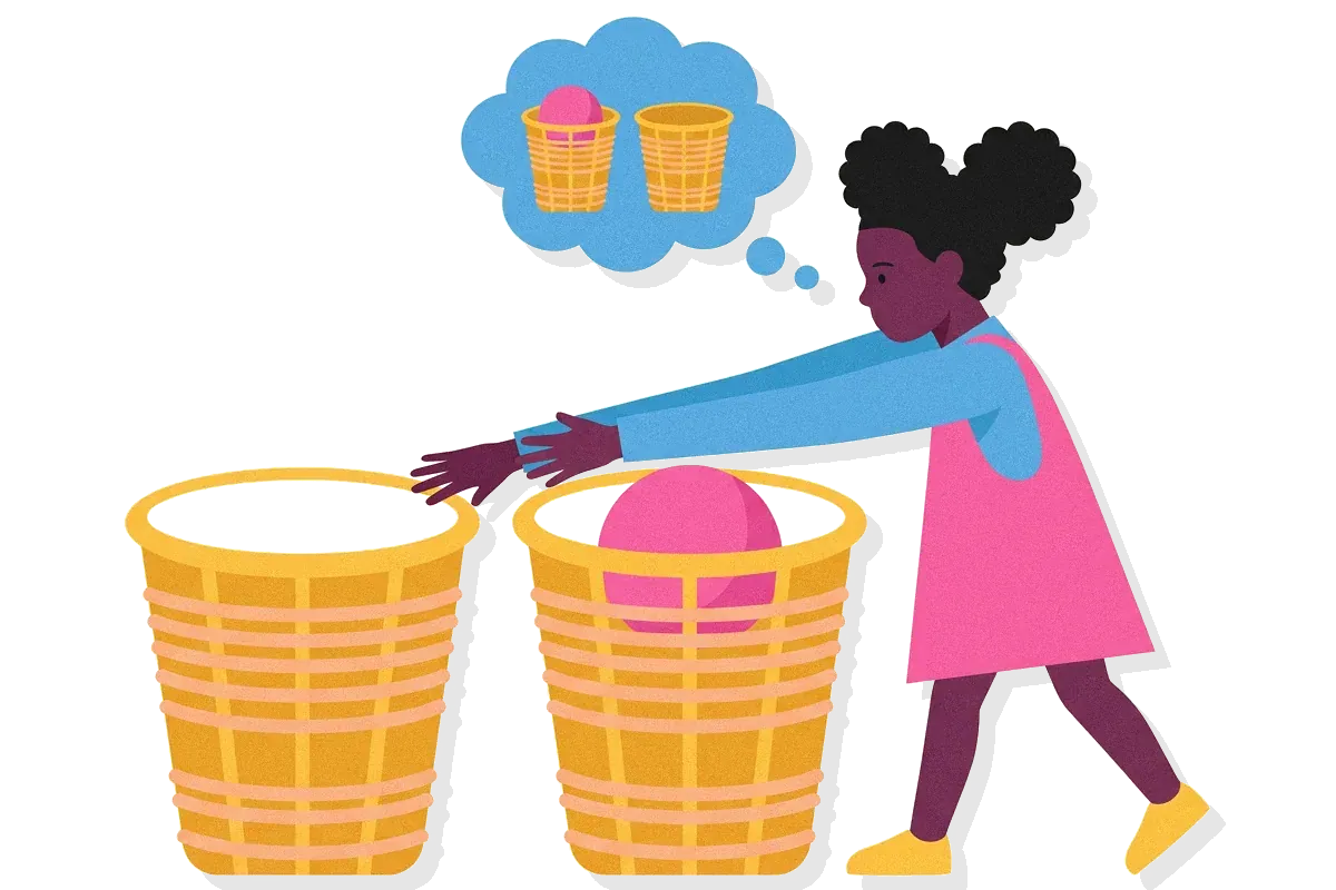
Psychologists call this functional fixedness. In 2005 Tim German and H. Clark Barrett tested whether it appears in a culture with few manufactured tools. Their 29 participants were aged 12 to 25 and lived in two Shuar villages in Ecuadorian Amazonia.
Each person received a rescue task. A story character was stuck on a perch, and the person had to build a tower high enough to reach it. The materials were a cardboard box, six foam cubes, a battery, a pencil eraser and a rubber ball. The cubes alone were too short. Only a tower built on the box reached the perch.
In one setup the box lay beside the other items, and in the other setup the same items were handed over inside it. Participants were faster at using the box as a platform when the box's container role had not been established than when it had already held the other items. The test on the box task was borderline. On a second task, where a spoon had to serve as a bridge, the delay was clear.
Nothing was hidden here. The box sat in plain view. What hid the second use was the person's own idea of the box as a container. For a designer, this is the other half of the problem. People arrive with expectations about what things are for, so a sign has to compete with those expectations as well as with the clutter on the screen.
072 min
Where the evidence on affordance blindness is contested
The evidence has three limits, and the first is the label itself. Affordance blindness has no agreed way of being measured. Studies measure nearby effects, such as where the eyes go, how long a task takes, or how many people find a control.
The second limit is that the best-known numbers drew objections. After NN/G published the jewellery study, critics said its title promised a test of flat design against design with depth, while the page pairs also differed in other ways, such as ghost buttons and links styled as text. Sean Dexter of Cigna was among those who said readers should not judge a study by its title, and Moran agreed that the title was the fairest complaint. Her answer to the rest was that every change came from real flat websites, and that weak signs were exactly what the study set out to compare.
The third limit is scope. People did short tasks on a single page. Moran also said NN/G found no quantitative evidence that users cannot work out flat designs, only that they sometimes have a harder time locating what they came for.
So the sizes in the study belong to the pages and tasks that were tested. The direction fits Gaver's argument and Nielsen's Windows 8 test. The study does not say how many real visitors would give up.
A common misreading
Some readers took the study to mean that flat design is the cause. Moran's reply separates the two: the problem is a weak or absent sign, and flat design is one place it shows up. A flat page with clear signs does not cause affordance blindness.
081 min
When affordance blindness does not appear
A quiet sign does not always fail. In NN/G's study, 3 of the 9 page pairs showed no difference in where people looked. One of them was a bank page with light purple in-line links and no underline. NN/G concluded that in-line links are recognised without an underline as long as their colour contrasts with the text around them.
The other two pairs had traits in common. They held little content with plenty of white space, their buttons and links stood where people expect them, and their targets contrasted with their surroundings and had room around them.
So the sign does not have to be loud. It has to differ enough from its surroundings, in a place where people already look.
091 min
Affordance blindness vs. nearby concepts
A reader may ask whether this is banner blindness. The two have opposite causes.
| Concept | What the person fails to do | What causes it |
|---|---|---|
| This pageAffordance blindness | ||
| DesignBanner blindness | ||
| PsychologyFunctional fixedness |
Jan Benway and David Lane of Rice University named banner blindness in 1998. In an intranet test, almost every participant scrolled past a large banner-style link to Internet courses, and chose a small text link labelled "courses" from a list at the bottom of the page. The large link was the one the designers wanted noticed. The affordance was easy to see, and people skipped it. In affordance blindness, the sign is too quiet. In banner blindness, it is too much like something people have learned to ignore.
102 min
How to find and fix affordance blindness
Say a designer ships an email list where swiping a row to the left archives the message. Nothing on the row hints at the swipe. In a test, people archive messages by opening each one and using a menu. The team that built the list never sees this, because they know about the swipe.
- Run a usability test with people who have never seen the screen. Give them a task that needs the hidden action, and do not point at it. Watch for pauses, a pointer hovering over plain text, and people stopping at the wrong element, like the heading in the jewellery study.
- List the actions on each screen that have no visible sign. Swipes, long presses, hover-only controls and links styled as text are the usual ones. For each, ask whether most people need it or know it exists.
- Add a sign. For a link in text, a contrasting colour is enough. For a gesture, add a visible control that does the same job. For a rarely used action, show a hint once, where it applies.
- Put a reminder where people already look. In the Windows 8 test, apps with their own search reminder got more use of search.
- Test again with new people. Anyone who saw the first version now knows where the action is.
Signs have a cost. If every element carries a loud sign, none of them stands out, and people learn to skip them. Keep clear signs for the actions most people need. Leave rare actions out of the main view and make sure one visible place points to them. Whether people can find an action at all is the subject of discoverability.
111 min
Affordance blindness and accessibility
A gesture raises a second problem besides the missing sign. WCAG 2.2 success criterion 2.5.1, Pointer Gestures (Level A), requires a single-pointer way to do anything that normally needs a swipe or another path-based gesture, unless the gesture is essential.
People who use a head pointer, an eye-gaze system or a speech-controlled mouse often cannot draw a precise path. A visible button next to a swipe therefore helps two groups: people who do not know the swipe exists, and people who cannot perform it.
121 min
Frequently asked questions
Is affordance blindness the same as a user mistake?
No. The person responded sensibly to what the screen showed. When a working action has no visible sign, missing it is the expected result, and the fix belongs in the design.
Does affordance blindness only affect new users?
No. NN/G's Windows 8 test used 12 experienced PC users, and many still forgot the hidden charms panel. Experience helps only once the person has learned that the control exists.
Does every action need a visible sign?
No. Rarely used actions can stay out of sight. Actions that most people need, or that people have no reason to expect, need a sign, because nothing else tells them to look.
?3 questions
Questions people ask
Is affordance blindness the same as a user mistake?
Does affordance blindness only affect new users?
Does every action need a visible sign?
▶1 video
Watch
Understanding Affordance Blindness
§9 sources
Sources
Show all 9 sourcesHide sources
William W. Gaver, "Technology affordances", CHI '91 Proceedings, 1991. lri.fr
Donald A. Norman, "Signifiers, not affordances", ACM Interactions 15(6), 2008. jnd.org
Kate Moran, "Flat UI Elements Attract Less Attention and Cause Uncertainty", Nielsen Norman Group, 2017. nngroup.com
Kate Moran, "Response to Criticisms of Flat-Design Eyetracking Study", Nielsen Norman Group, 2017. nngroup.com
Jakob Nielsen, "Windows 8 — Disappointing Usability for Both Novice and Power Users", Nielsen Norman Group, 2012. nngroup.com
Donald A. Norman and Jakob Nielsen, "Gestural interfaces: a step backward in usability", ACM Interactions 17(5), 2010. jnd.org
Jan Panero Benway and David M. Lane, "Banner Blindness: Web Searchers Often Miss 'Obvious' Links", Rice University, 1998. rice.edu
Tim P. German and H. Clark Barrett, "Functional Fixedness in a Technologically Sparse Culture", Psychological Science 16(1), 2005. ucsb.edu
W3C, "Understanding Success Criterion 2.5.1: Pointer Gestures", WCAG 2.2. w3.org